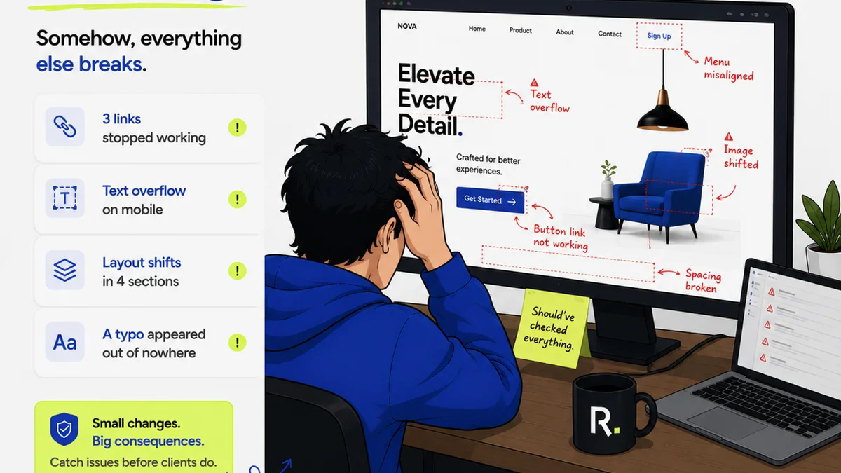
Everyone agrees design documentation is important. It’s the blueprint, the record, the single source of truth. We’ve all seen the checklists: client brief, wireframes, mockups, style guides, final assets. None of that is wrong. But it’s incomplete.
The hard truth is, good design documentation isn’t just about listing deliverables. It’s about creating a shared understanding that prevents costly rework and keeps projects on track. It’s an ongoing process, not a one-off task. And it’s the bedrock of efficient creative operations.
1. The Foundation: Briefing and Discovery
This is where it all begins. A vague brief leads to vague design. And vague design leads to endless revisions.
1.1. The Client Brief: Beyond Buzzwords
Your client brief should be more than a wish list. It needs to capture the 'why' behind the project, not just the 'what'.
- Project goals: What does success look like, quantitatively and qualitatively?
- Target audience: Who are we designing for? Demographics, psychographics, needs.
- Brand guidelines: Existing visual identity, tone of voice, do's and don'ts.
- Scope and deliverables: What exactly are we building? What’s out of scope?
- Technical constraints: Platform limitations, accessibility requirements, browser support.
- Budget and timeline: Realistic expectations for both.
This isn't just about gathering information; it's about aligning expectations from day one.
1.2. Discovery Workshop Outputs
After the initial brief, you might run discovery workshops. Document the key takeaways.
- User personas: Detailed profiles of your ideal users.
- User journey maps: Visualizing the user's experience with the product or service.
- Competitive analysis: Understanding the landscape and identifying opportunities.
- Key insights: Unexpected findings that shape the design direction.
This phase sets the strategic direction. Your documentation should reflect that.
2. Design System & Style Guides: Consistency is Key
A style guide or design system is your brand's visual DNA. Without it, every project becomes a fresh start, leading to fragmentation and inconsistency.
2.1. Core Brand Elements
This is the non-negotiable stuff.
- Logo usage: Clear rules on spacing, color variations, and prohibited uses.
- Color palette: Primary, secondary, and accent colors with HEX, RGB, and CMYK values.
- Typography: Font families, weights, sizes, line heights for headings, body text, and UI elements.
- Imagery and iconography: Guidelines on style, tone, and usage.
This ensures every touchpoint feels like it belongs to the same brand.
2.2. UI Components and Patterns
For digital products, this is crucial. Documenting reusable components saves immense time and ensures a cohesive user experience.
- Buttons: States (default, hover, active, disabled), sizes, styles.
- Forms: Input fields, labels, error states, validation rules.
- Navigation: Headers, footers, menus, breadcrumbs.
- Cards, modals, tooltips: Structure and behavior.
- Spacing and layout grids: Establishing visual rhythm and consistency.
Think of this as your UI Lego set. Documenting it properly allows for rapid prototyping and development.
2.3. Tone of Voice
Design isn't just visual; it's also verbal. Document how the brand communicates.
- Brand personality: Is it playful, serious, authoritative?
- Key messaging: Core statements and value propositions.
- Grammar and style: Specific rules or preferences.
This ensures copywriters and designers are speaking the same language.
3. Project-Specific Documentation: The Deliverables
This is the documentation directly tied to a specific project's output.
3.1. Wireframes and User Flows
Before pixels are placed, the structure and flow need to be clear.
- Sitemap: The overall structure of the website or application.
- User flows: Step-by-step paths users take to complete tasks.
- Wireframes: Low-fidelity layouts focusing on content hierarchy and functionality.
These documents prevent architectural mistakes early on.
3.2. Mockups and Prototypes
These are the high-fidelity representations of the final design.
- Visual design mockups: Pixel-perfect screens showing the look and feel.
- Interactive prototypes: Clickable versions simulating user interaction.
- Annotations: Explaining interactions, states, or specific design decisions.
Prototypes are invaluable for user testing and client presentations.
3.3. Asset Specifications
This is the handover material for developers.
- Redlines: Dimensions, spacing, colors, typography for specific elements.
- Exportable assets: Icons, images, logos in required formats and resolutions.
- Interaction specifications: Detailed descriptions of animations and transitions.
Clear specs reduce ambiguity and speed up development.
4. Accessibility Documentation: Designing for Everyone
Accessibility is not an afterthought; it's a fundamental requirement. Documenting accessibility considerations ensures inclusivity.
4.1. WCAG Compliance Goals
State the target WCAG level (A, AA, AAA) for the project. WCAG guidelines provide the framework.
4.2. Specific Accessibility Features
- Color contrast ratios: Ensuring text is readable.
- Keyboard navigation: Documenting focus states and logical tab order.
- Screen reader compatibility: Semantic HTML structure, ARIA attributes.
- Alt text for images: Descriptive text for visually impaired users.
- Form labels and error handling: Clear instructions and feedback.
Designing for accessibility benefits everyone, not just users with disabilities.
5. Post-Launch & Maintenance
Documentation doesn't stop when the project launches.
5.1. User Feedback and Analytics
Document key findings from user testing, A/B tests, and analytics data.
- Usability issues: Problems users encountered.
- Performance metrics: Bounce rates, conversion rates, task completion times.
- User satisfaction scores: NPS, CSAT.
This data informs future iterations and improvements.
5.2. Change Logs and Version History
Keep a record of updates, bug fixes, and new features.
- Date of change
- Description of change
- Impact and affected areas
- Version number
This is critical for understanding the product's evolution and troubleshooting.
Where Revue Fits In
Managing all this documentation, especially the feedback and approval cycles, can become chaotic. That’s where a centralized platform like Revue becomes essential.
Instead of scattered email threads and endless document versions, Revue provides a single source of truth for creative feedback. You can track revisions, manage approvals, and maintain a clear audit trail for every design decision.
This visibility is key. It ensures everyone is working from the latest approved version, reduces miscommunication, and streamlines the entire review process, directly impacting the quality and efficiency of your design documentation.
Final Thought
Is your design documentation a rigid set of files, or a living, breathing system that actively guides your team and clients? The difference impacts everything from project timelines to client satisfaction. Treating documentation as an ongoing strategic process, not just a deliverable, is the real key to success.
Frequently asked questions
What is the most critical part of design documentation?
The most critical part is the initial client brief and discovery phase. A clear, comprehensive brief sets the foundation for the entire project. Misunderstandings here cascade into costly revisions later.
How often should a style guide be updated?
A style guide should be updated whenever brand elements evolve or new UI patterns emerge. For digital products, it's often updated alongside development sprints. It should be a living document, not a static one.
Why is accessibility documentation important for agencies?
Documenting accessibility ensures you meet legal requirements, reach a wider audience, and demonstrate ethical design practices. It prevents costly redesigns and builds client trust by showing you prioritize inclusivity.
Can documentation help reduce client revisions?
Yes, absolutely. Clear documentation, especially detailed briefs, user flows, and prototypes with annotations, creates a shared understanding. This minimizes subjective feedback and reduces revisions based on misinterpretation.