Everyone agrees design handoff is important. It’s that moment when the designer’s vision meets the developer’s code. You’ve probably seen checklists for it: export assets, document colors, list fonts. None of that is wrong. But it’s incomplete.
The real truth? Design handoff isn’t just a step. It’s a high-stakes handover of trust. The success of your project hinges on how effectively you communicate intent, context, and nuance. It’s where the rubber meets the road, and a shaky handoff means a bumpy ride—or worse, a crash.
1. Beyond the Pixel-Perfect Mockup: Communicating Intent
Designers obsess over pixels. Developers build systems. These aren’t always aligned by default. A static mockup tells *what* to build, but rarely *why* or *how* it should behave in the wild.
The ‘Why’ Behind the Design
Why is this button blue? Why does this animation ease out? Understanding the user problem and the strategic goals behind design decisions is crucial. This context prevents developers from making assumptions that derail the user experience.
The ‘How’ of Interaction
Static designs can’t convey everything. Think about:
- Microinteractions: The subtle animations and feedback that make an interface feel alive.
- Edge Cases: What happens when a user enters too much text? When there’s no data to display?
- States: Hover, active, disabled, loading, error states for every interactive element.
- Responsiveness: How does the layout adapt across different screen sizes and orientations?
These details are often overlooked but are vital for a polished, usable product.
The Problem of Ambiguity
Ambiguity is the enemy of efficient development. When in doubt, developers will often default to the simplest implementation. This might be technically correct but functionally or aesthetically wrong. Clear, comprehensive documentation minimizes this.
2. Asset Management: More Than Just Exports
Exporting assets is table stakes. But organizing and delivering them effectively is where the real work lies. Think about the developer’s workflow, not just yours.
Organized for Use
Don’t just dump a folder of PNGs. Group assets logically, ideally mirroring the component structure they belong to. Use clear, consistent naming conventions. Developers shouldn’t have to guess what `button_primary_large_blue_v2.png` actually is.
Scalable Formats
Use vector formats (SVG) for icons and illustrations whenever possible. They scale without losing quality. For raster images, provide them in appropriate resolutions and formats (like WebP for web) to balance quality and performance.
Iconography and Typography
Icon libraries should be easy to access and use. Specify font families, weights, sizes, and line heights clearly. Don’t forget letter spacing and paragraph styles.
Code Snippets for Styles
Where possible, provide basic CSS or design tokens for common styles. This isn't about writing production code, but about giving developers a clear starting point for colors, typography, and spacing.
3. Documentation: The Single Source of Truth
Documentation isn’t an afterthought; it’s the blueprint. A well-structured design system or style guide is invaluable.
Component-Based Documentation
Document UI elements as components. For each component, specify its purpose, states, variations, and usage guidelines. This is the foundation of a scalable design system.
Accessibility Considerations
This is non-negotiable. Document:
- Color contrast ratios.
- Focus order and keyboard navigation.
- ARIA labels and roles where necessary.
- Font sizes and readability standards.
Reference guidelines like the Web Content Accessibility Guidelines (WCAG).
Performance Budgets
Are there specific image size limits? Animation performance targets? Include these. Designers and developers should collaborate on understanding the trade-offs between fidelity and performance.
Brand Guidelines Integration
Ensure brand guidelines are accessible and integrated. This includes logos, brand colors, tone of voice, and any other brand-specific elements.
4. The Handoff Meeting: Collaboration, Not Just Presentation
A meeting is often the final checkpoint. Treat it as a collaborative session, not a one-way information dump.
Walk Through Key Flows
Don’t just show screens. Demonstrate interactive prototypes and walk through critical user flows. Highlight any complex interactions or animations.
Q&A and Clarification
This is the primary time for developers to ask questions. Be prepared to answer them thoroughly. If you don’t have an answer, commit to finding one quickly.
Establish Feedback Loops
Define how developers will provide feedback during implementation. Will they flag issues in a project management tool? Schedule regular check-ins?
Involve the Right People
Ensure designers, developers, product managers, and QA testers are present. Everyone needs to be on the same page.
5. Where Revue Fits In
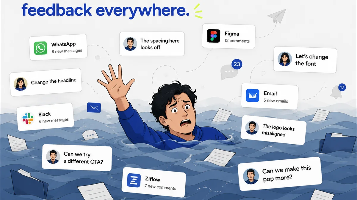
Managing the sheer volume of feedback, revisions, and approvals during design and development can be chaotic. This is where a centralized platform like Revue becomes essential.
Revue streamlines the entire creative workflow, from initial concept to final deployment. It acts as the single source of truth for all client and stakeholder feedback, ensuring that designers and developers are working from the most up-to-date information.
During the design phase, you can collect and organize feedback directly on designs, track revisions, and get clear approvals. This clarity then flows directly into the handoff process.
For developers, having a clear history of design iterations and final approved states within Revue means less time spent hunting for the latest version or deciphering conflicting comments. It ensures that the build aligns precisely with the approved vision, minimizing costly rework and accelerating the delivery timeline.
6. Post-Launch: The Feedback Loop Continues
Handoff isn’t truly over when the code is deployed. User feedback and performance data from the live product should inform future design iterations.
Monitor Live Performance
Track analytics. Are users engaging with the features as intended? Are there performance bottlenecks?
Gather User Feedback
Collect reviews, conduct surveys, and monitor social media. Real-world usage often reveals issues or opportunities missed in pre-launch testing.
Iterate and Refine
Use the insights gained to plan the next round of improvements. This continuous loop ensures the product evolves and stays relevant.
Final Thought
Is your design handoff process a rigid checklist, or a dynamic conversation? The difference determines whether you’re just delivering files, or launching successful, user-centric products.
Frequently asked questions
What is the most critical element of a successful design handoff?
Beyond just exporting assets, the most critical element is communicating the 'why' and 'how' behind the design decisions. This includes design intent, interaction details, and edge cases, which prevents developers from making incorrect assumptions and ensures the final product aligns with user needs and strategic goals.
How can I ensure my design assets are organized for developers?
Organize assets logically, mirroring the component structure they belong to. Use clear, consistent naming conventions and provide scalable formats like SVG for icons. Offer different resolutions for raster images and consider formats like WebP for web use to balance quality and performance.
What role does documentation play in design handoff?
Documentation serves as the single source of truth. It should include component-based descriptions, accessibility considerations (like contrast ratios and ARIA labels), performance targets, and integration with brand guidelines. Comprehensive docs minimize ambiguity and reduce costly rework.
How can a platform like Revue improve the design handoff process?
Revue centralizes all feedback, revisions, and approvals, acting as a single source of truth. This clarity ensures that both designers and developers are working from the most up-to-date information, reducing confusion and minimizing rework during the handoff and implementation phases.