You think a design QA checklist is just about catching stray pixels and misaligned elements. That’s what everyone says. That’s what the templates tell you.
None of that is wrong. But it’s incomplete.
The hard truth? A truly effective design QA process is less about the final output and more about the operational friction leading up to it.
It’s about preventing errors before they happen, streamlining communication, and ensuring the design serves its actual purpose, not just aesthetic perfection.
1. The Pixel-Perfect Trap
We’re all guilty of it. The endless hunt for that one rogue pixel. The obsession with absolute alignment. It’s a noble pursuit, but it’s often a distraction.
Design QA isn't just a final sweep. It's an ongoing vigilance.
Focusing solely on minor visual flaws means you might miss bigger problems. Problems with:
- User flow
- Accessibility
- Brand consistency
- Technical feasibility
- Client requirements
A design that’s pixel-perfect but doesn’t solve the client’s problem is a failure. A design with a few minor visual quirks but achieves business goals is a success.
Your checklist needs to reflect this reality.
Beyond Visuals: Functional QA
This is where many checklists fall short. They’re too focused on the *look* and not enough on the *function*.
Ask yourself:
- Does the interactive element behave as expected?
- Are all links functional and pointing to the correct destinations?
- Is the form submission process clear and error-free?
- Do animations and transitions serve a purpose, or are they just decorative noise?
- Is the content readable and understandable on all target devices and screen sizes?
This type of QA requires a different mindset. It’s about testing the user experience, not just the visual presentation.
2. The Human Element: Communication & Collaboration
The biggest source of design errors isn’t a lack of skill; it’s a breakdown in communication. Your design QA checklist should address this head-on.
Think about your feedback loop. Is it clear? Is it timely? Is it actionable?
A disorganized feedback process leads to:
- Misinterpretations
- Scope creep
- Endless revision cycles
- Frustration on both sides
Your checklist needs to integrate with your workflow, not just sit at the end of it.
Pre-emptive QA: Setting Expectations
The best QA starts before the first design is even drafted. It’s about clarifying the brief.
Ensure your brief includes:
- Clear objectives and KPIs
- Target audience definition
- Brand guidelines
- Technical constraints
- Success metrics
This isn't just for the client to provide; it's for your team to actively solicit and confirm.
A solid brief is your first line of defense against design errors.
During-Project QA: Integrated Checkpoints
Don’t wait until the final deliverable. Build QA into each stage of the design process.
Consider checkpoints for:
- Concept approval
- Wireframe review
- Mood board sign-off
- Key screen reviews
- Interactive prototype testing
This allows for course correction without derailing the entire project.
3. Accessibility: The Non-Negotiable Standard
This isn't a nice-to-have. It's a requirement for any usable design. Your design QA checklist absolutely must include accessibility checks.
Many designers still treat accessibility as an afterthought. This is a costly mistake.
Consider the consequences:
- Alienating a significant portion of your audience
- Potential legal challenges
- Damaged brand reputation
- Lower engagement and conversion rates
Start with the basics. Are you following Web Content Accessibility Guidelines (WCAG)?
Key areas to check:
- Color Contrast: Is text readable against its background? Use tools to verify contrast ratios (aim for WCAG AA or AAA).
- Keyboard Navigation: Can users navigate and interact with all elements using a keyboard alone? Is the focus indicator clear?
- Alt Text: Are informative images described with concise alt text? Decorative images should have null alt attributes.
- Semantic HTML: Are headings, lists, and other elements used correctly to structure content logically? This aids screen readers.
- Form Labels: Are all form fields clearly labeled, associated with their respective inputs?
Tools like WAVE or browser developer tools can help automate some of these checks. But human oversight is crucial.
4. Brand Consistency: The Unifying Thread
A design QA checklist is a gatekeeper for brand integrity. Every element should reinforce the brand, not dilute it.
This goes beyond just slapping a logo on it.
Think about:
- Tone of Voice: Does the copy align with the brand’s personality?
- Visual Language: Are typography, color palettes, and imagery consistent with brand guidelines?
- UI Elements: Do buttons, icons, and other interface components adhere to the established design system?
- Overall Experience: Does the entire user journey feel cohesive and on-brand?
Inconsistent branding confuses users and erodes trust. It suggests a lack of attention to detail.
Your checklist should explicitly call out checks against brand guidelines. Make sure these guidelines are easily accessible and up-to-date.
5. Performance & Technical Viability
A beautiful design is useless if it’s slow, buggy, or impossible to build.
Your design QA must include technical considerations. This requires close collaboration with developers.
Key technical checks:
- Responsiveness: Does the design adapt gracefully to different screen sizes and resolutions? Test on actual devices or reliable emulators.
- Asset Optimization: Are images and other assets optimized for web performance without sacrificing quality?
- Cross-Browser/Device Compatibility: Does the design render consistently across major browsers and devices?
- Code Standards: If applicable, are the designs translatable into clean, maintainable code?
- Accessibility of Interactions: Do complex interactions (like drag-and-drop) have accessible fallbacks or alternatives?
This isn’t about the designer writing code. It’s about understanding the implications of design decisions on the final product’s performance and maintainability.
Where Revue Fits In
Managing a comprehensive design QA process across multiple projects and clients can feel like juggling chainsaws.
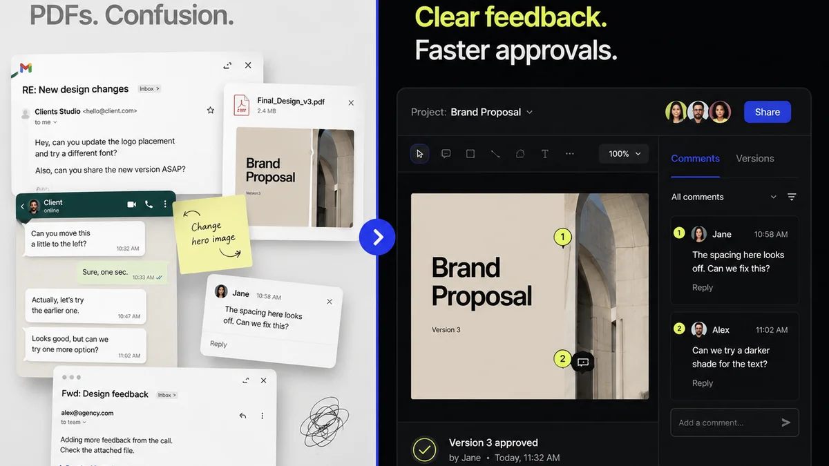
This is precisely why tools like Revue exist. They centralize feedback, making your QA process more efficient and less error-prone.
Imagine this:
- Centralized Feedback: All client comments, stakeholder input, and internal reviews live in one place, tied directly to the design asset. No more digging through endless email threads or Slack messages.
- Version Control Visibility: Easily track revisions and see exactly what changed between versions. This is critical for QA, allowing you to verify that requested changes were implemented correctly.
- Streamlined Approvals: Formalize the approval process. Know exactly when a design is signed off, reducing ambiguity and preventing last-minute changes after QA.
- Clear Audit Trail: Maintain a record of all feedback and decisions. This is invaluable for post-project reviews and for defending your work if questions arise later.
Revue helps transform your QA from a chaotic final hurdle into a structured, manageable part of your workflow. It ensures that what gets approved is what gets built, and that the quality bar is consistently met.
6. The Checklist Itself: Making it Work
Your design QA checklist shouldn’t be a static document gathering dust.
It needs to be a living, breathing part of your team’s workflow.
Tailor It to Your Needs
A generic checklist is a starting point, not an endpoint. Adapt it for different project types.
A simple social media graphic needs a different QA process than a complex web application.
Consider a modular approach:
- Core checks (always applicable)
- Project-specific checks (e.g., e-commerce, mobile app, branding)
- Client-specific requirements
Integrate, Don’t Isolate
The checklist should guide actions, not just tick boxes.
Use it:
- During internal reviews
- As a basis for client feedback sessions
- To train new team members
Make it a tool for learning and improvement, not just a gatekeeping mechanism.
Automate Where Possible
Leverage tools to handle repetitive checks. This frees up human reviewers for more critical tasks.
Tools can help with:
- Link checking
- Basic accessibility scans
- Responsiveness previews
- Code validation
But remember, automation is a supplement, not a replacement, for human judgment.
Final Thought
Is your design QA checklist focused on the right things? Is it truly ensuring quality, or just chasing perfection?
The goal isn't just a flawless design. It's a design that works, performs, and satisfies the strategic objectives it was created for.
What’s the most overlooked aspect of design QA in your agency?
Frequently asked questions
What is the primary goal of a design QA checklist?
The primary goal is to ensure a design meets all functional, aesthetic, and strategic requirements before delivery. This goes beyond just visual perfection to include aspects like user experience, accessibility, brand consistency, and technical viability.
How can I make my design QA checklist more effective?
To make it more effective, tailor the checklist to specific project types and client needs. Integrate it into the workflow rather than using it only at the end. Focus on communication, accessibility, and functional testing, not just visual details. Automate repetitive checks where possible.
What are the key areas a design QA checklist should cover?
Key areas include: functional testing (user flow, links, forms), accessibility (color contrast, keyboard navigation, alt text), brand consistency (visual language, tone), performance and technical viability (responsiveness, asset optimization), and ensuring all original project objectives are met.
How does a tool like Revue help with design QA?
Revue centralizes feedback, making it easier to track revisions and ensure requested changes are implemented correctly. It provides a clear audit trail and streamlines the approval process, transforming QA from a chaotic final step into a structured part of the workflow.