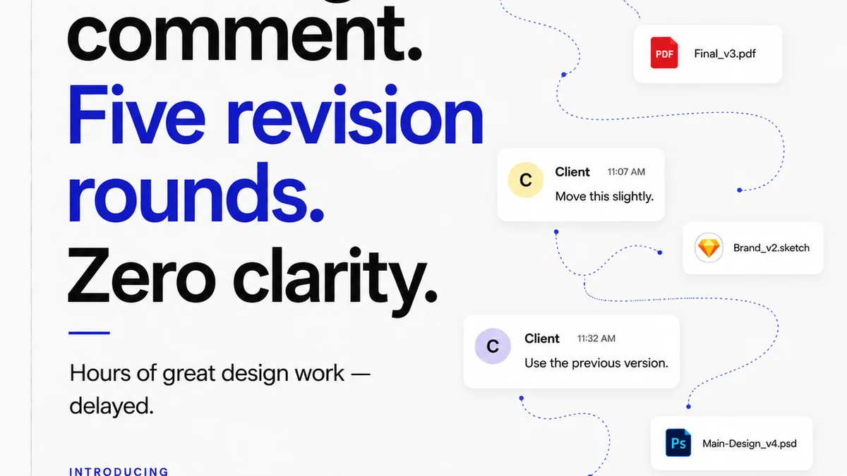
Everyone knows you need to review designs before they go live. It’s a basic step. A rite of passage for any creative team.
But that’s usually where the thinking stops. A quick glance, a gut feeling, maybe a Slack message like “Looks good to me.”
None of that is wrong. But it’s incomplete. It’s a recipe for missed details, unhappy clients, and endless revision cycles.
The Hard Truth About Design Reviews
The hard truth is that relying on ad-hoc reviews is a weak process. It’s subjective and inconsistent. What one person catches, another misses entirely.
This leads to a cascade of problems: scope creep, missed deadlines, and burnout. Your best work gets buried under a mountain of minor fixes that should have been caught earlier.
A robust design review checklist isn't about micromanagement. It's about building an efficient, reliable quality control system.
1. The Visual Audit: More Than Just Pretty Pixels
This is where most reviews start and end. But a true visual audit goes deeper than aesthetics.
Brand Consistency
Is the design on-brand? Not just the logo, but the overall tone, color palette, typography, and imagery.
- Does it align with the brand guidelines?
- Is the brand voice reflected visually?
- Are there any elements that feel out of place?
UI/UX Principles
Beyond the look, does it *work*? This means adhering to established usability standards.
- Is the navigation intuitive?
- Are calls to action clear and prominent?
- Is the information hierarchy logical?
- Are interactive elements predictable?
- Is it accessible? We'll cover this more later.
Visual Hierarchy and Layout
Does the design guide the user's eye effectively? Is the most important information immediately apparent?
- Is there a clear focal point?
- Is whitespace used effectively to reduce clutter?
- Are elements aligned properly?
- Is the layout responsive across different screen sizes?
Typography
Type is a powerful visual tool. Is it being used correctly?
- Are font choices legible and appropriate for the context?
- Is there a consistent typographic scale?
- Are line lengths comfortable for reading?
- Are kerning and tracking appropriate?
Color Usage
Color impacts mood, usability, and brand perception.
- Are color combinations accessible (sufficient contrast)?
- Does the color palette support the brand and the message?
- Are colors used consistently for interactive states (e.g., hover, active)?
2. The Functional Check: Does It Actually Work?
A beautiful design that breaks is useless. This is about testing the user experience in practice.
Interactivity and States
How do elements behave when a user interacts with them?
- Do buttons and links change state on hover and click?
- Are form fields clear about their requirements and validation?
- Do animations and transitions enhance the experience without being distracting?
- Are loading indicators present for longer processes?
Cross-Browser and Cross-Device Compatibility
The web is not a single environment. Your design needs to work everywhere.
- Test on major browsers (Chrome, Firefox, Safari, Edge).
- Test on various devices (desktop, tablet, mobile) and operating systems (iOS, Android, Windows).
- Ensure layout and functionality remain intact.
Performance Considerations
Slow-loading designs kill user engagement. Are there obvious performance bottlenecks?
- Are images optimized for web use?
- Are there excessive or unoptimized animations?
- Are third-party scripts impacting load times significantly?
3. The Content Audit: Clarity and Accuracy
Design is the vehicle for content. If the content is flawed, the design fails.
Copy Review
Is the text clear, concise, and error-free?
- Proofread for spelling and grammar errors.
- Check for tone of voice consistency.
- Ensure all copy is finalized and approved.
- Are calls to action unambiguous?
Information Accuracy
Is all the information presented correct and up-to-date?
- Verify dates, times, prices, names, and any other factual data.
- Ensure links point to the correct destinations and are functional.
Placeholder Content
“Lorem ipsum” is a sign of an incomplete review. Never approve a design with placeholder text.
- All real content should be in place.
- Check that content fits within the design without breaking layouts.
4. Accessibility: Designing for Everyone
This isn't an afterthought; it's a fundamental requirement of good design. Ignoring accessibility excludes a significant portion of your audience and can lead to legal issues.
Color Contrast
Ensure sufficient contrast between text and background colors. The Web Content Accessibility Guidelines (WCAG) provides specific ratios.
- Check body text contrast (at least 4.5:1).
- Check large text contrast (at least 3:1).
Keyboard Navigation
Can users navigate and interact with the design using only a keyboard?
- Is the focus order logical?
- Is the focus indicator visible?
- Can all interactive elements be accessed and activated?
Semantic HTML and ARIA
Using proper HTML structure and ARIA roles helps assistive technologies understand the content.
- Are headings used correctly to structure content?
- Are images given descriptive alt text?
- Are form elements properly labeled?
Readable Font Sizes
Ensure text can be easily read without zooming on most devices.
5. The Technical & Legal Check: Avoiding Future Headaches
These are the details that often get overlooked but can cause major problems down the line.
File Naming and Organization
Are assets named clearly and logically? Is the project file structure organized?
- Consistent naming conventions (e.g., `component-state-size.svg`).
- Logical folder structures for assets.
Metadata and Alt Text
Are images and other media properly tagged for SEO and accessibility?
- Descriptive alt text for all meaningful images.
- Appropriate meta descriptions and titles for pages.
Legal Compliance
Depending on the project, there might be specific legal requirements.
- Are disclaimers clear and visible?
- Is privacy policy information accessible?
- Are terms and conditions properly linked?
- Are any licensing requirements for fonts or images met?
Where Revue Fits In
Managing these checks manually is a recipe for disaster. It’s easy for details to slip through the cracks, especially when you’re juggling multiple clients and projects.
This is where a centralized platform like Revue becomes essential. It transforms the chaotic review process into a structured, transparent workflow.
With Revue, you can:
- Centralize Feedback: All comments, annotations, and approvals live in one place, tied directly to the design asset. No more hunting through email chains or Slack messages.
- Track Revisions: See the history of changes, understand the rationale behind them, and ensure all feedback has been addressed. This visibility is crucial for accountability.
- Automate Quality Checks: While Revue doesn't replace human review, it supports it. By having a clear process and a checklist integrated into your workflow, you ensure consistency. You can even build standardized review templates within Revue to guide your team.
- Streamline Approvals: Get clear sign-offs from stakeholders, reducing ambiguity and preventing last-minute changes after a design is supposedly final.
Revue helps you move beyond subjective
Frequently asked questions
What is the primary goal of a design review checklist?
The primary goal is to ensure consistency, catch errors, and maintain quality across all creative work before it's finalized or published. It moves reviews from a subjective gut-check to an objective, systematic process.
How often should a design review checklist be used?
A design review checklist should be used at critical stages of the design process, typically before handing off to development, before client presentation, and before final launch. It's a quality gate at each step.
Can a design review checklist replace a designer's intuition?
No, a checklist complements, rather than replaces, a designer's intuition and expertise. It ensures fundamental checks are met, freeing up the reviewer to focus on higher-level creative and strategic feedback.
What are the key areas a design review checklist should cover?
A comprehensive checklist typically covers visual consistency, UI/UX principles, functionality, content accuracy, accessibility, and technical/legal compliance.