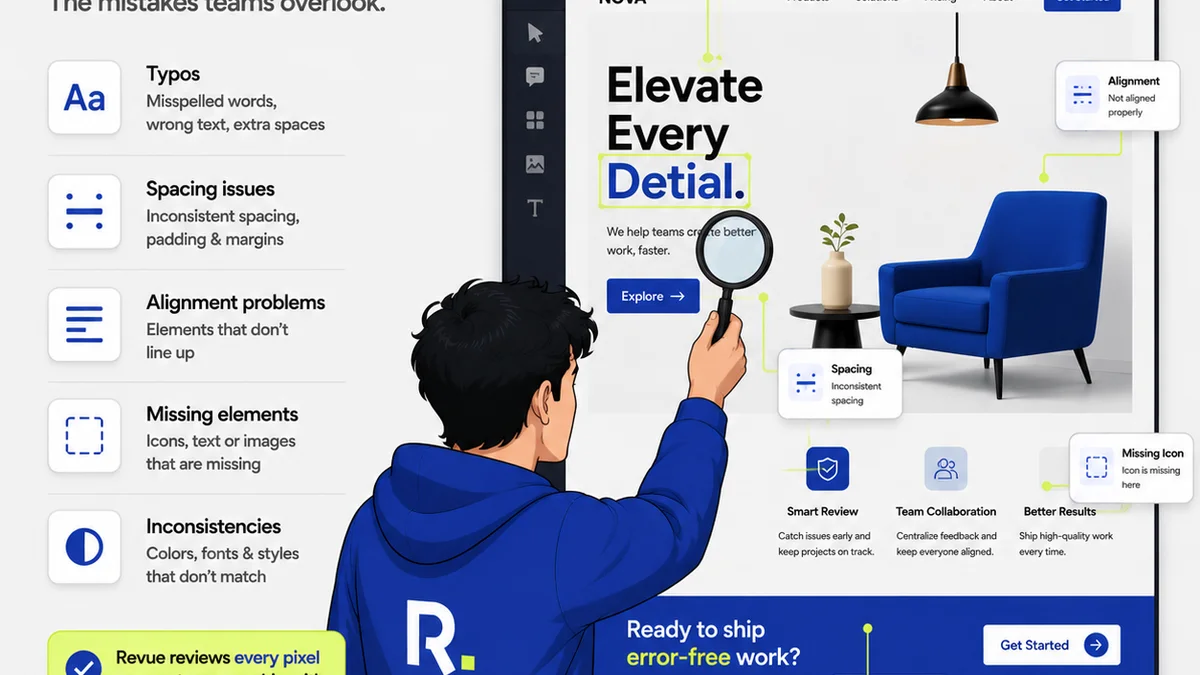
Everyone thinks they know how to conduct a design review. You gather the team, look at the mockups, maybe jot down a few notes. Simple, right?
None of that is wrong. But it’s incomplete. Treating design reviews as a perfunctory step before launching is a missed opportunity for real quality control.
The hard truth is that many creative directors and project managers treat design reviews as a checkbox exercise. They skim the surface, looking for obvious aesthetic issues or glaring errors. They miss the deeper problems that impact usability, brand consistency, and ultimately, client satisfaction. A truly effective design review requires a structured approach, a comprehensive checklist that goes beyond the superficial.
1. The Strategic Alignment Check
Before anyone utters a word about kerning or color palettes, the most critical review happens at the strategic level. Does the design actually solve the problem it was intended to solve?
Is it on brief?
This sounds obvious, but it’s frequently overlooked. Was the original client brief understood and translated effectively into the visual solution?
- Does it address the core objective?
- Does it target the intended audience?
- Does it align with the client's brand guidelines and overall business goals?
Does it meet business objectives?
Beyond the creative brief, how does this design serve the client's broader business aims? A beautiful design that doesn't drive conversions or engagement is ultimately a failure.
- Will this design encourage the desired user action?
- Does it support the client’s marketing funnel?
- Is it measurable?
2. The Usability and User Experience (UX) Audit
This is where many reviews falter. They focus on how the design *looks*, not how it *works*. A good design review checklist prioritizes the user's journey.
Navigation and Information Architecture
Can users find what they need easily and intuitively? Clunky navigation is a quick way to lose users.
- Is the primary navigation clear and accessible?
- Are calls to action (CTAs) prominent and unambiguous?
- Is the content hierarchy logical and easy to scan?
- Are breadcrumbs or other navigation aids present and functional?
Interaction and Flow
How does the user move through the interface? Every step should be logical and frictionless.
- Are interactive elements clearly identifiable?
- Are error states handled gracefully and informatively?
- Is feedback provided for user actions?
- Does the flow make sense for common user tasks?
Accessibility Considerations
This isn't an add-on; it's a fundamental requirement. A design that excludes users is a flawed design.
- Is there sufficient color contrast? (Refer to WCAG guidelines.)
- Are interactive elements large enough for touch targets?
- Is the design navigable via keyboard?
- Is alt text provided for all meaningful images?
3. The Visual and Brand Consistency Review
This is the area most people think of when they hear
Frequently asked questions
What is the most common mistake in design reviews?
The most common mistake is treating design reviews as a superficial aesthetic check rather than a deep dive into strategic alignment, usability, and technical execution. This often leads to missing critical flaws that impact user experience and business goals.
How can a design review checklist improve team efficiency?
A structured checklist ensures that all critical aspects of a design are evaluated consistently, reducing subjective debates and speeding up the feedback process. It helps identify issues early, preventing costly revisions later in the project lifecycle.
What are the key areas a design review checklist should cover?
A comprehensive checklist should cover strategic alignment (brief adherence, business objectives), usability and UX (navigation, flow, accessibility), visual design and brand consistency, technical feasibility, and content accuracy.
How does accessibility fit into a design review?
Accessibility should be a core component, not an afterthought. The checklist should include checks for color contrast, keyboard navigation, touch target sizes, and alt text for images, ensuring the design is usable by everyone.