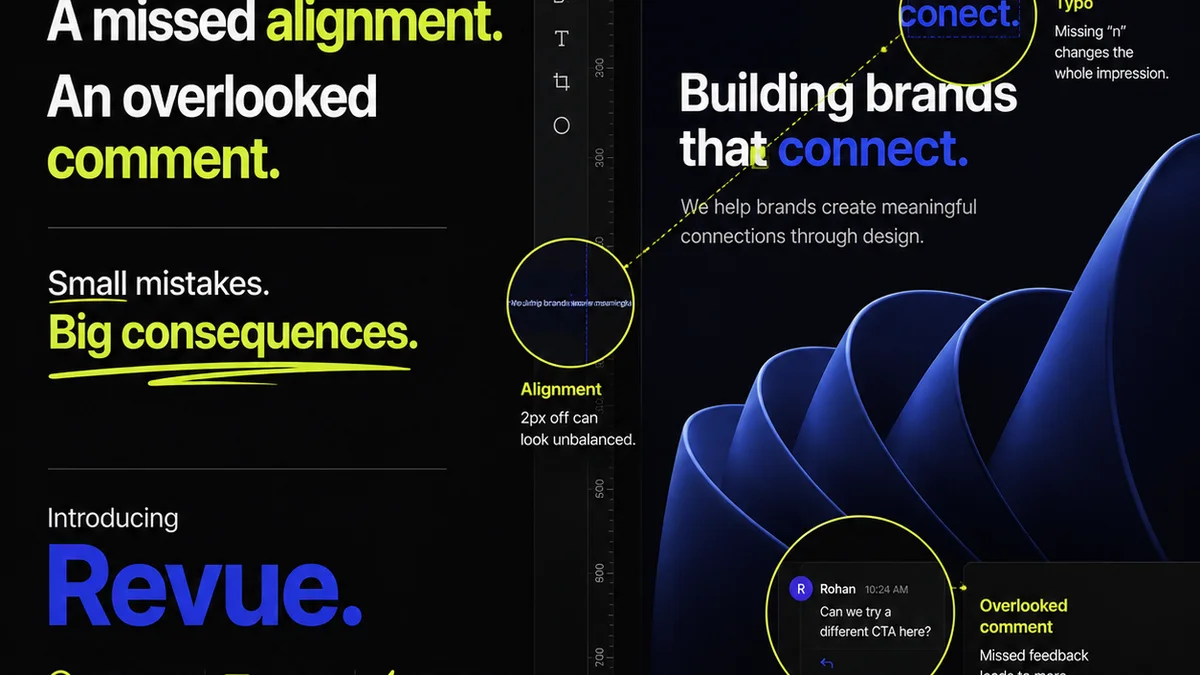
Everyone thinks design reviews are about aesthetics. About whether the client likes the shade of blue or the font choice. That’s part of it, sure. But it’s not the whole story. Not even close.
The real problem with design reviews isn't subjective taste. It's operational chaos. It's a failure to manage the process, the feedback, and the expectations. And that's where the biggest mistakes happen.
1. Treating Feedback as Gospel
Clients hire you for your expertise. They expect you to guide them, not just take orders. Yet, many agencies treat every client comment as a directive that must be implemented verbatim. This is a massive mistake.
Why? Because clients often don't know what they *really* want. They react to what they see. They might say they want something “more modern,” but what they *mean* is they want to feel confident in the design’s ability to achieve their business goals. They might point to a competitor's design, but they’re not seeing the underlying strategic thinking, just the surface.
The Wrong Way: Blindly Implementing
You get feedback like:
- “Make the logo bigger.”
- “I don’t like this color, try something else.”
- “Can we make it pop more?”
The default reaction is to open the file and make the changes. No questions asked. This leads to:
- Bloated, unfocused designs.
- Frustrated designers who know better.
- Clients who keep changing their minds because they never felt truly guided.
- Projects that spiral out of scope and budget.
The Right Way: Strategic Interpretation
Your job is to translate business objectives into effective design. When feedback comes in, ask *why*.
Instead of:
Client: “Make the logo bigger.”
You:
Designer: “Got it. What’s the goal behind making the logo more prominent? Are we trying to increase brand recognition, or is there another objective?”
Client: “I don’t like this color, try something else.”
You:
Designer: “Understood. This color was chosen to evoke [specific feeling/benefit]. What feeling or message are you hoping to communicate with the alternative color?”
Client: “Can we make it pop more?”
You:
Designer: “Absolutely. ‘Pop’ can mean a few things. Are we looking to increase visual hierarchy on a specific element, create more energy, or ensure it stands out in a crowded digital space?”
This approach reframes the review from a simple approval process to a collaborative problem-solving session. It leverages your expertise and keeps the focus on the project's actual goals.
2. Unstructured Feedback Loops
This is perhaps the most common and damaging mistake. Feedback is given haphazardly, without context, and often through the wrong channels.
Think about it:
- Emails buried under dozens of other messages.
- Verbal feedback in a meeting that’s forgotten by the time someone opens the design file.
- Comments scribbled on a PDF that gets lost.
- Multiple people giving conflicting feedback without anyone coordinating.
This isn't a review; it's a recipe for disaster. It creates confusion, leads to missed feedback, and wastes immense amounts of time. Designers end up chasing ghosts, trying to decipher vague or contradictory instructions.
The Symptom: The “Ping-Pong” Effect
You see this when a design goes back and forth endlessly. The client asks for a change, you make it, they ask for another, you make it, and so on. Each iteration adds time and cost, but the core issues remain unaddressed because the feedback process itself is broken.
The Fix: Centralize and Clarify
You need a single source of truth for all feedback. This means:
- Using a dedicated platform for design reviews.
- Establishing clear guidelines for *how* feedback should be given (e.g., specific annotations, clear explanations).
- Designating a single point person on the client side to consolidate feedback, if possible.
- Ensuring all feedback is logged and tracked.
When feedback is structured and centralized, you can easily track what’s been addressed, what’s pending, and what needs further discussion. It brings order to the creative chaos.
3. Neglecting Revision History and Version Control
How many times has a client said, “I liked the previous version better”? Then the frantic search begins. Which version? Where is it? Who has it?
This is a direct consequence of poor version control during the review process. Relying on file names like `logo_final_v3_client_approved_really_final.ai` is a losing game.
The Problem: The Black Hole of Files
Without a clear system, you risk:
- Working on outdated versions of the design.
- Losing critical feedback or approved iterations.
- Wasting hours searching for the “right” file.
- Accidentally delivering the wrong final asset.
- Undermining client confidence when you can't recall previous states.
The Solution: Visible, Accessible History
Every design iteration should be saved and accessible. More importantly, the *reason* for each iteration should be clear.
This means:
- Linking feedback directly to specific versions.
- Having a clear audit trail of who said what and when.
- Making it easy to revert to a previous, approved version if necessary.
When you have a robust revision history, you can confidently answer client questions about past decisions and easily navigate the project’s evolution. It’s not about dwelling on the past; it’s about having a clear map of how you got to the present.
4. Lack of Clear Review Criteria
What does “done” look like? If you can’t answer this clearly, you’re setting yourself up for endless reviews.
Design reviews often devolve into subjective debates because the objective criteria for success were never defined. This is especially true in complex projects like website design or app development.
The Assumption: “Good Design” is Self-Evident
Many teams assume everyone involved understands what constitutes successful design. This is a dangerous assumption.
Success criteria should be tied to the project brief and business objectives. Is the design:
- Usable?
- Accessible?
- On-brand?
- Meeting conversion goals?
- Technically feasible?
- Aligned with user research?
If these aren't discussed and agreed upon *before* the review, you're essentially reviewing in a vacuum.
Defining Success
Before any design work begins, and certainly before the first review, establish clear criteria. These should be:
- Measurable: Where possible, define metrics for success.
- Agreed Upon: Both your team and the client must understand and accept these criteria.
- Documented: Written down and referenced throughout the project.
During the review, you can then ask questions like:
- “Does this iteration meet the usability goals we set out?”
- “Does the visual hierarchy effectively guide the user towards the primary call to action, as per our brief?”
- “Are we adhering to the WCAG 2.1 AA accessibility standards we committed to?”
This shifts the conversation from personal preference to objective performance. It’s a much more productive and defensible position.
5. Involving the Wrong Stakeholders (or Too Many)
Who needs to sign off on a design? If the answer is “everyone,” you’re in trouble.
Design by committee is rarely effective. Too many cooks spoil the broth, as the saying goes. When too many people with varying perspectives and levels of understanding weigh in, the feedback becomes diluted, contradictory, and impossible to reconcile.
The Bottleneck: Decision Paralysis
A common mistake is to loop in every single person who has even a tangential interest in the project. This creates:
- Conflicting feedback from different departments (e.g., Marketing vs. Legal vs. Sales).
- Endless meetings to appease everyone.
- Slow decision-making, delaying the project.
- A final design that tries to please everyone and ends up pleasing no one.
The Streamline: Identify Key Decision-Makers
Before the review process even starts, clearly identify:
- The primary decision-maker(s): Who has the final say?
- Key stakeholders: Whose input is crucial but not necessarily final?
- Those who need to be informed: Who just needs to be kept in the loop?
Structure your review process around these roles. Ensure the primary decision-makers are the ones providing the final sign-off. Other stakeholders can provide input, but it should be curated and presented to the decision-makers in a digestible format. This ensures clarity and accountability.
Where Revue Fits In
Managing these design review mistakes requires robust processes and the right tools. That’s where a platform like Revue comes in.
Revue helps agencies and creative teams centralize client feedback. Instead of scattered emails and meeting notes, all comments, annotations, and discussions live in one place, tied directly to the creative asset. This eliminates ambiguity and ensures nothing gets lost.
It provides a clear audit trail for revisions and approvals, making it easy to track the project’s evolution and revert to previous versions if needed. This solves the version control nightmare.
By having a single, organized system for feedback and approvals, you can ensure that reviews are structured, criteria are met, and the right stakeholders are involved. It brings efficiency and clarity to what is often a chaotic part of the creative process.
Final Thought
Design reviews aren't just about getting a 'yes' or 'no.' They are critical junctures for strategic alignment, problem-solving, and ensuring the final output truly serves the client's business goals. Are your review processes built for collaboration and clarity, or are they an exercise in managing chaos?
Frequently asked questions
What is the most common mistake in design reviews?
The most common mistake is treating client feedback as absolute truth without strategic interpretation. Agencies often blindly implement suggestions without understanding the underlying business goals, leading to unfocused designs and scope creep.
How can I avoid unstructured feedback loops?
Centralize all feedback in a single platform, establish clear guidelines for how feedback should be provided (e.g., using annotations), and designate a primary point person for consolidating client input. This ensures clarity and prevents feedback from getting lost.
Why is version control important in design reviews?
Proper version control prevents confusion and errors. It ensures everyone is working on the correct iteration, provides a clear history of changes and approvals, and makes it easy to revert to previous versions if needed, saving significant time and preventing costly mistakes.
How do I define success criteria for a design review?
Define success criteria based on the project brief and business objectives *before* the review process begins. These criteria should be measurable, agreed upon by all parties, and documented. Examples include usability, accessibility, brand alignment, and technical feasibility.
Should I involve all stakeholders in design reviews?
No, design by committee is rarely effective. Identify the primary decision-makers and key stakeholders whose input is crucial. Structure your review process around these roles to avoid conflicting feedback and decision paralysis.