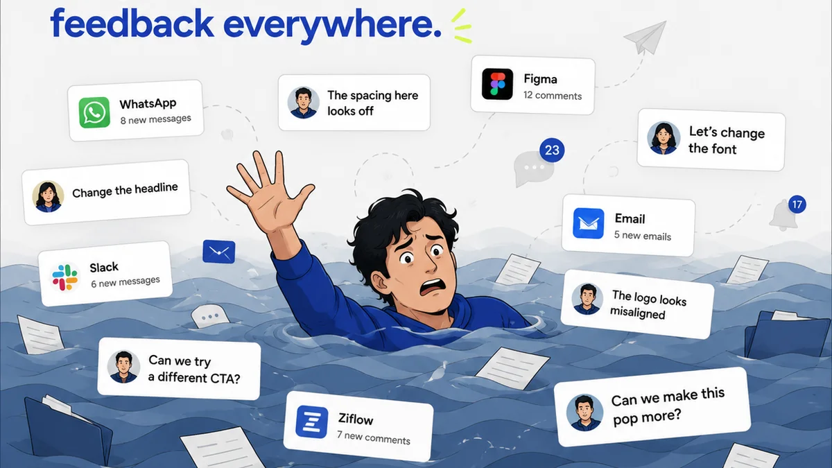
Everyone thinks design reviews are about catching typos or picking the right shade of blue. That’s the surface level.
It’s a common assumption. But it’s incomplete.
The real problem with design reviews? They’re usually a symptom of deeper workflow chaos, not the disease itself. As a Creative Director, your job isn't just to give feedback; it's to engineer a process where feedback becomes a catalyst for better work, not a roadblock.
1. The Vague Feedback Vortex
This is the most common killer of good design. Feedback that’s unspecific, subjective, or contradictory.
Think about it:
- “Make it pop more.”
- “I don’t like it.”
- “Can we try something bolder?”
- “This feels off.”
What does any of that actually mean for the designer or developer? Nothing concrete. It forces them to guess, leading to endless revisions and frustration.
The hard truth is, vague feedback wastes everyone’s time and erodes creative confidence. It turns a review into a guessing game, not a collaborative problem-solving session.
The Root Cause: Lack of Clear Objectives
Why is feedback often so vague? Because the goals for the design weren't clearly defined upfront. If you don't know what success looks like, how can you judge if you're there?
This isn't just about the final deliverable; it’s about the *purpose* of the design. What problem is it solving? Who is it for? What action should it drive?
The Fix: Context is King
Before any review, ensure the brief is crystal clear. What are the KPIs? Who is the target audience? What is the desired user journey? What are the brand guidelines?
When giving feedback, be specific. Instead of “Make it pop,” try: “The call-to-action button needs to be more prominent. Let’s increase its contrast against the background by 20% and ensure it’s the first element users’ eyes are drawn to.”
2. The “Everyone’s a Critic” Committee
The more people involved in a review, the messier it gets. Especially when those people don't have a clear role or understanding of the project’s goals.
You end up with conflicting opinions from stakeholders who aren't qualified to judge specific design decisions. The account manager wants it to look “expensive,” the CEO wants it to look like the competitor's successful campaign, and the designer is stuck in the middle.
This isn't just inefficient; it’s demoralizing. It dilutes the vision and can lead to a Frankenstein’s monster of a design, appeasing everyone and impressing no one.
The Problem: Unclear Roles and Authority
Who has the final say? Who is responsible for the strategic vision? When these questions are unanswered, every review turns into a debate with no clear resolution.
Decisions get made based on loudest voice or highest title, not on what’s best for the project or the user.
The Solution: Streamlined Approvals
Define clear roles and responsibilities *before* the review process begins. Identify the key decision-makers and the stakeholders whose input is valuable but not necessarily final.
Use a structured feedback process. For example, have a design lead or project manager consolidate feedback before it goes to the wider team. This acts as a filter, ensuring only relevant, constructive input reaches the designer.
Consider a RACI matrix (Responsible, Accountable, Consulted, Informed) for critical projects. This clarifies who does what and who has the ultimate authority.
3. The Endless Revision Cycle
This is the symptom that keeps CD’s up at night. You thought you were done, but suddenly you’re back to square one, making tweaks to feedback that was already given.
This happens when feedback isn’t captured systematically, or when changes aren’t tracked. It’s easy for a small tweak to snowball into a complete overhaul because the original intent got lost somewhere between email chains and Slack messages.
The true cost isn't just time; it's the loss of momentum and the erosion of trust between the creative team and the client or internal stakeholders.
The Culprit: Poor Version Control and Communication
Are you tracking every iteration? Can you easily see what changed between version 3 and version 4? If the answer is no, you’re in trouble.
Miscommunication is rampant. A client might say, “Just make that change,” and the agency assumes it’s minor. But the client meant it in the context of a much larger, unstated shift in strategy.
The Remedy: Centralized Feedback and Tracking
You need a single source of truth for all feedback and revisions. This means ditching scattered email threads and chaotic Slack channels for a dedicated platform.
When feedback is tied directly to the creative asset (an image, a video, a mockup), and revisions are tracked, everyone can see the history. This transparency prevents “scope creep” and clarifies decision-making.
When a client requests a change, it's logged. When the designer implements it, that's logged too. You can see the evolution of the design and the exact rationale behind each step.
4. The “Gut Feel” Decision Trap
Design is an art, but it's also a science. Relying solely on intuition or personal preference in reviews is a recipe for inconsistency and missed opportunities.
Creative Directors often have incredible instincts. But when those instincts aren't backed by user data, usability principles, or established best practices, they can lead the project astray.
This trap is particularly dangerous when it comes to user experience (UX) and accessibility. What feels “intuitive” to one person might be a barrier to another.
The Fallacy: Personal Preference vs. User Needs
Your personal taste doesn't dictate what resonates with the target audience. What you find aesthetically pleasing might not align with the brand's identity or the user's expectations.
This is where usability heuristics and accessibility standards come into play. Ignoring them is like building a house without adhering to building codes.
The Antidote: Data-Informed Design and Standards
Incorporate user research, A/B testing, and analytics into your review process. Even simple usability testing with a few target users can uncover critical issues.
Adhere to established design principles and accessibility guidelines. For instance, understanding the Web Content Accessibility Guidelines (WCAG) ensures your designs are usable by people with disabilities. Following principles from established guides like Material Design or Apple's Human Interface Guidelines provides a solid foundation for effective UI/UX.
When feedback is tied to these principles or data points, it becomes objective and actionable. “This button placement doesn’t follow established Fitt’s Law principles for efficient interaction” is far more valuable than “I don’t like where it is.”
5. The Neglected Quality Assurance (QA) Step
Reviews often end with an “approval,” but what does that really mean? Is it a stamp of finality, or just a “good enough for now”?
Many teams skip a formal QA phase, assuming the review process covered everything. This leads to missed bugs, design inconsistencies, and a poor final product.
The real cost? Rework, damaged reputation, and a failure to meet project goals. A seemingly minor visual glitch can undermine user trust.
The Oversight: Approval ≠ Perfection
An approval often signifies that the client is happy with the direction or the major elements. It rarely means that every pixel is perfect, every link works, or that the design is fully accessible across all devices and browsers.
This is where the line between creative review and technical QA blurs, and it’s a dangerous place to be.
The Fix: Integrate Dedicated QA
Implement a distinct QA phase after the final creative approval but before launch. This phase should focus on:
- Cross-browser and cross-device testing.
- Functional testing (links, forms, interactive elements).
- Visual consistency checks against the approved design.
- Accessibility checks.
- Performance checks.
This isn't about re-reviewing the creative direction; it's about ensuring the execution is flawless. It’s the final gatekeeper for quality.
Where Revue Fits In
Managing design reviews effectively means bringing order to chaos. It’s about ensuring clarity, accountability, and efficiency.
A platform like Revue is built for this. It centralizes client feedback, attaching comments and annotations directly to the creative assets themselves. This eliminates ambiguity and the need to sift through endless email chains.
Revision tracking is built-in. You can see every version, every comment, and every approval in one place. This provides a clear audit trail and prevents disputes over what was agreed upon.
Furthermore, Revue helps streamline the approval process. Stakeholders can see the project's progress, provide feedback within the defined workflow, and give clear approvals. This structured approach reduces the likelihood of the “Vague Feedback Vortex” and the “Everyone’s a Critic” committee.
By centralizing feedback and managing revisions systematically, Revue empowers Creative Directors to move beyond reactive firefighting and proactive process engineering. It ensures that design reviews serve their intended purpose: elevating the creative output, not hindering it.
Final Thought
Are your design reviews a bottleneck or a launchpad? The difference often lies not in the creative talent, but in the operational rigor applied to the feedback and approval process.
What’s one assumption about your current review process that you’re willing to challenge this week?
Frequently asked questions
What is the biggest mistake in design reviews?
The biggest mistake is treating design reviews as solely about aesthetics or minor tweaks. The deeper issue is often a lack of clear objectives, vague feedback, unclear roles, and poor process management, leading to endless, unproductive revision cycles.
How can I get more specific feedback on designs?
Ensure the creative brief is detailed and includes clear objectives, target audience, and desired outcomes. When giving feedback, always tie it to these objectives. Instead of 'make it bolder,' say 'increase button contrast by 20% to improve click-through rates for the target audience.'
How do I avoid endless revision cycles?
Implement a centralized feedback system that tracks all comments and revisions directly on the creative asset. Define clear approval workflows and roles upfront to prevent scope creep and ensure decisions are documented, preventing back-and-forth on previously settled points.
What is the role of QA in design reviews?
Creative reviews focus on the overall concept, strategy, and user experience. Quality Assurance (QA) is a separate, critical step that happens after creative approval but before launch. It focuses on technical execution: testing for bugs, cross-browser compatibility, accessibility, and ensuring all elements function as intended.