You probably think you know typography. Kerning is space between letters. Tracking is space between words. Leading is space between lines. None of that is wrong. But it’s incomplete.
The hard truth? Understanding these terms is just the first step. Truly mastering them—and ensuring they’re applied correctly across every project, every client, every time—is where the real operational challenge lies. It’s not about knowing the definitions; it’s about consistent execution.
1. The Building Blocks of Readability
Typography isn't just about making text look pretty. It’s about clarity. It’s about guiding the reader’s eye. It’s about conveying professionalism before a single word is even fully processed.
When kerning, tracking, and leading are off, the subtle friction starts. Readers might not consciously identify the problem, but they feel it. Their eyes snag. The flow is interrupted. This is where good design devolves into just… text.
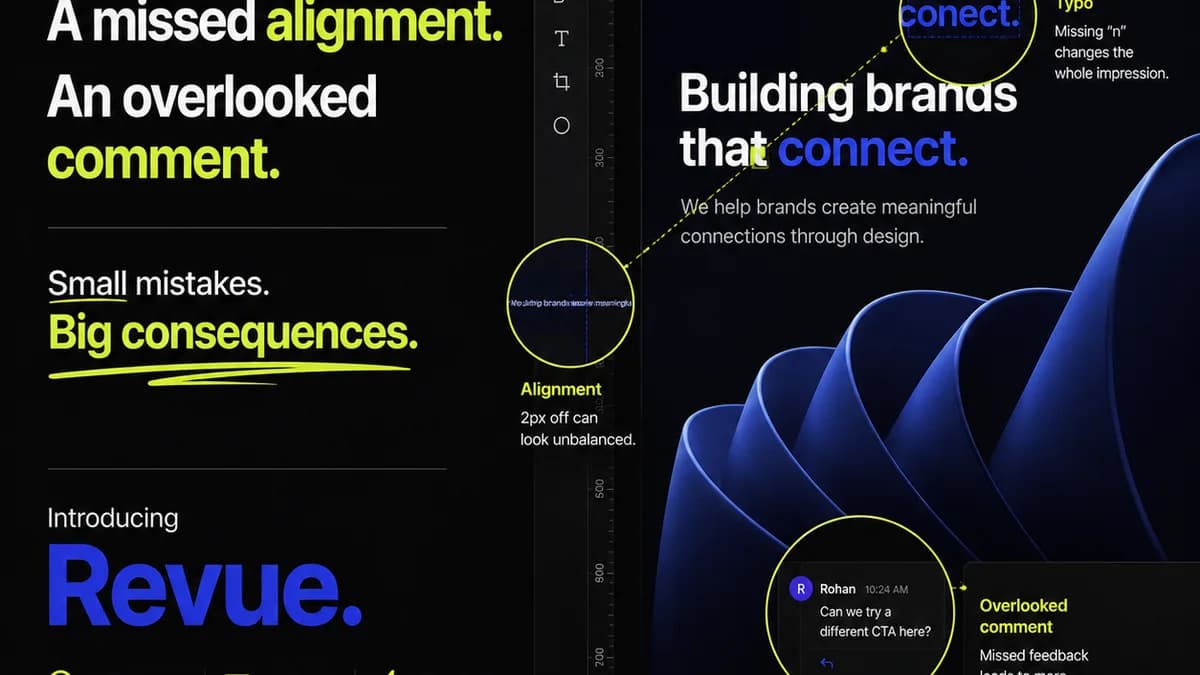
1.1. Kerning: The Art of Individual Spacing
Kerning is the adjustment of space between specific pairs of characters. Think ‘AV’, ‘To’, ‘We’. These pairs often have awkward gaps that look too wide if left to default spacing.
Why does it matter?
- It prevents visual
Frequently asked questions
What's the difference between kerning and tracking?
Kerning adjusts the space between specific pairs of letters (like 'AV'), while tracking adjusts the overall spacing uniformly across a range of characters or a whole word/line.
When should I use kerning?
Kerning is crucial for improving the visual appeal and readability of text, especially with specific letter combinations that create awkward gaps. It’s most noticeable in headlines, logos, and display text.
How does leading affect readability?
Leading (line spacing) determines the vertical distance between lines of text. Proper leading prevents lines from feeling too cramped or too spread out, which significantly impacts reading comfort and comprehension, especially in body copy.
Is automatic kerning or tracking reliable?
Automatic settings are a starting point, but they are rarely perfect. Manual adjustment is often necessary for optimal results, especially in professional design where every detail matters. Relying solely on auto-settings can lead to inconsistent or unprofessional-looking typography.