Everyone thinks a logo is complete when it looks good on screen. Maybe a few mockups are shared, and the client gives a thumbs-up. That’s the easy part.
The hard truth? That’s only the surface. A logo’s real value is unlocked when it’s built for the real world, across countless applications. Getting there requires rigorous Quality Assurance (QA) that goes far beyond aesthetics.
1. The Assumption: 'It Looks Right' Isn't Enough
The common assumption is that a logo’s QA is about visual polish: Is it sharp? Are the colors correct? Does it align with the brand guide?
None of that is wrong. But it’s incomplete.
A logo is a functional asset. It needs to work, not just look pretty. This means scrutinizing its performance in every conceivable context, from a tiny app icon to a colossal billboard.
The Deeper Truth: Functionality Trumps Form (Almost)
A logo’s ultimate success hinges on its versatility and integrity across all media. This requires a systematic approach to QA that anticipates problems before they arise.
Think of it like building a bridge. It needs to look strong, yes, but more importantly, it needs to *be* strong and handle traffic without failing. A logo is no different.
2. Building Your Logo QA Checklist
A comprehensive logo QA checklist is your shield against inconsistent branding and costly errors. It forces a methodical review, catching issues that a quick glance will miss.
Here’s what to build into yours:
File Formats and Variations
- Primary Logo: Ensure the main vector and raster versions are present and correct.
- Color Variations: Black and white, single-color, reversed (white on dark), and full-color versions.
- Lockups: Horizontal, vertical, stacked, and icon-only versions.
- Sub-brands/Extensions: If applicable, check any variations for sub-brands or product lines.
- File Naming Conventions: Are files named logically and consistently?
- Metadata: Are copyright and author information embedded where appropriate?
Technical Specifications
- Vector Integrity: All paths closed, no stray points, correct stroke weights (not outlined if they shouldn't be).
- Color Profiles: Correct CMYK, RGB, and Hex values defined. Pantone references if needed.
- Scalability: Test rendering at extreme sizes—from 16px to 1600px.
- Legibility: Check readability at small sizes (e.g., favicons, social media avatars).
- Negative Space: Ensure clear space rules are maintained around the logo.
- Bleed and Safe Zones: For print applications, check bleed allowances and critical design elements within safe zones.
Application Testing
This is where many checklists fall short. You need to simulate real-world usage.
- Digital Mockups: Website headers, social media profiles, app icons, email signatures.
- Print Mockups: Business cards, letterheads, packaging, signage, apparel.
- Video/Animation: How does it behave in motion? Does it hold up?
- Accessibility: Check contrast ratios for text elements within the logo or lockups. A logo that’s invisible on certain backgrounds fails.
3. The Hard Truth: Consistency is King (and Queen)
A logo isn’t just a graphic; it’s a promise. Inconsistent application erodes trust and dilutes brand recognition.
Your QA process directly impacts brand consistency.
Common Pitfalls to Avoid
- Incorrect File Usage: Using a low-res JPG for a large print run.
- Color Mismatches: RGB values creeping into CMYK files, leading to muddy colors.
- Distortion: Stretching or squashing the logo.
- Improper Placement: Cropping the logo or placing it too close to other elements.
- Outdated Versions: Using an old logo iteration.
- Lack of Clear Space: Crowding the logo with other design elements.
Each of these issues, however small, chips away at the brand’s professional image.
4. Beyond the Visual: Accessibility and Performance
Modern QA must include accessibility. A logo that isn't perceivable by everyone isn't doing its job.
Key Accessibility Checks
- Contrast Ratios: Ensure sufficient contrast between logo elements and their backgrounds, especially for text. Tools like the WebAIM Contrast Checker can help.
- Alternative Text: While not part of the logo file itself, ensure that digital implementations have appropriate alt text.
- Scalability for Vision Impairment: Does the logo remain clear and distinguishable when zoomed or when the user’s display settings are adjusted?
Performance also means how well the logo performs technically. Is the SVG optimized? Are there unnecessary layers?
5. Where Revue Fits In
Managing logo assets and ensuring their correct application across numerous projects and clients is a core challenge for agencies. This is where centralized feedback and version control become critical.
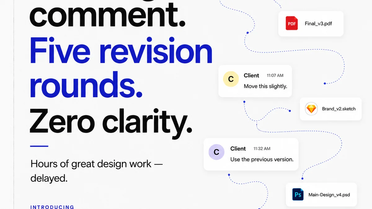
Revue helps streamline the entire creative review and approval process. Instead of chasing down file versions via email or scattered cloud storage, you can:
- Centralize Feedback: All comments, revisions, and approvals for logo files (and any other creative assets) live in one place, linked directly to the asset.
- Track Revisions: Maintain a clear history of changes, making it easy to see how a logo evolved and revert to previous versions if needed.
- Ensure Quality Checks: Use the platform to conduct structured QA, ensuring all requirements from your checklist are met before final delivery.
- Streamline Approvals: Get clear, documented sign-offs from clients and stakeholders, reducing ambiguity and potential disputes.
This level of control and visibility is essential for maintaining brand integrity, especially when working on multiple projects simultaneously.
6. The Checklist in Action: A Practical Workflow
Integrate your logo QA checklist into your standard operating procedure. Don't treat it as an optional step.
Pre-Launch QA Steps
- Assign a dedicated team member or role (e.g., Brand Manager, Senior Designer) to conduct the final QA.
- Use a shared digital checklist (e.g., within Revue, or a linked document) that can be marked off.
- Perform checks on actual mockups and, where possible, test versions in live environments before full rollout.
- For digital assets, always check rendering across different browsers and devices.
- For print, ensure proofs are reviewed meticulously against the final digital files.
Post-Launch Monitoring
QA doesn't stop at delivery.
- Periodically audit client websites, social media, and marketing materials for correct logo usage.
- Have a process for addressing incorrect usage promptly and professionally.
7. Final Thought
Is your logo QA process just a box-ticking exercise, or is it a strategic function that safeguards your clients' brands and your agency's reputation?
Frequently asked questions
What are the essential file types for a logo?
You should provide vector formats like AI, EPS, and SVG for scalability, and raster formats like PNG (with transparency) and JPG for web and general use. Include different color variations (full color, black, white, single color) and layout options (horizontal, vertical, icon-only).
How do I ensure a logo is accessible?
For accessibility, focus on contrast ratios between logo elements and their backgrounds, especially if text is involved. Ensure the logo is legible when scaled up or down and that digital implementations have proper alt text.
What is the difference between logo QA and brand guideline adherence?
Logo QA is the technical and functional check of the logo asset itself and its immediate application. Brand guideline adherence is the broader application of the logo and all brand elements consistently across all communications, following the rules set out in the guidelines.
How often should I update my logo QA checklist?
Your logo QA checklist should be reviewed and updated annually, or whenever new technologies, platforms, or accessibility standards emerge that might impact logo usage or performance.