Everyone’s talking about component libraries. They’re hailed as the silver bullet for design consistency, developer efficiency, and scalable UIs. And none of that is wrong. But it’s incomplete.
The deeper truth is that a component library is only as good as the system that supports it. Without the right workflow, it becomes just another siloed asset, a beautiful but underutilized collection of UI elements.
1. The Assumption: A Library is Just a Figma File (or Sketch, or XD)
The most common mistake? Treating your component library as a static design asset. You build it, you share it, you assume everyone will use it perfectly. It’s like building a state-of-the-art kitchen and then expecting gourmet meals without a chef, a pantry, or a recipe book.
A truly effective component library is a living, breathing system. It requires ongoing maintenance, clear governance, and a robust process for contribution and consumption.
The Hard Truth: It’s an Ecosystem, Not a File
Your component library is the heart of your design system, but it needs supporting infrastructure. This includes:
- Clear documentation for every component, including states, variations, and usage guidelines.
- A defined process for proposing, reviewing, and integrating new components or changes.
- Tools and workflows that make it easy for designers and developers to access and use the library.
- A feedback loop to identify issues and areas for improvement.
Without these elements, your library risks becoming outdated, inconsistent, and ultimately, ignored.
2. Building for Adoption, Not Just Existence
Many teams focus all their energy on *building* the library. They meticulously craft every button, every input field, every modal. And then… crickets.
Adoption isn’t automatic. It’s a deliberate strategy. Think about how users interact with any tool. If it’s difficult, confusing, or doesn’t solve their immediate problems, they’ll find a workaround. Or worse, they’ll revert to old habits.
Key Adoption Drivers
- Accessibility: Is it easy to find and import components? Are the naming conventions intuitive?
- Usability: Are the components flexible enough to meet common use cases without requiring excessive overrides?
- Trust: Do designers and developers trust that the components are up-to-date, well-tested, and approved?
- Onboarding: Is there a clear process for new team members to learn about and start using the library?
If your library is a chore to use, it won’t be used. Period.
3. The Myth of the Single Source of Truth
We often hear about the component library as the “single source of truth.” It sounds great, a utopia of perfect alignment. But in practice, the reality is far messier.
A truly unified source of truth requires more than just a shared library file. It demands a shared understanding and a consistent application across disciplines and projects.
Bridging the Design-Dev Divide
The gap between design and development is where the “single source of truth” often breaks. Designers create in Figma, developers build with code. If these aren’t tightly coupled, you get drift.
- Version Mismatches: Design updates a component, but dev hasn’t implemented it yet.
- Interpretation Errors: Dev implements a component based on their understanding, which differs from the designer’s intent.
- Scope Creep: Custom components are built outside the library, creating fragmentation.
The goal isn’t just to have one library; it’s to ensure that what’s in the library accurately reflects what’s being built and what’s being designed.
4. Governance: The Unsung Hero
This is where most teams stumble. They love the idea of a component library, but they dread the idea of governance. It sounds like bureaucracy, like slowing things down. But the opposite is true.
Lack of governance is what *actually* slows things down. It leads to chaos, inconsistency, and duplicated effort.
What Good Governance Looks Like
- Clear Ownership: Who is responsible for maintaining the library?
- Contribution Workflow: How are new components proposed, designed, coded, and tested?
- Decision-Making: Who decides on the direction and priorities for the library?
- Deprecation Policy: How are old or unused components retired gracefully?
Governance isn’t about control; it’s about clarity and efficiency. It ensures the library evolves purposefully, not randomly.
5. Measuring Success Beyond UI Kits
How do you know if your component library is actually working? It’s easy to point to a beautiful Figma file and say, “See? It’s great!” But that’s not a measure of success.
Success is measured in reduced build times, fewer design-to-dev bugs, faster iteration cycles, and a more cohesive user experience across products.
Metrics That Matter
- Time to Market: Are new features being launched faster?
- Bug Reduction: Are there fewer UI-related bugs reported?
- Consistency Score: How consistent is the UI across different parts of the product or different products?
- Team Velocity: Are designers and developers spending less time on repetitive tasks and more time on innovation?
If your library isn’t impacting these operational metrics, it’s likely just a pretty picture.
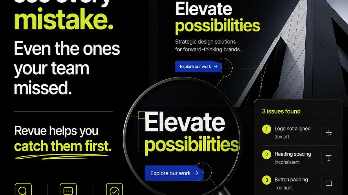
Where Revue Fits In
A robust component library is crucial, but managing the *process* around it is where many teams struggle. This is especially true when it comes to client feedback and stakeholder approvals on designs that utilize these components.
When clients review designs, they often comment on specific elements, states, or variations. Without a centralized system, these comments can get lost in email threads or scattered across chat messages. Revising components and ensuring those updates are correctly implemented across all relevant screens becomes a manual, error-prone task.
Revue helps by centralizing all feedback directly on the design assets. When a client points out an issue with a specific button state or an incorrectly configured card component, that feedback is logged and visible to the entire team.
This visibility is key. Designers and developers can clearly see which components are causing friction, which ones are being requested, and which approved versions are ready for implementation. It streamlines the revision and approval process, ensuring that the integrity of your component library is maintained even under client review.
By providing a single source of truth for feedback and revisions on design work, Revue helps ensure that your meticulously crafted component library translates into a consistent, high-quality final product.
Final Thought
A component library is a powerful tool, but it’s not a set-and-forget solution. It’s a commitment to operational excellence. Are you building a static asset, or are you building a dynamic system that fuels efficiency and consistency?
Frequently asked questions
What's the biggest mistake teams make when building a component library?
The biggest mistake is treating it as a static design file. A truly effective library is a living system requiring ongoing maintenance, clear documentation, and a robust process for contribution and consumption.
How can I ensure my component library gets adopted by the team?
Focus on adoption by making the library accessible, usable, and trustworthy. Ensure clear onboarding, intuitive naming conventions, and components flexible enough for common use cases.
What is component library governance and why is it important?
Governance refers to the policies and processes that guide the creation, maintenance, and use of your component library. It's crucial for ensuring clarity, consistency, and efficiency, preventing chaos and duplicated effort.
How does a component library relate to a design system?
A component library is a core part of a design system. It provides the reusable UI elements (like buttons, inputs, cards) that form the building blocks of the system, while the design system encompasses the broader principles, guidelines, and standards.