Everyone thinks they know what good packaging looks like. You’ve got the design, the client signed off, and the print files are ready to go. Job done, right?
Wrong.
That’s the assumption. The hard truth? Packaging QA is where creative brilliance meets brutal reality. It’s the last line of defense against costly mistakes, brand damage, and disappointed customers. And most teams treat it like a formality. They skim, they glance, they assume. Big mistake.
Let’s talk about how to actually *do* packaging QA, the right way.
1. The Brief Isn’t Just for Design
Before a single pixel is placed, the packaging brief needs to cover more than just aesthetics and messaging. It needs to be a blueprint for the physical product.
What are the critical elements that MUST be on the final package? Think:
- Mandatory legal disclaimers (ingredients, warnings, certifications)
- Regulatory compliance marks (CE, FCC, UL, etc.)
- Brand logo placement and minimum size requirements
- Key product identifiers (SKU, barcode, product name)
- Nutritional information or ingredient lists (if applicable)
- Country-specific requirements
If these aren’t nailed down and communicated *before* design starts, you’re setting yourself up for a last-minute scramble. And last-minute scrambles are where errors creep in.
Sub-point: Beyond the Visual
Packaging isn’t just a flat graphic. It’s a 3D object. The brief needs to consider:
- Die-lines and structural integrity
- Material requirements (paper weight, finish, coatings)
- Any special printing techniques (foiling, embossing, spot UV)
- How the package will be assembled and filled
These aren’t design details. They’re production realities that impact the final look and feel, and therefore, the QA process.
2. Design Files Are Not Final Files
This is a classic point of failure. The files you get from the designer are rarely the files that go to print. There’s a transformation process.
Here’s the typical workflow:
- Initial design concepts (e.g., in Adobe Illustrator or Photoshop)
- Client feedback and revisions
- Final design approval
- Production file preparation (often by a separate production artist or pre-press specialist)
- Print vendor review and approvals
Each step is a potential point of error. The designer’s approved file might have RGB color profiles, missing fonts, or incorrect dimensions. The production artist has to convert these, package them correctly, and ensure everything is print-ready.
The Hand-off Trap
The hand-off between design and production is critical. Are you:
- Using a standardized checklist for production file preparation?
- Ensuring all fonts are outlined or embedded correctly?
- Verifying color modes (CMYK vs. Pantone)?
- Checking bleed and trim marks?
- Confirming dimensions match the die-line?
If these aren’t systemized, you’re relying on individual diligence. That’s a gamble.
3. The Print Vendor is Your Partner, Not Your Proofreader
Many teams assume the printer will catch everything. They won’t.
Printers are experts in printing. They’re not necessarily experts in *your* brand or *your* client’s specific product details. They’ll catch technical printing issues, sure. But they might miss a typo in a product name or an incorrect regulatory symbol if it looks plausible.
What to Expect from Your Printer
A good printer will:
- Provide a PDF proof (soft proof) for your review.
- Offer a physical press proof (hard proof) before full production.
- Flag obvious technical printing issues (e.g., low-res images, incorrect bleed).
What NOT to Expect
Don’t assume they will:
- Catch every grammatical error.
- Verify the accuracy of nutritional information.
- Ensure compliance with every obscure local regulation.
- Confirm the correct SKU is being printed.
The ultimate responsibility for accuracy rests with you and your client.
4. Proofing: Beyond the Screen Glow
Digital proofs are essential, but they’re not the end of the line. Relying solely on screen-based review is a recipe for disaster.
Screens are calibrated differently. Colors look different under different lighting. And small details can be missed when you’re staring at a glowing rectangle.
The Power of Print Proofs
Physical proofs are non-negotiable for critical packaging elements.
What should you be looking for on a physical proof?
- Color Accuracy: Does the printed color match the approved Pantone or CMYK values? This is crucial for brand consistency.
- Text Legibility: Can you easily read all the text, especially small print? Check for any blurring or distortion.
- Image Quality: Are graphics and photos sharp and clear? Any banding or pixelation?
- Registration: Do the different ink colors align correctly? Look for misregistration, especially around fine lines or text.
- Die-cut and Score Marks: Are they correctly placed and clean?
- Overall Impression: Does it feel and look like the approved design?
And critically, compare the physical proof against a high-resolution PDF of the final approved artwork. Don’t proof the proof in a vacuum.
5. The 'Final' Final Check: A Checklist is Your Best Friend
You’ve done the design, the production prep, the digital proof, the physical proof. What else?
A comprehensive, systematic final check. This isn’t about reinventing the wheel each time. It’s about having a standard checklist that covers all the bases.
Your Packaging QA Checklist Should Include:
- Dimensions: Does the final artwork match the required dimensions for the packaging structure?
- Bleed and Trim: Is there sufficient bleed? Are trim marks correctly placed?
- Color Profiles: All colors correctly converted to CMYK or specified as Pantone? No stray RGB elements?
- Fonts: All fonts outlined or embedded? No missing font warnings?
- Mandatory Elements: Are all required legal text, logos, symbols, barcodes, and regulatory marks present and correct?
- Accuracy Check: Cross-reference all text (product names, ingredients, descriptions, contact info) against the approved brief or master document.
- Image Resolution: Are all images at the correct resolution for print (typically 300dpi at final size)?
- Die-line Alignment: Does the artwork align perfectly with the die-line and any structural folds?
- Special Finishes: Are foiling, embossing, or spot UV areas correctly specified and positioned?
- Print Vendor Notes: Have all specific instructions from the print vendor been incorporated?
This checklist should be used *before* the files are sent to the printer, and again when reviewing the first physical press proof.
Where Revue Fits In
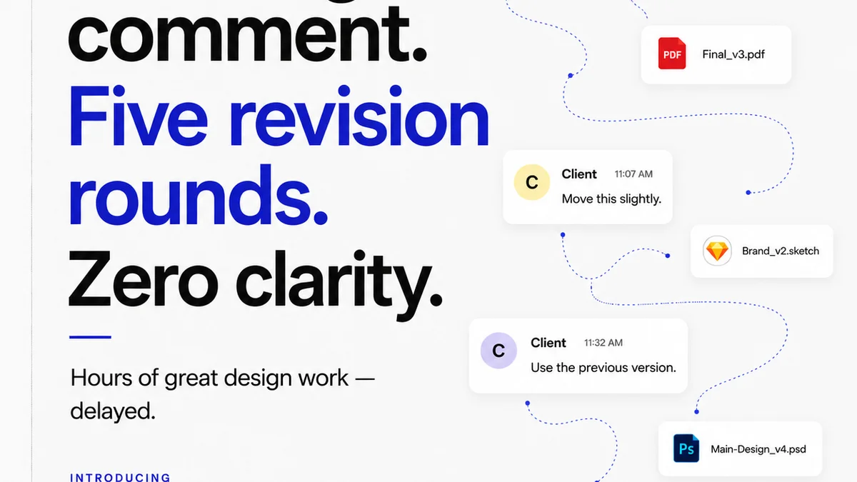
The chaos of packaging production often stems from fragmented communication and unclear approvals. Feedback gets lost in email chains, revision histories are murky, and who signed off on what becomes anyone’s guess.
Revue helps centralize this. By managing your creative assets and feedback within a single platform, you create a clear, traceable record.
- Centralized Feedback: All comments, annotations, and approvals live on the asset itself. No more digging through inboxes for that one crucial piece of feedback.
- Version Control: Easily track revisions. See exactly what changed between versions and who approved each iteration. This is vital for packaging where a small change can have big implications.
- Quality Checks: Use Revue’s tools to conduct your QA. Annotate specific areas of concern directly on the artwork, link to your standardized checklists, and ensure all stakeholders review against the same criteria.
- Clear Approval Trails: Formalize the approval process. Know definitively when and by whom a specific version was approved, reducing ambiguity and the risk of overlooked errors.
When every piece of feedback, every revision, and every approval is documented and visible, the chance of a critical error slipping through the cracks on your packaging project diminishes significantly.
Final Thought
Packaging is the silent salesperson. It’s the first physical interaction a customer has with your product. If that interaction is marred by a mistake – a typo, a missing barcode, a faded color – the damage isn’t just to the package. It’s to the brand’s reputation for quality and attention to detail.
Are you treating your packaging QA with the gravity it deserves? Or are you still hoping for the best?
Frequently asked questions
What is the most common mistake in packaging QA?
The most common mistake is treating packaging QA as a superficial check or assuming the printer will catch all errors. This often leads to overlooking critical details like typos, incorrect legal text, missing regulatory marks, or color inaccuracies that fall outside the printer's scope of responsibility.
How important is a physical proof for packaging?
A physical proof (hard proof) is extremely important for critical packaging elements. Digital proofs can be misleading due to screen calibration and lighting. A physical proof allows you to verify color accuracy, text legibility, image quality, registration, and the overall look and feel against your approved specifications before mass production.
Who is ultimately responsible for packaging accuracy?
The creative agency or in-house team that designed the packaging is ultimately responsible for its accuracy. While printers are partners, they are not expected to be experts on your specific brand, product details, or every regulatory requirement. The final sign-off rests with you and your client.
Can digital tools like Revue replace a physical proof?
No, digital tools like Revue cannot replace a physical proof for final verification. However, they are invaluable for managing the process leading up to the physical proof. Revue helps centralize feedback, track revisions, and ensure all stakeholders are reviewing the correct versions, thereby reducing errors that might otherwise appear on the physical proof.