Everyone thinks prepress is the last hurdle. The final sign-off before hitting 'print' or 'deploy'.
That’s not entirely wrong. But it’s dangerously incomplete.
The hard truth? Prepress isn't just a final gate; it's an integrated quality control process that should begin much earlier. Neglecting it is a direct path to expensive errors, missed deadlines, and client dissatisfaction. Mastering your prepress checklist is about professional execution, not just finishing touches.
1. Understanding the Core of Prepress
Prepress refers to all the steps that happen between the creation of a print or digital layout and the final output. For print, this means preparing files for the printing press. For digital, it means ensuring assets are optimized for their intended platform.
It’s where design meets production reality. This is where colors are managed, images are corrected, and files are formatted to spec. It’s the technical translation of creative intent.
The Print vs. Digital Divide
While the principles overlap, the execution differs significantly.
- Print: Focuses on physical reproduction – ink, paper, bleed, trim, color profiles (CMYK, Pantone), resolution, trapping.
- Digital: Focuses on screen display – file formats (JPG, PNG, GIF, SVG), color profiles (RGB), resolution for screens, animation, interactivity, accessibility.
Both demand meticulous attention to detail.
2. The Essential Print Prepress Checklist
For print projects, a robust prepress checklist is non-negotiable. It catches issues that can ruin a run.
File Setup and Requirements
- Bleed: Ensure artwork extends beyond the trim edge. Standard is 1/8 inch (3mm), but check with your printer.
- Trim Marks: Include crop or trim marks to indicate where the page should be cut.
- Color Mode: Files must be in CMYK (Cyan, Magenta, Yellow, Black) or specific Pantone colors, not RGB.
- Resolution: Images and graphics should be at least 300 DPI (dots per inch) at their final print size. Lower resolutions lead to pixelation.
- Fonts: Outline all fonts or embed them in the file. Unusually, missing fonts render as gibberish.
- Rich Black: For deep blacks, use a combination of CMYK (e.g., C:60, M:40, Y:40, K:100) rather than 100% K alone. This prevents 'hollow' blacks.
- Trapping: Adjusting overlaps between adjacent colors to prevent gaps when printing. This is often handled by the printer but understanding it is key.
Image and Color Accuracy
- Image Compression: Use lossless formats like TIFF or EPS where possible. Avoid highly compressed JPEGs for final print files.
- Color Profiles: Use industry-standard profiles like SWOP or FOGRA, as specified by your printer. Mismatched profiles cause color shifts.
- Spot Colors: Ensure any spot colors (e.g., Pantone) are correctly named and defined.
Layout and Content Verification
- Proofreading: A final, thorough proofread of all text. Typos are embarrassing and costly to fix post-print.
- Content Accuracy: Verify all details – dates, prices, names, contact information.
- Die Lines and Varnish: If using special finishes, ensure these layers are correctly set up and clearly marked.
This is not exhaustive. Always consult your specific printer’s guidelines.
3. The Digital Prepress Checklist
Digital prepress focuses on performance, compatibility, and user experience.
Asset Optimization
- File Formats: Choose the right format for the job: JPG for photos, PNG for transparency, SVG for scalable graphics, GIF for simple animations.
- File Size: Optimize images for web use to reduce load times without sacrificing visual quality. Tools like TinyPNG or ImageOptim are invaluable.
- Resolution and Dimensions: Assets should be sized appropriately for their intended display. Don't upload a 4000px image where a 400px one will suffice.
- Color Space: Use the sRGB color profile, the standard for web and most digital displays.
Performance and Delivery
- Lazy Loading: Implement lazy loading for images to improve initial page load speed.
- Responsive Design: Ensure assets scale and display correctly across all devices and screen sizes.
- Accessibility: Provide alt text for images (
<img alt="Description">). Ensure sufficient color contrast.
Interactive and Animated Assets
- Animation Loops: For GIFs or Lottie animations, ensure loops are smooth and file sizes are manageable.
- Interactive Elements: Test buttons, links, and any interactive components to ensure they function as expected.
The digital landscape changes rapidly. Stay updated on best practices.
4. Integrating Prepress into Your Workflow
The biggest mistake is treating prepress as an afterthought. It should be woven into the fabric of your creative process.
Early Involvement
Bring production considerations into the design phase. If a client wants a complex die-cut, or a specific Pantone color that’s hard to match, knowing early saves massive headaches.
Standardized Templates and Guidelines
Use templates for recurring projects. Develop internal style guides that dictate file formats, color usage, and resolution requirements.
Automated Checks
Leverage software that can automate parts of the prepress process. FlightCheck for print, or automated image optimization tools for digital, can catch common errors.
Clear Communication
Maintain open lines of communication with printers, developers, and clients. Confirm specifications upfront and address any potential issues proactively.
Where Revue Fits In
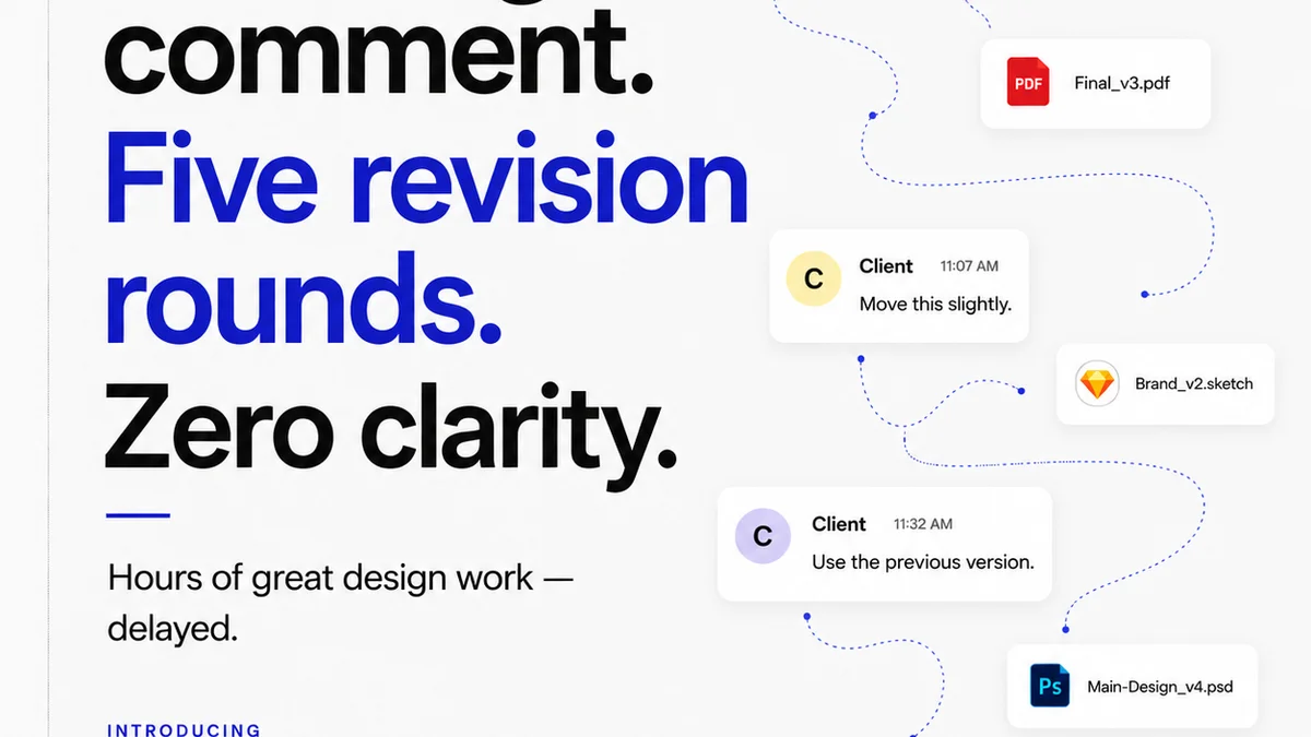
Effective prepress relies on clear communication and version control. It’s about knowing exactly what’s been approved and what’s ready for the next stage.
Revue centralizes client feedback, making it easy to track revisions and ensure that only the finalized, prepress-ready assets move forward. You can see every annotation, every approval, and every iteration in one place. This visibility eliminates ambiguity about which version is the 'master' and reduces the risk of using outdated files.
When feedback is consolidated and approvals are logged, your team can confidently prepare files for print or digital deployment, knowing they are working from the definitive, approved artwork. This streamlines the entire prepress process, minimizing errors and accelerating delivery.
5. Common Prepress Pitfalls and How to Avoid Them
Even with a checklist, mistakes happen. Understanding common pitfalls is crucial.
- RGB Files Sent for Print: The most frequent offender. Leads to dull, muddy colors. Fix: Convert to CMYK or the correct Pantone, and soft-proof using the printer’s profile.
- Low-Resolution Images: Using web-optimized images (72 DPI) in print. Fix: Source high-resolution images or request them from the client. Always check DPI at final size.
- Missing Fonts: Fonts not embedded or outlined, replaced by system defaults. Fix: Outline all text or embed fonts when saving the final file.
- Incorrect Bleed: Artwork not extending far enough, resulting in white slivers after trimming. Fix: Always add bleed and ensure critical elements are inside the safe area.
- Color Profile Mismatches: Using generic profiles instead of the printer’s specific requirements. Fix: Ask your printer for their preferred color profile and use it consistently.
These issues are preventable with diligence and the right tools.
Final Thought
Is your prepress process a frantic last-minute scramble, or a systematic assurance of quality? The difference isn't just about avoiding mistakes; it's about building a reputation for reliability and excellence. Your clients trust you with their brand. Ensure your final output reflects that trust, every single time.
Frequently asked questions
What is the most common mistake in print prepress?
The most frequent error is submitting files in the RGB color space when they need to be CMYK or specific Pantone colors for printing. This leads to drastically different and often undesirable color results.
How important is bleed in print prepress?
Bleed is critical. It's the extra margin of artwork that extends beyond the trim line. This ensures that when the final piece is cut, there are no unintended white edges if the cut is slightly off. Always check your printer's specific bleed requirements.
What resolution should images be for print?
For most standard print jobs, images should be at least 300 DPI (dots per inch) at their final intended size. Lower resolutions (like 72 DPI common for web) will appear pixelated and unprofessional when printed.
How does Revue help with prepress?
Revue centralizes feedback and approvals, ensuring that only the final, approved versions of creative assets are used for prepress. This visibility reduces errors caused by using outdated or unapproved files, streamlining the process.
Should I outline fonts or embed them?
Both methods ensure fonts appear correctly. Outlining converts text to vector shapes, making it independent of font files. Embedding includes the font data within the document. Outlining is often preferred for final print files to avoid potential font conflicts, but embedding works well too, provided the font license allows it.