You think your print design is ready for the printer. You’ve agonized over kerning, agonized over color palettes, and triple-checked that the client’s logo is the right shade of approved blue. So you hit send. Done. Right?
None of that is wrong. But it’s incomplete.
The hard truth is that print production is a fundamentally different beast than digital. It’s analog, unforgiving, and expensive to fix post-press. A missing bleed, a misunderstood trim, or an incorrect paper stock can turn a masterpiece into a costly mistake. That’s why a rigorous Quality Assurance (QA) process isn’t just a nice-to-have; it’s essential for survival.
1. Beyond the Screen: Understanding Print’s Unique Demands
Your monitor is a liar. It’s a glowing, calibrated box that shows you RGB values, not the physical reality of ink on paper. What looks perfect on screen can be muddy, oversaturated, or just plain wrong when printed. This disconnect is the root of many print QA headaches.
Print files have a different DNA. They need to account for:
- Physical dimensions and bleeds.
- Color models (CMYK vs. RGB).
- Resolution appropriate for print.
- Font embedding and outlining.
- Specific printer requirements.
Ignoring these specifics is like trying to fly a plane by reading a car manual. You’re missing critical context.
2. The Pre-Flight Checklist: File Setup Essentials
Before you even *think* about sending a file, it needs to be built correctly. This isn’t just about aesthetics; it’s about technical readiness.
Document Setup
This is where the rubber meets the road. Get these wrong, and the printer will have a bad day, and you’ll have an even worse one.
- Bleed: Is it present and correct? For most print jobs, this means extending your design elements at least 1/8 inch (3mm) beyond the trim edge. This prevents unsightly white slivers if the cutting isn't perfectly aligned.
- Trim Marks: Are they included? These indicate where the page should be cut.
- Color Mode: Is it CMYK? Unless you’re specifically printing with spot colors or for a digital press that accepts RGB, CMYK is the standard for commercial offset printing. Convert your files *before* final export, not after.
- Resolution: Is it high enough? For most print applications, 300 DPI (dots per inch) at the final output size is the standard. Lower resolutions will result in pixelated or blurry images.
Typography
Fonts are tricky. What looks good on screen can misbehave in print.
- Font Embedding: Are all fonts embedded or outlined? If you don’t embed them, and the printer doesn’t have them, the design will revert to a system font, and your carefully crafted layout will be ruined. Outlining fonts creates vector shapes, ensuring consistency, but it makes text uneditable. Choose wisely based on the workflow.
- Kerning and Leading: Have you checked these carefully? Small adjustments that look fine on screen can become glaringly obvious in print, especially in large blocks of text or headlines.
- Text as Paths/Outlines: If you’ve outlined fonts, ensure it was done correctly and that the resulting paths are clean.
Color Management
This is a minefield. What you see is rarely what you get, precisely.
- CMYK Profiles: Are you using the correct CMYK profile for your region and the specific print process? Different profiles (e.g., SWOP, GRACoL) yield different color results.
- Spot Colors: Are they clearly identified with their correct Pantone (or equivalent) names? Ensure they are not accidentally converted to CMYK.
- Rich Black: For deep blacks, a single 100% K value often looks muddy. A common build is C:40, M:30, Y:30, K:100. But this varies by printer. Always confirm their recommendation.
- Total Ink Limit (TIL): This is crucial. Printing too much ink in one area can cause smudging, slow drying, and set-off (ink transferring to the next sheet). Most printers have a specific TIL they recommend (often around 300-340%). Check this for all areas of your design.
Images and Graphics
They need to be print-ready, not just screen-ready.
- Resolution: As mentioned, 300 DPI at physical size is key. Check embedded images within your layout software.
- Color Space: Ensure all placed images are in CMYK or a suitable color space before export.
- Clipping Paths: If images are silhouetted, ensure the clipping path is clean and correctly applied.
3. The Export Process: Generating Print-Ready PDFs
The PDF is the universal language of print. But not all PDFs are created equal.
PDF Settings
Your export settings are critical. Don’t just hit ‘Save As’ and hope for the best.
- PDF/X Standards: Use PDF/X-1a or PDF/X-4. These standards ensure that fonts are embedded, color spaces are handled correctly, and transparency issues are resolved. PDF/X-4 is generally preferred as it supports newer features like live transparency.
- Marks and Bleeds: Include crop marks, bleed marks, and ensure the bleed settings in your export dialog match your document setup. This tells the printer where to cut and what to trim.
- Downsampling: Be careful with image downsampling. If your source images are high-res, you generally don’t want to downsample them aggressively in the PDF export, as this can reduce quality. If you *must* downsample, ensure it’s to a print-appropriate resolution (e.g., 300 DPI).
File Naming Conventions
Clarity prevents confusion. A well-named file tells a story.
- Include the client name, project name, version number, and output type (e.g., `ClientName_ProjectName_Brochure_v3_CMYK_PDFX4.pdf`).
- Avoid spaces and special characters.
4. The Human Element: The Final QA Review
Technology can only do so much. A human eye is still the most critical QA tool. This is where many agencies fall short, rushing the final check.
The Checklist Approach
Don’t rely on memory or a quick glance. Use a systematic checklist. Print it out, or use a digital tool. Go through every item methodically.
- Visual Inspection (On-Screen): Zoom in to 400% or more. Look for pixelation, incorrect colors, incorrect spacing, stray points, or artifacts.
- Proofreading: A fresh pair of eyes should proofread *everything*. Typos, grammatical errors, and factual inaccuracies are magnified in print.
- Color Check: Compare colors against a physical swatch book if possible, or at least against known good examples. Understand that screen variations are inevitable.
- Layout Consistency: Check margins, spacing, alignment, and grid adherence across all pages.
- Specific Printer Specs: Did you confirm and implement the printer’s specific requirements for bleeds, color, file format, etc.?
Proofing Methods
Don’t skip this. There are levels of proofing, and you need to choose wisely.
- Soft Proof: A PDF viewed on screen. Useful for layout and content checks, but unreliable for color accuracy.
- Hard Proof (Contract Proof): A high-quality printout, often produced on a calibrated inkjet printer, that simulates the final printed output. This is essential for checking color, trapping, and overall appearance.
- Press Check: The ultimate QA. Being present at the printer during the actual print run. This is expensive and time-consuming but allows for immediate adjustments. Reserved for critical, high-volume jobs.
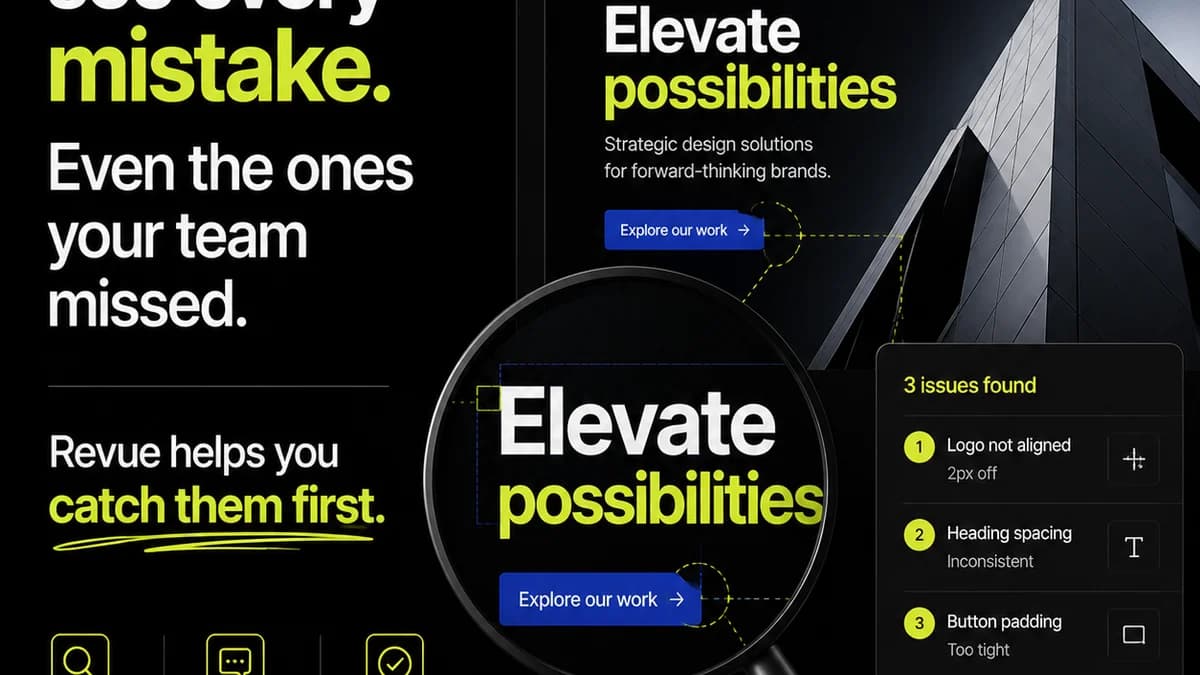
5. Where Revue Fits In
Managing feedback and revisions for print projects can be chaotic. Emails get lost, comments are vague, and tracking changes is a nightmare. This is where a centralized platform becomes invaluable.
Revue helps streamline the entire creative workflow, including print QA. Instead of scattered email threads, all client feedback, internal reviews, and revision history are housed in one place. This provides:
- Centralized Feedback: All comments and annotations are linked directly to the creative asset, eliminating ambiguity.
- Version Control: Clearly track which version of the design is being reviewed and approved, reducing errors related to outdated files.
- Streamlined Approvals: Manage the entire approval process, ensuring all stakeholders have signed off before the file goes to print.
- Visibility into Revisions: Easily see the history of changes, understand the rationale behind them, and ensure no critical feedback was missed during the iterative process.
This structured approach minimizes the risk of miscommunication and ensures that the final file sent to the printer is exactly what the client approved, based on clear, documented feedback.
Final Thought
Print design QA isn’t just about catching typos. It’s about safeguarding your agency’s reputation, protecting your client’s investment, and ensuring the final output reflects the quality you promised. It’s the unglamorous, essential bedrock of good print production. Are you treating it with the respect it deserves?
Frequently asked questions
What is the most common print design mistake?
One of the most common mistakes is incorrect bleed setup, leading to white edges after trimming. Another frequent error is using RGB colors instead of CMYK for print, resulting in duller, inaccurate colors.
How important is resolution for print files?
Resolution is critical. For most print applications, images and graphics need to be at least 300 DPI (dots per inch) at their final output size. Lower resolutions will appear pixelated or blurry when printed.
What’s the difference between a soft proof and a hard proof?
A soft proof is a digital representation viewed on screen, useful for checking layout and content but not color accuracy. A hard proof (or contract proof) is a physical printout designed to simulate the final printed output, making it essential for verifying colors and overall appearance.
Should I outline my fonts before sending to the printer?
Outlining fonts converts them into vector shapes, ensuring they appear consistently regardless of whether the printer has the original font. However, this makes the text uneditable. Embedding fonts is another option, but outlining is often preferred for final print files to guarantee consistency.