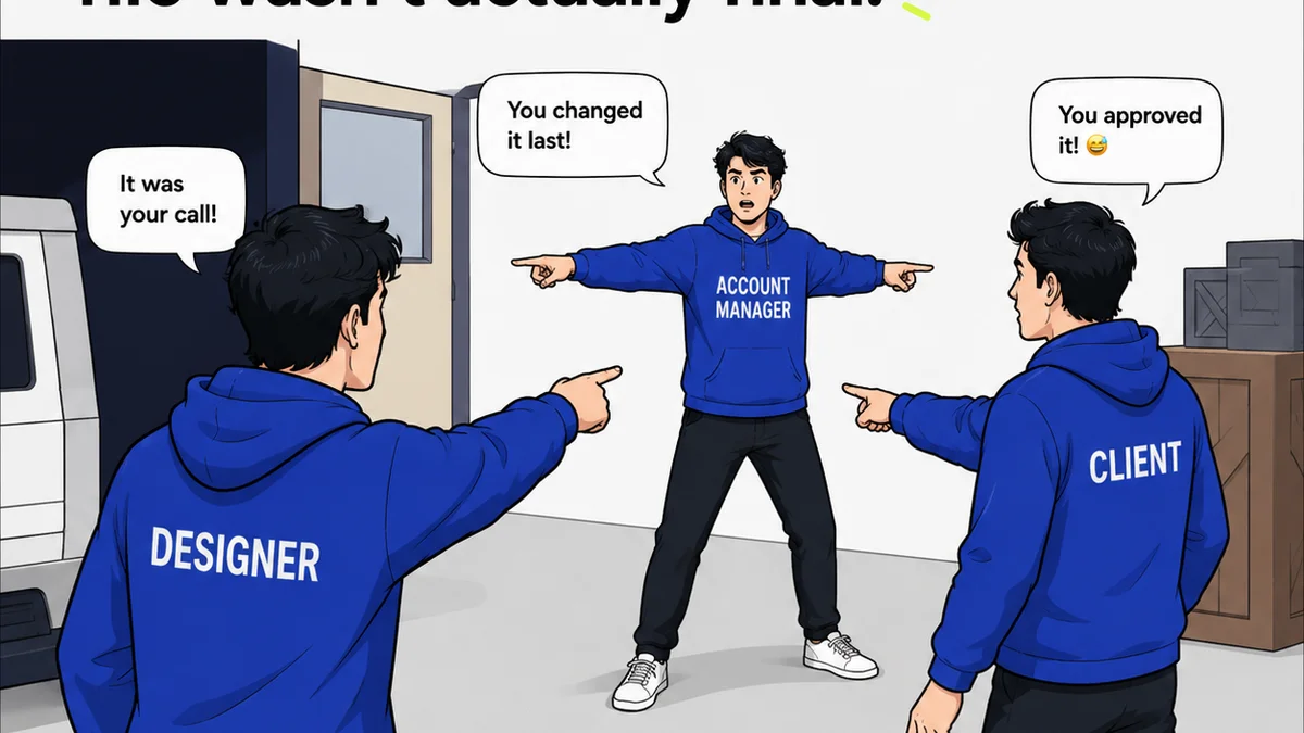
Everyone’s been there. The client calls, furious. The brochures are the wrong color. The signage is blurry. The packaging is misaligned. The immediate reaction? Pointing fingers at the printer. “They messed up,” you say. “This is their fault.”
None of that is wrong. But it’s incomplete.
The hard truth is, print production errors rarely stem from a single point of failure at the final output stage. Most are rooted deep in the creative and pre-production workflow. The printer is often the last to see the file, and the first to feel the heat when something’s wrong.
1. The Myth of the Perfect File Hand-off
You’ve probably heard it: “Just send a print-ready PDF.” Sounds simple, right? It’s the common assumption that if you export a PDF with the right settings, the job is done. You’ve done your part.
But a “print-ready” PDF is a complex beast. It’s not just about resolution and bleed. It’s about understanding the entire chain from design software to the final press. Most teams, even experienced ones, are flying blind on many crucial details.
Color Spaces Are Not Universally Understood
RGB vs. CMYK is the classic example. You designed in RGB because your screen looks great. But print uses CMYK. Converting is necessary, but *how* you convert, and *when*, matters immensely. Are you using the correct profiles for the intended print process (e.g., SWOP, GRACoL)? Or are you letting software make a generic conversion that shifts colors unexpectedly?
This isn’t just about brightness. It’s about gamut. What looks vibrant on your screen might be impossible to reproduce in CMYK, leading to muddy, disappointing results. Relying on the printer to “fix” this is asking them to guess your original intent, which is a recipe for disaster.
Fonts Are Landmines
Did you embed them? Outline them? Are they licensed for embedding? These questions are often overlooked. When fonts aren’t properly handled, they substitute, reflow text, or disappear entirely. Suddenly, your carefully typeset layout is a mess.
Transparency and Overprint Quirks
Complex layering, drop shadows, and blending modes can behave unpredictably when flattened for print. What looks fine in Adobe Illustrator or Photoshop might render differently in a print RIP (Raster Image Processor). Understanding how these elements flatten and interact with spot colors or specific ink combinations is critical.
Bleed and Trim are Not Suggestions
Designing right to the edge of your artboard without accounting for bleed is a common mistake. When the printer trims the stock, white edges appear. Conversely, placing critical elements too close to the trim line means they risk being cut off.
The Hidden Costs of Inattention
These aren’t minor inconveniences. They are direct routes to:
- Costly reprints
- Missed deadlines
- Damaged client relationships
- Wasted materials
- Eroded profit margins
2. The Pre-Press Black Hole
Between the design file and the printing press lies pre-press. This is where files are checked, corrected, and prepared for the specific printing technology. It’s a crucial gate, but often, it’s under-resourced or misunderstood by the design team.
Manual Checks Are Inconsistent
Many agencies rely on a quick visual check by a designer or project manager before sending the file. This is woefully inadequate. Humans miss things. Automated preflight checks in software like Acrobat Pro are better, but they aren't foolproof and require proper configuration.
Lack of Specialized Knowledge
Pre-press requires expertise. Knowing about trapping, imposition, ink densities, dot gain, and specific press requirements for different paper stocks is specialized knowledge. Expecting every designer or account manager to possess this is unrealistic.
The Printer’s Pre-Flight as a Last Resort
When a printer performs pre-flight checks, it’s often because the file failed basic requirements. They might catch obvious errors, but they aren’t paid to redesign your file or guess your intentions. Their checks are often focused on technical viability, not aesthetic perfection. If they find issues, they’ll flag them, but the clock is ticking, and charges for corrections can mount quickly.
Communication Breakdowns
When pre-press issues arise, the communication between the agency, the client, and the printer can become a tangled mess. Misunderstandings about who is responsible for what, and how much time/cost is involved, lead to frustration and delays.
3. The Illusion of “Proofing”
You get a digital proof. You approve it. Then the final print comes back wrong. What happened?
Digital proofs (like PDFs or soft proofs) are essential, but they are not perfect representations of the final printed piece. They have limitations:
Color Gamut Differences
Your monitor, even if calibrated, cannot perfectly replicate the color gamut of CMYK printing or specific spot colors (like Pantone). A digital proof might look acceptable on screen, but the actual printed colors could be significantly duller or shifted.
Material Simulation Fails
A PDF proof doesn’t show you how the ink will look on the actual paper stock. Will it be glossy, matte, textured? These properties affect color perception and overall appearance. A proof on coated stock won’t accurately represent the result on uncoated, for example.
Lack of Tactile Feedback
Print is a tactile medium. The weight of the paper, the finish, the embossing – these elements are lost in a digital proof. Approving a digital file means you’re approving a flat, intangible representation.
Hard Proofs Aren’t Always Practical
While a calibrated hard proof (a physical printout from a specialized printer) is more accurate, it’s expensive and time-consuming. Many projects, especially those with tight turnarounds or smaller budgets, skip this step. Relying solely on digital proofs or a quick glance at a press sheet is a gamble.
The Approval Process Itself
Are approvals being handled systematically? Is it clear who has the final say? Are feedback loops documented? Vague approvals, or approvals based on incomplete understanding of proof limitations, are a major source of error.
4. The Hidden Variables: Substrate and Finishing
You designed for a glossy brochure, but it printed on matte paper. Or you expected a clean die-cut, but the edges are rough. These issues often get lumped under “print errors,” but they originate earlier.
Paper Choice Matters
Different paper stocks absorb ink differently, have different brightness levels, and affect color reproduction. Choosing a paper without considering its interaction with the ink and the final design can lead to unexpected results. The printer might substitute a similar stock if the specified one isn't available, and without clear communication, this substitution might not be flagged until it's too late.
Finishing Effects Are Production Steps
Die-cutting, embossing, foil stamping, lamination – these aren't just decorative additions. They are production processes with their own tolerances and potential pitfalls. If the die-lines aren't correct, or if the artwork isn't set up to accommodate the finishing technique, errors will occur.
Environmental Factors
Humidity, temperature, and even the physical handling of materials can impact print quality. While printers strive to control these, extreme conditions can cause issues like curling, ink set-off, or color shifts.
Where Revue Fits In
The complexity of print production means that clear, centralized communication and meticulous tracking are not optional; they’re essential. This is where a tool like Revue becomes invaluable.
Imagine a scenario:
- Centralized Feedback: All client comments on proofs, design iterations, and spec sheets live in one place. No more hunting through email chains or Slack messages.
- Revision Visibility: Track every change made. See exactly what was altered between versions, ensuring that feedback was implemented correctly and that no unintended changes crept in.
- Approval Tracking: Formalize the approval process. Know precisely when a proof was sent, when feedback was received, and when the final sign-off occurred. This creates an auditable trail, reducing disputes about what was (or wasn’t) approved.
- Quality Check Integration: Use Revue to manage the final review of print-ready files before they go to the printer, or even to track the delivery and initial inspection of printed materials.
By bringing structure to the chaos of client collaboration and project management, Revue helps teams catch potential print production errors *before* they happen, rather than reacting to them after the fact.
4. The Hard Truth: It’s About Process, Not Just People
The printer isn’t the sole villain. Nor is the designer. The problem is rarely a single person’s mistake; it’s a systemic breakdown in process, communication, and knowledge sharing.
The assumption that print production is straightforward, or that “the printer will fix it,” leads to a reactive rather than proactive approach. This reactive mode is expensive, stressful, and damaging to client relationships.
The real solution lies in building robust workflows that anticipate potential issues:
- Standardized Templates: Use templates with pre-set bleed, color profiles, and guides.
- Pre-flight Checklists: Develop internal checklists for file preparation that go beyond basic export settings.
- Clear Communication Protocols: Define how and when to communicate with printers about specifications, proofs, and potential issues.
- Proofing Best Practices: Educate your team and clients on the limitations of digital proofs and the value of hard proofs when necessary.
- Continuous Learning: Stay updated on printing technologies, paper types, and finishing techniques.
Treating print production as a complex, multi-stage process requiring careful management at every step is the only way to consistently achieve high-quality results and avoid costly errors.
Final Thought
What if the most expensive print jobs are the ones that *don’t* have obvious errors, but subtly miss the mark on color, finish, or impact because the process allowed for minor deviations to compound? Are you managing print production, or just hoping for the best?
Frequently asked questions
What is the most common cause of print production errors?
The most common cause is not a single error, but a breakdown in the pre-production workflow. This includes issues with file preparation (color spaces, fonts, bleed), misunderstanding proofing limitations, and poor communication between the design team, client, and printer.
How can I prevent color issues in print production?
Ensure your design files are set up in CMYK using the correct color profiles for your intended print process. Understand the limitations of RGB on screen versus CMYK in print, and be aware of spot colors (like Pantone). Calibrate your monitor and consider requesting a hard proof for critical color matching.
What’s the difference between a digital proof and a hard proof?
A digital proof (like a PDF) is a screen representation and has limitations in color accuracy and material simulation. A hard proof is a physical printout made using calibrated equipment that more closely simulates the final printed output, including color and paper stock, but is more expensive and time-consuming.
How can better client feedback management prevent print errors?
Centralizing feedback in a tool like Revue ensures all comments are captured and tracked. This prevents miscommunications or missed feedback that could lead to errors in the final file. Clear, documented approvals based on accurate information are crucial.
Should I always use a printer's pre-flight service?
While a printer's pre-flight check can catch some critical errors, it should be a last resort, not a primary quality control step. Relying on it means you're likely sending files with potential issues. Proactive internal checks and understanding file requirements are far more effective.