Everyone thinks getting a print or publishing project out the door is about design. About killer layouts, stunning photography, and perfect typography. You nail the creative, hit send, and wait for the applause.
None of that is wrong. But it’s incomplete.
The hard truth? The real challenge in print and publishing isn’t just the aesthetics. It’s the relentless, unglamorous grind of operations. The pre-press checks, the spec sheets, the printer comms, the color profiles, the file handoffs, the vendor management, the sheer volume of detail that can derail even the most brilliant creative vision.
This isn't about being a designer. It's about being a project manager, a production artist, and a detail-obsessed hawk all rolled into one. And if you’re not building that operational rigor into your workflow from day one, you’re setting yourself up for delays, budget overruns, and client headaches.
1. The Creative Brief: Beyond the 'What'
You’ve got the client’s vision. Great. But have you dug into the operational implications?
Defining Deliverables, Not Just Designs
This is where many projects falter. It’s not enough to say “a brochure.” You need to define:
- Format: Perfect bound, saddle-stitched, spiral bound?
- Size: Trim size, bleed, safety margins.
- Paper: Weight (gsm/lb), finish (coated, uncoated, matte, gloss), stock type (silk, natural).
- Ink: CMYK, Pantone spot colors, special finishes (UV coating, foil stamping, embossing).
- Quantity: This impacts printing method (digital vs. offset) and cost.
- Turnaround Time: Realistic expectations for design, revisions, proofing, printing, and delivery.
Get this wrong, and your beautiful design might not even be feasible within the budget or timeline.
Understanding the End-Use Environment
Where will this piece live? Is it a high-traffic trade show handout or a premium coffee table book? This impacts durability needs, paper choices, and even finishing options.
2. Pre-Press Perfection: The Devil is in the Details
This is the gatekeeper. Miss something here, and you’re not just redoing files; you’re potentially reprinting entire runs.
File Preparation Fundamentals
- Resolution: 300 PPI for print, 72 PPI for web (but you’re printing, so focus on 300).
- Color Mode: Always CMYK for print. RGB will cause color shifts.
- Bleed: Extend artwork beyond trim edge by at least 3mm (1/8 inch) to avoid white slivers.
- Safety Margins: Keep critical text and graphics within a safe zone, away from trim edges.
- Font Embedding: Ensure all fonts are either outlined (converted to paths) or embedded properly. Outlining is safer for consistency across platforms.
- Image Compression: Use lossless formats like TIFF or high-quality JPEG. Avoid excessive compression.
Your design software has presets for this. Use them. Double-check them.
Color Management: The Unsung Hero
CMYK is not RGB. And even within CMYK, there are profiles. Your printer will have a specific profile they work with (e.g., SWOP v2, FOGRA39). Ensure your files are set to this profile *before* you start designing, or convert them carefully before sending.
Pantone colors are essential for brand consistency. Make sure they are specified correctly and that the printer can accommodate them. Spot colors require special handling and can increase costs.
Proofing, Proofing, and More Proofing
Never, ever skip the proofing stage. There are levels to this:
- Soft Proof: A digital preview on your screen. Useful, but not foolproof due to monitor calibration.
- Hard Proof (Contract Proof): A high-quality inkjet print that simulates the final output. This is crucial for checking colors, layout, and overall appearance.
- Press Check: The ultimate proof. You (or a trusted representative) go to the printer *while* the job is running to approve the first few sheets. Essential for large or critical runs.
Client sign-off on a proof is non-negotiable. It’s your liability shield.
3. Vendor Selection & Management
Your printer is your partner. Choose wisely.
Finding the Right Printer
- Specialization: Do they excel at the type of work you need (e.g., large format, short-run digital, high-volume offset, specialty finishes)?
- Reputation: Check reviews, ask for references, look at their portfolio.
- Communication: Are they responsive? Do they ask clarifying questions?
- Location: Does it matter for shipping or press checks?
- Pricing: Get multiple quotes, but don't let price be the *only* factor. Quality and reliability matter more.
Building the Relationship
Treat your printer like a collaborator, not just an order-taker. Provide clear, organized files. Communicate any nuances or special requirements upfront. Ask questions if you’re unsure about their process.
A good printer can guide you, suggest cost-saving alternatives, and flag potential issues before they become problems. A bad relationship leads to finger-pointing and disaster.
4. File Handoffs: The Final Frontier
This is the moment of truth. Your meticulously prepared files meet the printer’s workflow.
Delivery Methods
- FTP/Cloud Services: For large files, use dedicated services like WeTransfer, Dropbox, Google Drive, or your printer’s dedicated portal.
- File Naming Conventions: Be consistent and clear. Include project name, version number, and date (e.g., `ClientName_Brochure_V3_20231027.pdf`).
- Packaging: If sending multiple assets (images, fonts, layout files), package them into a single archive (ZIP).
Preflight Checks: Automated Quality Control
Most professional design software (Adobe InDesign, Acrobat Pro) has preflight tools. These scan your document for common printing errors like missing fonts, low-res images, incorrect color modes, or insufficient bleed. Run these checks *before* you export your final PDF.
Many printers also offer their own preflight services. Understand what they check for and what their acceptable error tolerance is.
Where Revue Fits In
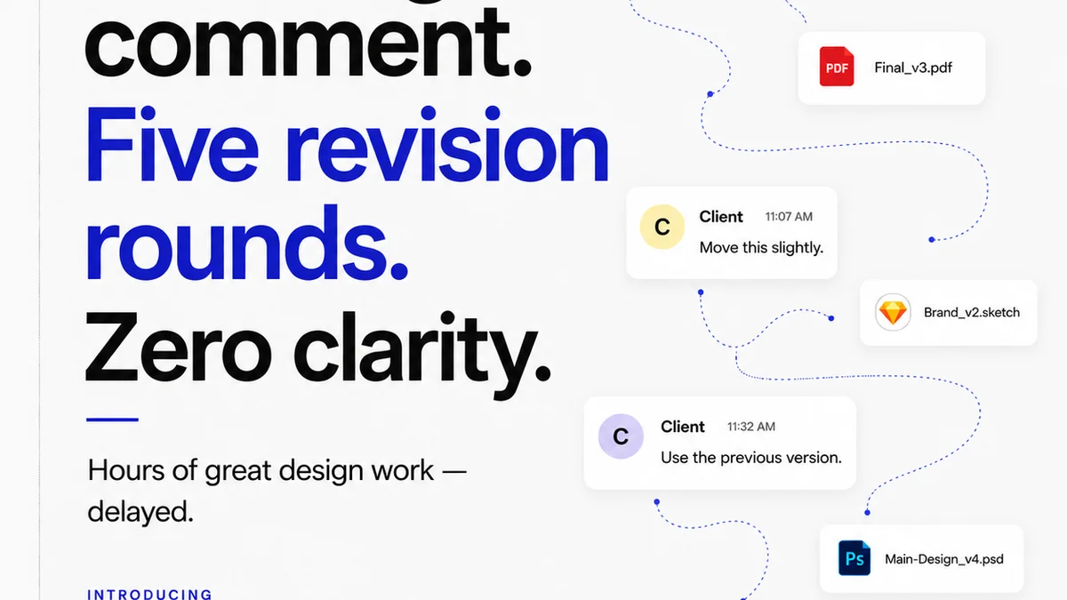
Managing all these moving parts – especially across multiple projects and clients – is where operational chaos thrives. It’s easy for crucial details to slip through the cracks when feedback is scattered across emails, Slack messages, and random PDF annotations.
Revue is built to bring order to this chaos. It centralizes client feedback, making it clear what needs to be addressed and what has been approved. You can track revisions, ensuring that every iteration is accounted for and that the final approved version is the one that goes to print. This visibility is critical for pre-press checks and final sign-offs, reducing the risk of errors and costly reprints.
5. Post-Press & Distribution
The job isn’t done when the ink is dry.
Quality Control on Delivery
When the printed materials arrive, do a thorough check. Compare them against the approved hard proof. Look for:
- Color consistency across the run.
- Sharpness of text and images.
- Absence of smudges, scratches, or printing defects.
- Accurate cutting and finishing (folding, binding, etc.).
If there are issues, address them immediately with your printer. Document everything.
Logistics and Fulfillment
How are these materials getting to their final destination? Are there multiple drop-off points? Is there a specific delivery schedule? Coordinating this can be as complex as the printing itself.
Final Thought
Print and publishing are often seen as the artistic side of creative work. But the reality is that flawless execution hinges on an operational backbone of unparalleled strength. Are you building that backbone, or just hoping the art is enough?
Frequently asked questions
What's the most common mistake in print file preparation?
The most common mistakes are incorrect color modes (using RGB instead of CMYK), insufficient bleed, and low-resolution images. Always double-check these before exporting your final print-ready PDF.
How important is a hard proof for print projects?
Extremely important. A hard proof (contract proof) is a physical representation of your final printed piece. It's crucial for verifying color accuracy, layout, and overall appearance before the full print run begins. Never skip it for critical projects.
What's the difference between outlining fonts and embedding fonts?
Outlining converts text into vector shapes, ensuring it appears exactly as designed regardless of whether the fonts are installed on the receiving computer. Embedding embeds the font file itself, allowing for text editing but requiring the font to be properly licensed and embedded. Outlining is generally safer for final print files to guarantee consistency.
How can I ensure consistent color across different print runs?
Consistency comes from using the correct CMYK color profile specified by your printer, accurately specifying any Pantone spot colors, and obtaining a contract proof for each run. Maintaining a good relationship with a reliable printer also helps significantly.