You’ve probably heard it a million times: check your bleed, ensure your resolution is at least 300 DPI, and convert your colors to CMYK. None of that is wrong. But it’s incomplete.
The hard truth about print-ready PDFs is that the technical specs are only half the battle. The other, much harder half, is about process, communication, and accountability. Get these wrong, and your perfect PDF still ends up costing you time, money, and client trust.
1. Beyond the Specs: The Human Element
The Assumption: Technical Checks Are Enough
Many designers and print managers assume that ticking off a technical checklist covers all bases. They’ll verify:
- Bleed and trim marks
- Resolution (300 DPI or higher)
- Color mode (CMYK)
- Font embedding
- File format (PDF/X-1a or PDF/X-4)
This is a good start. It catches the most common, catastrophic errors. But it misses the more insidious problems that creep in during the workflow.
The Hard Truth: Process Breeds Perfection (or Problems)
A print-ready PDF is the *output* of a robust process, not just a set of file settings. It reflects the clarity of communication, the rigor of review, and the accountability of the team involved. If your internal process is messy, your PDFs will reflect that, even if they technically meet the spec.
2. Deep Dive: Operational Pitfalls to Avoid
Problem: Ambiguous Client Feedback
Client feedback is notorious for its vagueness. “Make it pop more,” or “I don’t like the vibe.” When these comments aren’t translated into concrete, actionable changes, they lead to endless revisions and potentially incorrect file outputs.
- The Symptom: Multiple rounds of edits based on subjective, unquantifiable feedback.
- The Cause: Lack of a structured feedback mechanism.
- The Fix: Implement a system for capturing and clarifying feedback *before* it hits the design files. Document everything.
Problem: Version Control Chaos
How many times have you seen “_final_v2_reallyfinal.pdf” or “final_approved_USE_THIS_ONE.pdf”? Version control isn’t just about naming conventions; it’s about having a single source of truth that everyone trusts.
- The Symptom: Sending the wrong file to the printer.
- The Cause: Disparate file storage, unclear approval stages, and manual handoffs.
- The Fix: Centralize your files and track approvals meticulously. Every stakeholder needs to see the *exact* same version.
Problem: Inconsistent Internal Review
Your team might have a checklist, but is everyone applying it consistently? A quick glance might miss subtle issues that a thorough, standardized review would catch.
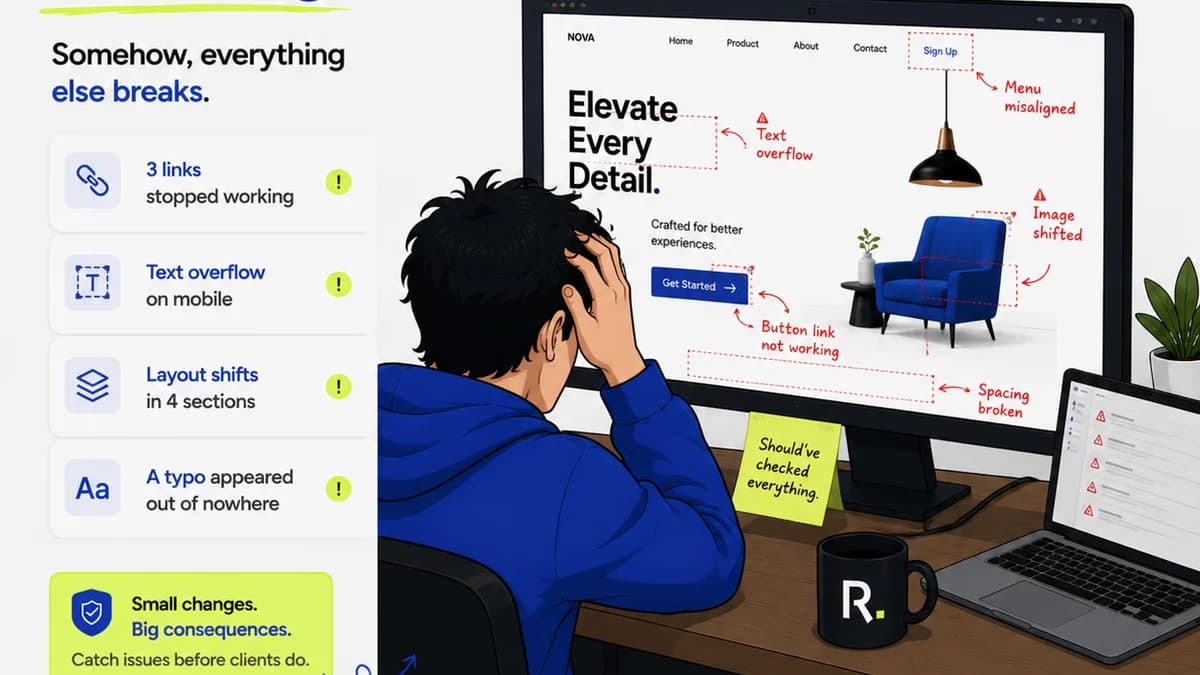
- The Symptom: Minor errors (like a misplaced hyphen, a slightly off-center logo, or a typo) slipping through to print.
- The Cause: Rushed reviews, lack of a shared review rubric, or insufficient training on print requirements.
- The Fix: Develop a standardized internal review process with clear criteria. Train your reviewers.
Problem: The Handoff Gap
The moment the file leaves your control and goes to the printer is critical. Miscommunication here is expensive.
- The Symptom: The printer calls with questions or issues that should have been addressed internally.
- The Cause: Incomplete briefing to the printer, or assuming the printer will catch what you missed.
- The Fix: Provide a clear, concise brief to the printer alongside the PDF. This includes finishing instructions, paper stock, and any specific printer notes.
3. The Technical Checklist: Reimagined
Let’s revisit the technical side, but with an operational lens.
Color: More Than Just CMYK
CMYK is standard, but what about spot colors? Are they defined correctly? Are you using the right profiles?
- Check: Ensure all spot colors are named correctly and match the printer’s swatch books if necessary.
- Check: Verify the correct CMYK profile is embedded (e.g., SWOP v2, GRACoL 2006). Ask your printer if unsure.
- Check: Look out for RGB or Lab colors accidentally left in the document.
Typography: Embedding and Outlining
Fonts must be embedded for the PDF to render correctly on any machine. But sometimes, outlining fonts is safer, especially if you suspect licensing issues or complex font behaviors.
- Check: Ensure all fonts are set to 'Embed All' or 'Embed Subset'.
- Consider: For critical jobs or when font licensing is questionable, outlining text (converting it to vector paths) can be a safer bet, but makes text uneditable.
- Warning: Outlining text means it's no longer actual text. Typos can’t be fixed in the PDF itself.
Images and Graphics: Resolution and Overprint
Resolution is key, but so is how images are treated.
- Check: Confirm effective resolution of images in their final size within the layout.
- Check: Watch for graphics or elements set to 'Overprint' unintentionally, especially black text on colored backgrounds, which can cause unexpected color shifts.
- Check: Ensure gradients and transparencies will render correctly in CMYK. Some complex effects might need flattening.
Bleed and Safety Margins
Bleed ensures no white edges after trimming. Safety margins keep critical content away from the trim edge.
- Check: Confirm bleed is set correctly (usually 1/8 inch or 3mm).
- Check: Ensure all background elements extend into the bleed area.
- Check: Keep essential text and logos within the safe zone, well away from the trim line.
File Structure and Trapping
Modern PDF/X standards handle much of this, but understanding the underlying principles helps.
- Check: Use PDF/X-4 where possible for maximum compatibility with modern workflows. PDF/X-1a is older and more restrictive.
- Understand: Trapping is the process of slightly overlapping adjacent colors to prevent gaps during printing. While often handled by RIP software, understanding its necessity is crucial for complex color jobs.
4. Where Revue Fits In
Managing all these moving parts—technical specs, client feedback, version control, internal reviews—is where a centralized platform becomes invaluable. You’re not just managing a file; you’re managing a project and its approvals.
Revue provides a single source of truth for your creative assets. Instead of chasing down feedback via email chains or Slack messages, you can:
- Centralize Feedback: All client and internal comments are attached directly to the specific version of the design, eliminating ambiguity.
- Track Revisions Clearly: Every change is logged, showing who did what and when. This creates an irrefutable audit trail, perfect for accountability.
- Manage Approvals: Formalize the approval process. Stakeholders can sign off on specific versions, ensuring that what gets sent to print is *exactly* what was agreed upon.
- Maintain Version Control: No more confusing file names. Revue manages versions, so you always know you’re working with and sending the latest, approved iteration.
This operational clarity reduces errors, speeds up the review cycle, and ultimately ensures that your technically perfect PDFs are also operationally sound.
5. Final Thought
The perfect print-ready PDF isn't just about settings. It’s a reflection of your team’s discipline, your communication clarity, and your commitment to process. Are you building a system that reliably produces great print files, or are you just hoping for the best with every export?
Frequently asked questions
What's the most common mistake agencies make with print-ready PDFs?
The most common mistake is focusing solely on technical specs like bleed and resolution, while neglecting the operational processes around feedback, version control, and internal review. This leads to errors slipping through, even if the file settings are correct.
Do I always need to outline fonts in a print-ready PDF?
Outlining fonts converts them to vector paths, ensuring they appear consistently regardless of whether the font is installed on the recipient's system. It's a safer bet for final print files, especially if you have font licensing concerns or suspect compatibility issues. However, it makes the text uneditable, so ensure it's truly the final version.
What is bleed and why is it important?
Bleed is the extra margin of artwork that extends beyond the trim edge of the page. It's crucial because it prevents unprinted white edges from appearing after the document is cut to its final size. Ensure all background elements extend into the bleed area.
How can a tool like Revue help with print-ready PDFs?
Revue helps by centralizing feedback, managing version control, and formalizing the approval process. This operational rigor ensures that the final PDF sent to the printer is the correct version, with all feedback addressed, reducing errors and costly reprints.
What resolution should my images be for print?
For most standard print jobs, images should have an effective resolution of at least 300 DPI (dots per inch) at their final printed size. Lower resolutions might suffice for very large format printing viewed from a distance, but 300 DPI is the industry standard for high-quality results.