Everyone knows you need to proofread graphic design. Catch the typos. Fix the kerning. Make sure the logo is the right color.
None of that is wrong. But it’s incomplete.
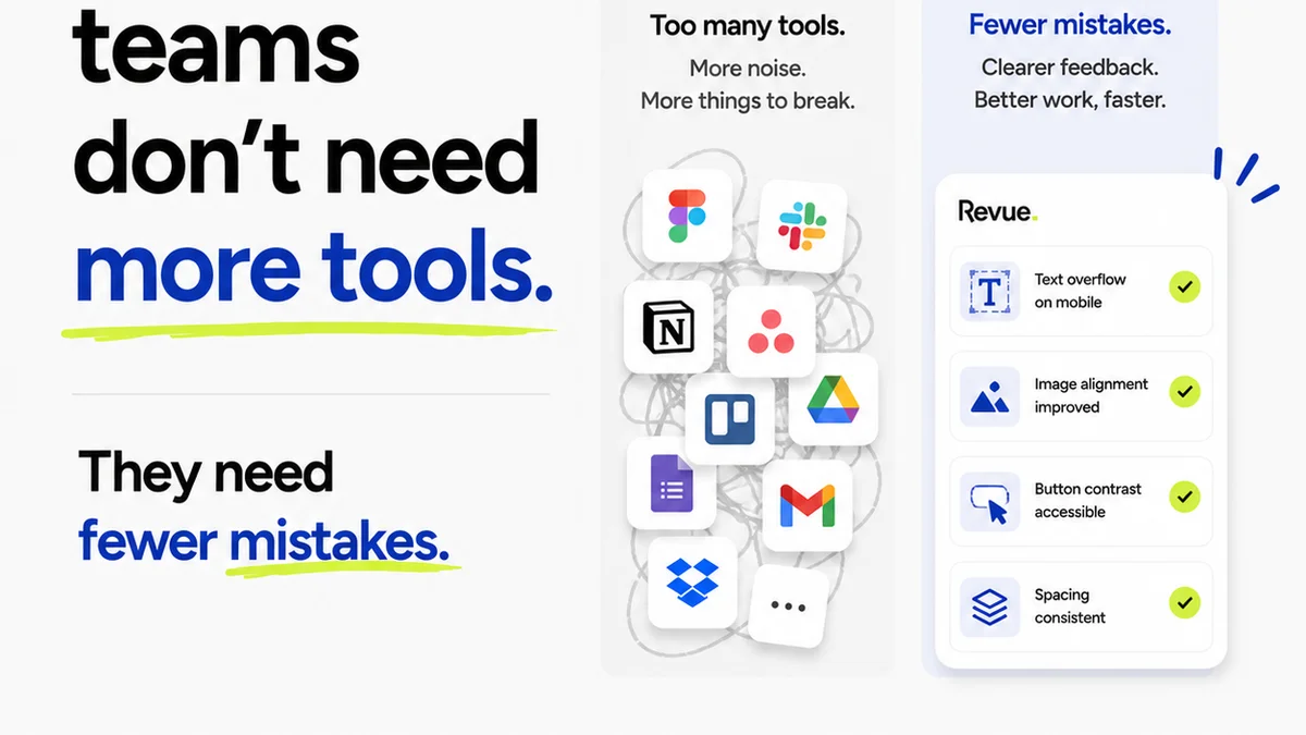
The real job of proofreading design isn't just spotting surface errors. It's about ensuring the design does what it's supposed to do. It’s the final sanity check before launch.
This means looking beyond the pixels and punctuation. It means understanding the project's goals, the client's brand, and the audience's perception.
The Hard Truth: Design Proofing is Strategic, Not Just Technical
Most teams treat proofreading as a checklist item. A final sweep for mistakes before hitting send. This view is dangerously narrow.
Proper design proofing is a critical quality assurance step. It’s where you confirm that the creative output aligns with the strategic brief, client expectations, and brand guidelines. It’s about validating the *effectiveness* of the design, not just its correctness.
Think of it like this: a technically perfect ad that doesn't resonate with the target audience is still a failure. A website with flawless code but a confusing user journey is still broken.
This deeper level of proofreading requires a different mindset. It requires collaboration. It requires context.
1. Deconstructing the Brief: Proofing Against Intent
Before you even look at the design, you need to understand the 'why'.
What was this piece of design meant to achieve?
- Increase sales by X%?
- Drive traffic to a landing page?
- Build brand awareness?
- Communicate a new product feature?
- Reinforce a specific brand message?
Your proofreading should actively check if the design supports these goals. This isn't about your personal aesthetic preferences. It's about objective alignment.
1.1. Message Clarity
Is the core message immediately obvious? Can someone glance at this design for 5 seconds and understand its primary purpose?
Look for:
- Overly complex taglines.
- Jargon that the target audience won't understand.
- Visuals that distract from or contradict the main point.
- Hierarchy that buries the most important information.
1.2. Call to Action (CTA) Effectiveness
If there's a CTA, is it clear, compelling, and easy to act upon?
Ask:
- Is the button text action-oriented? (e.g., 'Shop Now', 'Learn More', 'Download Guide')
- Is the CTA visually prominent?
- Does the CTA placement make sense in the user flow?
- Does it clearly state what will happen when clicked?
1.3. Brand Consistency
Does the design feel like it belongs to the client's brand?
This goes beyond just using the correct logo and colors. It includes:
- Tone of voice in any copy.
- Photography or illustration style.
- Overall aesthetic (e.g., modern, classic, playful, serious).
- Ensuring it aligns with the latest brand guidelines, not an outdated version.
A proofread design reinforces the brand, it doesn't dilute it.
2. The Technical Tidy-Up: The Fundamentals Still Matter
Okay, strategy is key. But the technical details are the bedrock. Mess these up, and the strategy crumbles.
This is the part most people think of as 'proofing'. Don't skip it.
2.1. Typography Checks
This is where many designs fall apart. Poor typography screams amateur.
Look for:
- Widows and Orphans: Single words or short lines at the end or beginning of a paragraph.
- Kerning and Tracking: Uneven spacing between letters or words. Especially critical for headlines.
- Leading: Line spacing that's too tight or too loose, affecting readability.
- Font Consistency: Are you using the approved fonts? Are weights and styles used consistently?
- Hierarchy: Do font sizes and weights clearly differentiate headings, subheadings, and body text?
- Legibility: Is the text readable at the intended size and distance? Consider contrast too.
2.2. Color and Imagery Verification
Colors have power. Images tell stories. Get them wrong, and you send the wrong message.
- Color Accuracy: Are CMYK/RGB values correct? Is the hex code right? Is the Pantone specified accurately? Check against brand guides.
- Contrast Ratios: Especially important for text on backgrounds. Ensure accessibility standards (WCAG) are met.
- Image Quality: Are images high-resolution enough for print or web? Are they pixelated or blurry?
- Image Relevance: Do the images support the message? Are they cliché or overused?
- Image Rights: Are all images properly licensed? (This is a legal proofread.)
2.3. Layout and Composition
A beautiful design can be ruined by a sloppy layout.
- Alignment: Are elements aligned properly? Are margins consistent?
- Spacing: Is there enough white space? Is the spacing between elements consistent and pleasing?
- Balance: Does the composition feel stable and well-proportioned?
- Grid Adherence: Does the design follow the established grid, or does it look haphazard?
- Bleed and Trim: For print, is the bleed set up correctly? Are important elements too close to the trim edge?
2.4. Copy and Content Accuracy
Yes, spellcheck is a start. But it's not enough.
- Typos and Grammatical Errors: The obvious stuff.
- Factual Accuracy: Are names, dates, prices, addresses, phone numbers, website URLs, and specifications correct? Double-check these relentlessly.
- Consistency: Are terms used consistently? (e.g., 'website' vs 'web site', 'e-mail' vs 'email').
- Completeness: Is all required copy present? No placeholder text like 'Lorem Ipsum' left in?
3. The Contextual Check: Proofing for the Real World
Designs don't exist in a vacuum. They live on screens, in print, and in the hands of users.
3.1. Device and Browser Testing (for Digital)
A design might look great on your 27-inch monitor. How does it perform on a 5-inch phone? Or in an older browser?
- Responsive Design: Test across multiple screen sizes (desktop, tablet, mobile).
- Browser Compatibility: Check in Chrome, Firefox, Safari, Edge, and maybe even IE11 if required.
- Performance: Are images optimized? Does the page load quickly?
3.2. User Experience (UX) Flow
Does the design guide the user intuitively? Is it easy to find information or complete tasks?
Navigate the design as if you were a first-time user. Ask:
- Is the navigation clear?
- Are interactive elements obvious?
- Is the information architecture logical?
- Are there any dead ends or confusing paths?
3.3. Accessibility Audit
Can *everyone* use this design?
This is no longer optional. It's a legal and ethical requirement.
- Color Contrast: As mentioned, crucial for visually impaired users.
- Keyboard Navigation: Can the entire interface be navigated using only a keyboard?
- Alt Text for Images: Are descriptive alt texts provided for screen readers?
- Semantic HTML: (For web) Is the underlying code structured correctly for assistive technologies?
3.4. Print Production Considerations
For print, the proof must anticipate the physical reality of ink on paper.
- Color Profiles: Correct CMYK profiles for the intended print process (e.g., sheetfed, web offset).
- Overprint Settings: Are blacks set to overprint correctly? Are there unintended overprints?
- Trapping: Are colors set up to trap properly to avoid gaps during the printing process?
- Die-lines and Finishing: If special finishes (foil, spot UV, die-cuts) are involved, are they correctly specified and positioned?
4. Establishing a Proofing Process: Systemize the Sanity Check
Ad-hoc proofing leads to missed errors. A defined process ensures consistency and thoroughness.
4.1. Multiple Passes, Multiple Eyes
No single person should be the sole proofreader. Different people catch different things.
- Designer Review: The creator should do a self-check first.
- Peer Review: Another designer or team member.
- Copywriter/Editor Review: For text-heavy designs.
- Project Manager/Account Manager Review: For strategic alignment and client brief adherence.
- Client Review: The final gatekeeper, but they shouldn't be the *first* person to catch a typo.
4.2. Use a Checklist
Don't rely on memory. Create and use a comprehensive proofing checklist tailored to your project types.
Your checklist should cover strategy, copy, technicals, and context.
4.3. Define
Frequently asked questions
What's the difference between proofreading and editing a design?
Editing focuses on improving the content and structure of the design itself (e.g., refining the message, improving layout). Proofreading is the final check for errors in spelling, grammar, typography, colors, and technical specs before publication or production.
Who should proofread graphic designs?
Ideally, multiple people should proofread. This includes the designer (self-check), a peer, a copy editor (if applicable), and a project manager. The client also reviews, but they shouldn't be the first to catch basic errors.
How do I proofread for accessibility?
Check color contrast ratios, ensure keyboard navigability, provide alt text for images, and use semantic HTML for web designs. Aim to meet WCAG guidelines.
What are widows and orphans in design proofreading?
A 'widow' is the last line of a paragraph appearing alone at the top of a page or column. An 'orphan' is the first line of a paragraph appearing alone at the bottom of a page or column. Both disrupt visual flow and are typically corrected during proofreading.