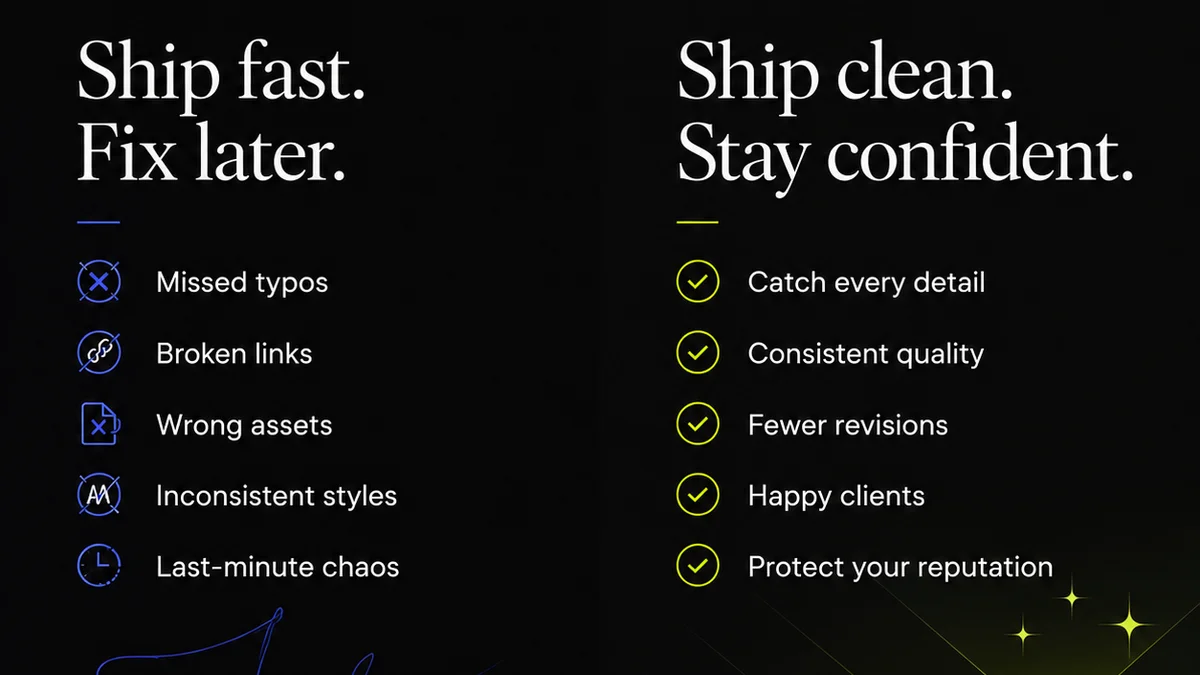
Everyone agrees good design documentation is important. You need it for handoffs, for future reference, for onboarding new designers. It keeps projects on track and prevents costly misunderstandings.
None of that is wrong. But it’s incomplete.
The hard truth is that “important” doesn’t mean “done.” Most agencies and in-house teams treat design documentation as a necessary evil, a chore tacked onto the end of a project. The result? Inconsistent, incomplete, and often useless files that cause more problems than they solve.
Standardizing design documentation isn't about creating more busywork. It's about building a reliable system that saves time, reduces errors, and elevates the quality of your creative output. It requires a deliberate approach, not just a vague aspiration.
1. The Myth of the "Self-Explanatory" Design File
The biggest assumption we make is that a well-organized Figma file or a clean Adobe XD artboard is enough. That the visual design itself tells the whole story.
It doesn’t.
Think about it. What’s the font hierarchy? What are the specific color values, not just the visual approximation? What are the interactive states for a button? What are the accessibility considerations for that form field?
Even the most intuitive design needs context. Without it, developers are left guessing, QA testers are flying blind, and future project managers are navigating a maze.
The Real Problem: Incomplete Context
When documentation is an afterthought:
- Developers implement based on assumptions, leading to rework.
- QA misses edge cases because states or interactions aren’t defined.
- Clients push back on minor details that could have been clarified upfront.
- New team members struggle to understand project history and rationale.
- Brand consistency erodes because there’s no single source of truth for elements.
This isn't just about aesthetics; it's about operational efficiency and project success.
2. Defining What "Good" Documentation Looks Like
Standardization starts with a clear definition of what you’re aiming for. What information *must* be present for every design deliverable?
This varies by team and project type, but a solid baseline includes:
- Clear Naming Conventions: Files, folders, layers, and artboards should be named logically and consistently. No more “Final_v2_real_final.sketch”.
- Component Libraries & Style Guides: A centralized, up-to-date repository of UI elements, typography, color palettes, and spacing rules. Think design tokens.
- Interaction Specifications: How elements behave. Hover states, click actions, transitions, animations.
- Content Guidelines: Tone of voice, character limits, placeholder text conventions.
- Accessibility Notes: Color contrast ratios, focus states, ARIA labels, keyboard navigation paths. Refer to resources like the Web Content Accessibility Guidelines (WCAG).
- Rationale & Decisions: Why was a certain approach taken? What alternatives were considered? This is crucial for complex problems.
- Technical Constraints: Any platform-specific limitations or performance considerations.
The
Frequently asked questions
What are the key benefits of standardizing design documentation?
Standardizing design documentation leads to fewer errors, reduced rework, faster onboarding, improved collaboration between design, development, and client teams, and ensures brand consistency across projects.
How can I enforce naming conventions for design files and assets?
Establish clear, documented naming convention guidelines. Conduct regular file audits and provide training. Integrate checks into your project setup process. Tools can also help automate some aspects.
What's the difference between a style guide and a design system?
A style guide typically covers visual elements like colors, typography, and logos. A design system is more comprehensive, including reusable components, patterns, code snippets, and usage guidelines, often serving as the single source of truth for product development.
How do I document design decisions and rationale?
Document decisions directly within your design files using comments or dedicated text layers. Maintain a separate project log or use a tool that tracks design iterations and discussions. Include links to user research or A/B test results that informed the decision.