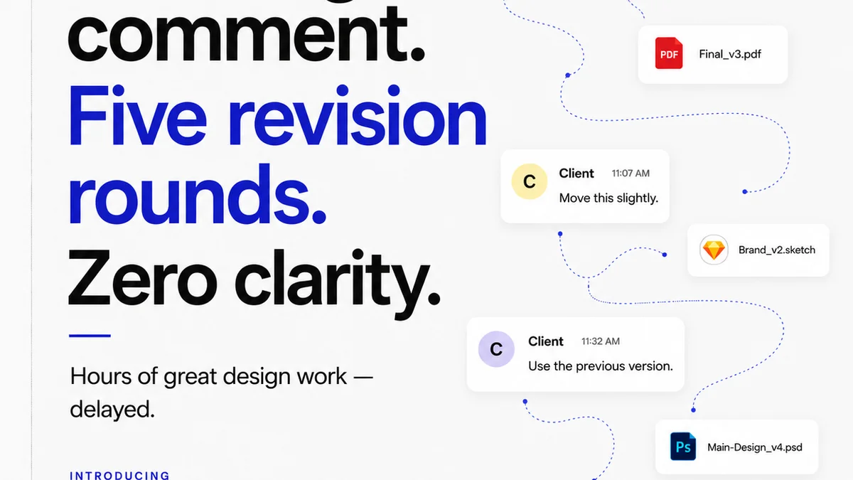
Everyone thinks clients kill good design. They demand endless revisions, change their minds daily, and never quite “get it.”
None of that is wrong. But it’s incomplete.
The hard truth? Many projects tank not because of client feedback, but because of fundamental design errors made long before the client ever saw a pixel. And often, the biggest culprit is typography.
Bad typography doesn’t just look ugly. It actively hinders communication, creates confusion, and signals a lack of professionalism. It’s the silent killer of creative projects, making clients question your expertise and costing you valuable time and money.
Let’s strip away the excuses and talk about the real typography mistakes that are sinking your agency or in-house team. And more importantly, how to fix them.
1. Ignoring Readability for the Sake of Aesthetics
This is the classic trap. You see a cool, experimental font and think, “This will make the design pop!” But then you apply it to body copy, and suddenly, no one can actually read the damn thing.
Aesthetic appeal is crucial, but it should never come at the expense of legibility. If users have to strain their eyes or re-read sentences multiple times, your design has failed, no matter how stylish the typeface.
Hierarchy Headaches
Typography’s primary job is to establish clear hierarchy. Without it, users don’t know where to look first, what’s most important, or how to navigate the content.
- Lack of distinct headings and subheadings.
- Body text that looks too similar to headings.
- Inconsistent use of font weights and sizes.
This forces users to work harder to understand your message. It's like walking into a library where all the books are the same size and color. Chaos.
Line Length Lunacy
Ever encountered a block of text so wide it feels like a marathon to read from left to right? That’s poor line length management.
Optimal line length keeps the reader’s eye moving smoothly. Too short, and the eye jumps around too much. Too long, and the reader loses their place.
A good rule of thumb for body copy is 45-75 characters per line. This can vary based on typeface and context, but it’s a solid starting point.
Leading the Blind
Leading (the space between lines of text) is another often-overlooked element. Too little leading makes text feel cramped and claustrophobic. Too much, and the text loses its cohesive flow, appearing disconnected.
Fine-tuning line spacing is essential for comfortable reading, especially for longer passages.
2. The Font Pairing Fiasco
Picking a single font is hard enough. Picking two or three that actually work together? That’s where things get really messy.
Too many designers grab a “safe” sans-serif and pair it with a “fancy” serif, thinking that’s the whole story. Often, these pairings are jarring, clashing rather than complementing.
Conflicting Personalities
Fonts have personalities. A geometric sans-serif has a different vibe than a humanist sans-serif. A classic old-style serif is miles away from a modern slab serif.
When you pair fonts with wildly different, clashing personalities, the design feels unstable and unprofessional. It’s like putting a punk rocker and a prim librarian in a room and expecting them to have a smooth conversation.
Lack of Contrast (or Too Much)
The goal of pairing is usually contrast. You want one font to provide a visual counterpoint to the other. This often means pairing a sans-serif with a serif, or a display font with a text font.
But the contrast needs to be intentional. Pairing two fonts that are *almost* the same creates a visual tension that’s deeply unsettling. It looks like a mistake, not a design choice.
Conversely, pairing two fonts with extreme, clashing characteristics without a clear purpose can also be a disaster.
Over-Reliance on Default Pairings
Many design tools offer pre-made font pairings. While these can be a starting point, relying on them exclusively leads to generic, uninspired work. Your work starts to look like everyone else’s.
3. The Size and Weight Mismatch
Font size and weight are your primary tools for creating visual hierarchy. When these are used haphazardly, the entire structure of your design crumbles.
Body Text Too Small to Read
This is a pervasive issue, especially on web and mobile design. Designers, often aiming for a minimalist aesthetic, shrink body text to minuscule sizes. Users then need to zoom or squint.
Remember accessibility. WCAG guidelines recommend a minimum text size for readability.
Headings That Don’t Stand Out
Your main headings should be the most prominent text elements. If they’re only slightly larger or bolder than the body copy, the hierarchy is lost.
Conversely, making headings excessively large or heavy can overpower the rest of the content, making it feel secondary.
Inconsistent Weight Usage
Using multiple weights of the same typeface can add nuance. But if you’re jumping between light, regular, bold, and black for no clear reason, it looks chaotic.
Use weights purposefully: bold for emphasis, regular for body copy, perhaps a lighter weight for secondary information. Stick to 2-3 weights max for clarity.
4. Bad Kerning and Tracking
Kerning is the space between specific pairs of letters. Tracking is the overall spacing of a group of letters.
These are subtle details, often overlooked, but they have a massive impact on how professional your typography looks.
Awkward Letter Spacing
Poor kerning leads to letters that are too close together or too far apart. This is especially noticeable in headlines and display text.
Think of the classic “AVA” kerning issue, or the gaping hole between a capital ‘T’ and ‘o’.
While design software has auto-kerning, it’s often imperfect. Manual kerning, especially for important headlines, is a mark of professional polish.
Overly Tight or Loose Tracking
Tracking affects the overall density of text. Text that is too tightly tracked can feel cramped and difficult to read. Text that is too loosely tracked can feel airy and disconnected.
This is often a problem when designers try to force text into a specific space by simply adjusting the tracking.
5. Choosing the Wrong Font for the Job
Every font has a context. Using a playful script font for a financial report, or a rigid, industrial slab serif for a children’s book, is a fundamental mismatch.
Context is King
Consider the brand, the audience, and the message. A font’s style should align with these elements. A tech startup might use a clean, modern sans-serif. A luxury brand might opt for an elegant serif.
Using a font that feels out of place immediately signals that the design team doesn't understand the project’s core requirements.
Overuse of Display Fonts
Display fonts are designed for impact, usually in short bursts like headlines or logos. They are rarely suitable for body copy.
Using a complex display font for paragraphs will inevitably lead to readability issues and fatigue.
Ignoring Technical Constraints
Some fonts don’t render well on screen, especially at small sizes. Others have limited character sets or poor hinting, leading to jagged edges.
Always test your chosen fonts in their intended environment and sizes. Ensure they have the necessary characters for your project (e.g., multiple languages, specific symbols).
6. Neglecting Accessibility
This isn’t just about compliance; it’s about good design. Typography choices directly impact how accessible your content is to everyone.
Insufficient Contrast
The contrast between text color and background color is critical. Low contrast makes text difficult or impossible to read for people with visual impairments.
Tools exist to check contrast ratios. Aim for a minimum of 4.5:1 for normal text and 3:1 for large text, as per WCAG AA standards.
Font Choice for Impaired Vision
Some fonts are inherently more readable than others. Fonts with clear, distinct letterforms and ample spacing are generally better. Avoid overly decorative or condensed fonts for body text.
Not Considering Different Devices and Resolutions
What looks great on your 27-inch monitor might be unreadable on a small phone screen. Responsive typography is key.
Ensure your type scales appropriately and maintains readability across all devices and screen sizes.
Where Revue Fits In
These typography mistakes aren’t just aesthetic slip-ups; they’re operational inefficiencies. They lead to cycles of feedback, revisions, and delays.
Clients will point out readability issues, spacing problems, or confusing hierarchy. If your feedback process is scattered across emails, Slack messages, and random documents, trying to track and implement these changes becomes a nightmare.
Revue centralizes client feedback directly on the creative assets. This means comments about font sizes, line spacing, or hierarchy are logged in context. Your team can see exactly what needs tweaking, reducing misinterpretation and speeding up revisions.
With clear version control and approval tracking in Revue, you ensure that the final approved version is indeed the *right* version, free from the typography errors that can plague a project.
Final Thought
Typography is more than just picking pretty fonts. It’s the bedrock of clear communication in design.
Are you treating it as a foundational element, or an afterthought?
Frequently asked questions
What is the most common typography mistake?
The most common typography mistake is prioritizing aesthetics over readability. This includes using fonts that are difficult to read for body copy, poor line length, and inadequate line spacing (leading), which hinders comprehension and user experience.
How do I choose good font pairings?
Good font pairings create contrast without clashing. Aim to pair fonts with distinct personalities, such as a serif with a sans-serif, or a bold display font for headlines with a clean text font for body copy. Ensure they complement each other rather than compete, and test them in context.
What's the difference between kerning and tracking?
Kerning refers to the adjustment of space between specific pairs of letters (e.g., 'AV'). Tracking refers to the overall spacing applied uniformly to a block of text. Both are crucial for achieving professional-looking typography, especially in headlines.
How can typography impact accessibility?
Typography significantly impacts accessibility through choices like text size, font style, line spacing, and contrast. Insufficient contrast between text and background, or using fonts that are inherently difficult to read, can exclude users with visual impairments. Adhering to WCAG guidelines for readability is essential.