Everyone thinks good typography is about picking the right font. That’s what designers obsess over, right? The perfect serif, the most legible sans-serif, the ideal display face for a headline. And sure, font choice matters.
But it’s not the whole story. Not even close.
The hard truth? Most typography mistakes aren't about the font itself. They’re about how you *use* it. Poor hierarchy, inconsistent spacing, illegible text on screens. These are operational problems. They kill readability, frustrate clients, and tank your brand’s perceived quality. And they’re fixable.
1. The Hierarchy Horror Show
This is where most projects go off the rails. Clients, account managers, even junior designers often struggle to see the difference between a headline, a sub-headline, and body copy when it’s all set in the same font size and weight. It’s not about the font; it’s about the visual pecking order.
The Problem:
- All text looks the same.
- Users can’t scan the page for key information.
- Important calls-to-action get lost.
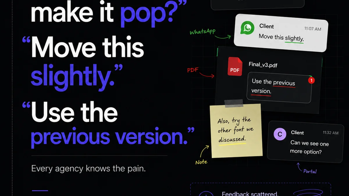
- Clients ask to “make it all bigger” because they can’t tell what’s important.
The Fix:
Use a clear typographic scale. This means distinct differences in size, weight, and sometimes even style for different levels of information. Think larger, bolder headlines. Slightly smaller, lighter sub-headlines. And well-proportioned body text.
Even simple projects benefit from a deliberate scale. A good starting point:
- Headline: 24pt Bold
- Sub-headline: 18pt Medium
- Body Copy: 12pt Regular
- Captions/Footnotes: 10pt Light
This is just an example. The key is contrast and consistency. Define your scale and stick to it across all deliverables.
Client Misunderstanding
Clients often don't grasp the subtle cues that good hierarchy provides. They see text and want it all to be equally prominent. Your job is to educate them on how visual hierarchy guides the reader’s eye. It’s not arbitrary design; it's strategic communication.
2. Spacing: The Unsung Hero (or Villain)
Bad spacing is the silent killer of good typography. It’s often overlooked because it’s subtle, but it has a massive impact on readability and professionalism. Think kerning, tracking, leading, and paragraph spacing.
Kerning & Tracking:
Kerning is the space between specific pairs of letters (like ‘AV’ or ‘To’). Tracking is the overall letter-spacing in a block of text. Many fonts have built-in kerning pairs, but they aren’t always perfect. Overly tight or loose text is a hallmark of amateur design.
Leading (Line Spacing):
This is the space between lines of text. Too little leading makes text feel cramped and hard to follow. Too much leading can break the flow and make paragraphs feel disconnected.
Paragraph Spacing:
Simply hitting ‘Enter’ twice between paragraphs is a common, but often poor, solution. It creates inconsistent spacing. Use dedicated paragraph spacing settings in your design software for better control.
The Rule of Thumb for Leading
A common guideline is to set leading at 120% of the font size. So, for 10pt text, use 12pt leading. For 12pt text, use 14.4pt leading. This is a starting point; adjust based on the font and context.
Tracking for Headlines vs. Body
Headlines can often benefit from slightly tighter tracking to feel more cohesive. Body copy usually needs standard or slightly looser tracking for maximum readability over long passages.
3. Legibility vs. Readability: The Crucial Distinction
These terms are often used interchangeably, but they mean different things. And getting them wrong is a common typography mistake that impacts user experience.
Legibility is about distinguishing individual characters. Can you tell an ‘i’ from an ‘l’ or a ‘0’ from an ‘O’?
Readability is about how easily you can read blocks of text. Does the text flow smoothly? Is it comfortable to read for extended periods?
The Mistakes:**
- Using highly decorative or script fonts for body copy. (Poor legibility).
- Setting body copy too small or with insufficient contrast. (Poor readability).
- Overusing ALL CAPS for long passages. (Poor readability).
- Choosing fonts with very similar characters (e.g., I, l, 1 or O, 0).
Font Choice Matters Here
Some fonts are simply designed for display (headlines, short bursts of text) and others for extended reading (body copy). A font like Futura might be legible in headlines but painful in paragraphs. A font like Merriweather or Open Sans is designed for both.
Consider accessibility standards. For instance, the Web Content Accessibility Guidelines (WCAG) provide recommendations for text size, contrast, and spacing to ensure content is readable by everyone.
4. Contrast and Color: More Than Just Aesthetics
The relationship between text color and background color is critical. It’s not just about making text visible; it’s about making it accessible and comfortable to read.
The Problem:**
- Low contrast ratios make text difficult to read, especially for users with visual impairments or in bright lighting conditions.
- Using pure black text on a pure white background can cause eye strain for some readers due to halation.
- Inconsistent color usage for emphasis or links can confuse users.
Contrast Ratios
WCAG recommends a minimum contrast ratio of 4.5:1 for normal text and 3:1 for large text. Tools like the WebAIM Contrast Checker can help you verify your combinations.
Often, a slightly off-white background with a dark grey or off-black text is more comfortable than stark black on white. Experiment.
Color for Meaning
Don't rely on color alone to convey information. For example, if links are blue, ensure they are also underlined or otherwise visually distinct. This helps users who are colorblind.
5. Inconsistency is Chaos
This is perhaps the most common and damaging typography mistake in agencies. A lack of a consistent typographic system across projects, platforms, and deliverables.
Symptoms:**
- Different font sizes for the same elements (e.g., body text is 11pt on the website, 12pt in the brochure).
- Inconsistent use of bold, italics, or ALL CAPS.
- No defined styles for headings, subheadings, quotes, or lists.
- Client feedback sessions where
Frequently asked questions
What is typographic hierarchy?
Typographic hierarchy is the arrangement and appearance of text to show its relative importance. It uses variations in size, weight, style, and spacing to guide the reader's eye through content, making it easier to scan and understand.
How do I improve readability with typography?
Improve readability by choosing appropriate fonts for body copy, ensuring sufficient line spacing (leading), controlling letter and word spacing (tracking), using adequate contrast between text and background, and maintaining a consistent typographic scale.
What's the difference between legibility and readability?
Legibility refers to the ability to distinguish individual characters, while readability refers to the ease with which blocks of text can be read. A font might be legible but not readable in large quantities if its spacing or character forms are poor for extended reading.
How can I ensure typographic consistency across projects?
Establish a clear typographic system or style guide that defines font families, sizes, weights, and spacing for all text elements (headings, body, captions, etc.). Train your team to adhere to this system and use it during the design and development process.