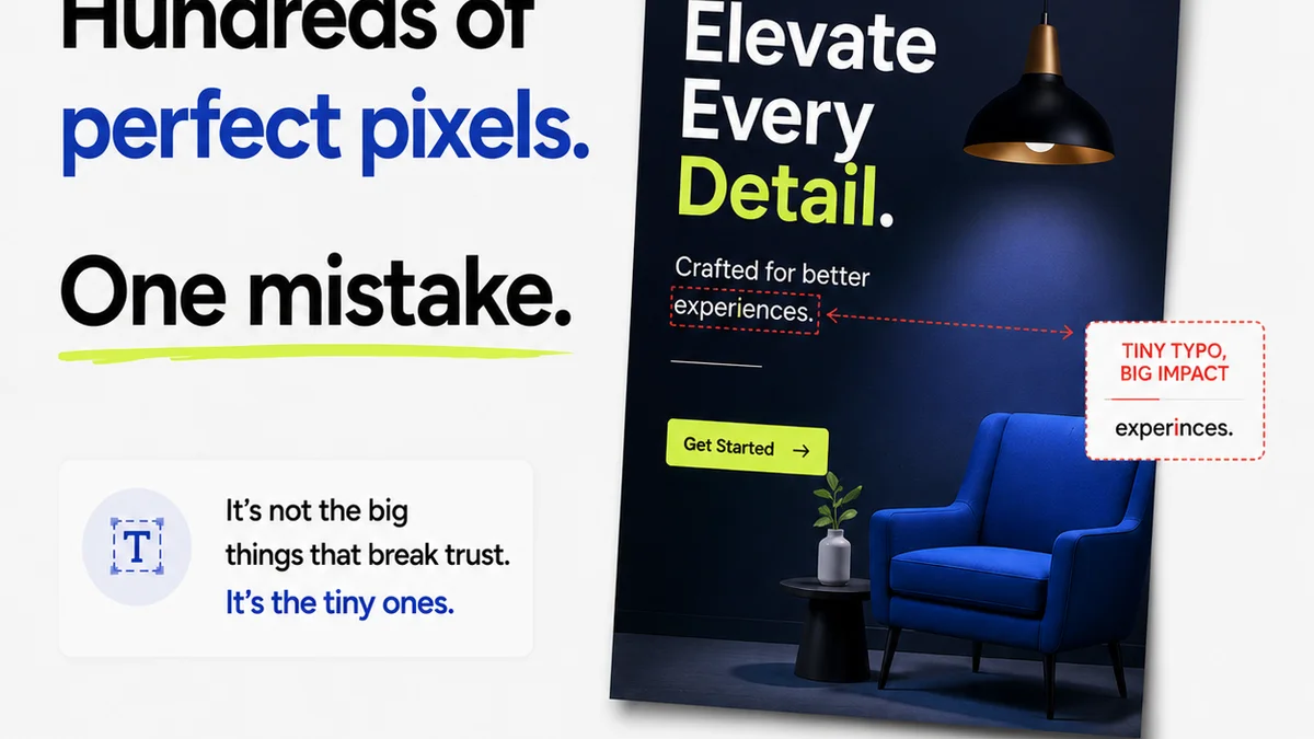
Everyone thinks they know good typography. It’s about picking a nice font, right? Making sure the text is readable. That’s not wrong. But it’s incomplete.
For enterprise teams, where brand consistency and clear communication across vast platforms are paramount, overlooking typography is a silent killer of credibility and efficiency. The hard truth? Sloppy type choices and inconsistent application are costing you more than just aesthetic points. They’re costing you trust, clarity, and budget.
1. The Over-Reliance on Default Fonts
Many enterprise brands default to system fonts or widely available,
Frequently asked questions
What is the biggest typography mistake enterprise teams make?
Often, it's the over-reliance on default or generic fonts, leading to a lack of brand distinction and potential legibility issues across diverse platforms. Inconsistent application is another major pitfall.
How can enterprise teams improve their typography?
Establish a clear typographic hierarchy, define a limited font palette, ensure accessibility (WCAG compliance), and implement a robust design system for consistent application across all touchpoints. Regular audits help maintain standards.
Why is typography important for enterprise brands?
Typography directly impacts brand perception, readability, and user experience. Consistent, well-executed typography builds trust, reinforces brand identity, and ensures information is communicated effectively to a broad audience.
What are accessibility considerations for enterprise typography?
Enterprise teams must ensure sufficient color contrast between text and background, use legible font sizes and weights, and provide clear line spacing and text alignment. Adhering to WCAG guidelines is critical.