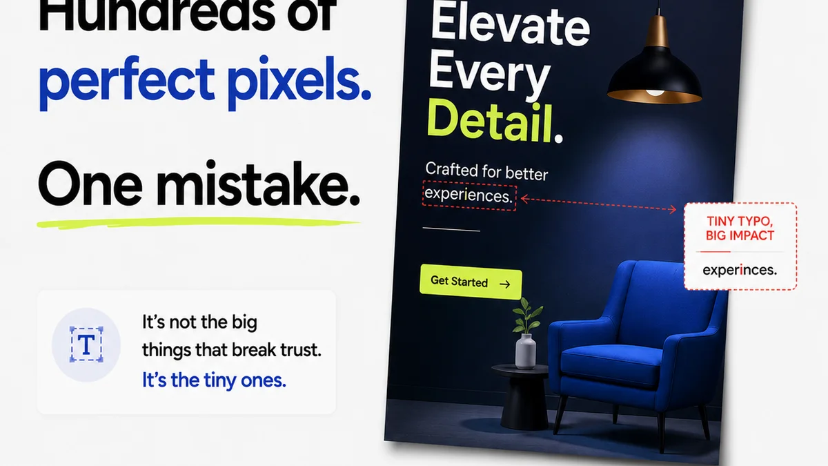
Everyone thinks good typography is about picking pretty fonts. That’s the surface-level stuff. The real impact of typography on your creative projects—whether it’s web design, branding, or marketing collateral—runs much deeper.
Bad typography doesn't just look unprofessional. It actively harms usability, erodes trust, and can even make your client's message impossible to understand.
1. Legibility vs. Readability: The Core Conflict
These terms are often used interchangeably, but they’re distinct. Getting them wrong is a foundational mistake.
Legibility
Legibility refers to how easily individual characters (letters, numbers, symbols) can be distinguished from one another. Think of an 'i' versus an 'l', or a '0' versus an 'O'.
Readability
Readability is about how easily blocks of text can be scanned and understood. This involves factors like line length, line spacing, and paragraph structure.
Many designers obsess over the *look* of a font (legibility) but neglect how it performs in actual copy (readability).
2. Ignoring Hierarchy: The Visual Chaos
A common typography mistake is failing to establish a clear visual hierarchy. When everything looks equally important, the reader doesn't know where to start or what to focus on.
The Symptoms of Poor Hierarchy
- Headings, subheadings, and body text all look too similar.
- Key calls to action get lost in the noise.
- Users struggle to scan the page for essential information.
- The overall design feels flat and unengaging.
Establishing Hierarchy
Use a combination of font size, weight (boldness), color, and spacing to guide the reader's eye. A clear hierarchy makes content digestible.
- Size: Larger for more important elements.
- Weight: Bolder for emphasis.
- Color: Contrasting colors for key elements.
- Spacing: More space around headings than body text.
3. Awkward Line and Letter Spacing
This is where many projects fall apart. Even a great font can look terrible with poor spacing.
Leading (Line Spacing)
Too little leading makes text feel cramped and hard to read. Too much leading can break the flow between lines, making the text feel disjointed.
A good rule of thumb for body text is to set leading at 120-150% of the font size. This is a starting point, not a hard rule. Always test.
Tracking (Overall Letter Spacing)
Adjusting tracking globally can affect the density of text. Tight tracking can make text feel claustrophobic; loose tracking can feel airy but sometimes disconnected.
Kerning (Specific Letter Pair Spacing)
Kerning is crucial for headlines and large type. It's the adjustment of space between specific pairs of letters that have awkward gaps (like 'AV' or 'To').
Most modern design software handles basic kerning automatically, but manual kerning is often required for professional polish, especially in display type.
4. Inconsistent Styles: The Devil in the Details
This is a killer for professional polish. Inconsistency breeds confusion and looks sloppy.
Common Inconsistencies
- Using multiple similar fonts when one or two would suffice.
- Mixing serif and sans-serif fonts without a clear purpose or system.
- Inconsistent use of bold, italics, or underlines for emphasis.
- Varying heading styles across different pages or sections.
- Using different colors for the same type of element (e.g., links).
A defined typographic system is essential. This includes a limited set of fonts and clear rules for their application.
5. Poor Contrast and Color Choices
Typography relies heavily on contrast. Insufficient contrast between text and background is a major accessibility issue and a readability killer.
Accessibility Standards
Tools like the WCAG (Web Content Accessibility Guidelines) provide specific contrast ratio requirements. For normal text, a ratio of at least 4.5:1 is recommended. For large text, 3:1 is the minimum.
Don't guess. Use contrast checking tools to ensure compliance. This isn't just about ticking a box; it's about ensuring everyone can read your content.
Color Blindness Considerations
Relying solely on color to convey information is problematic for colorblind users. Use patterns, icons, or text labels in conjunction with color.
6. Inappropriate Font Choices
The context matters. Picking a font that doesn't fit the brand or the message is a common, yet avoidable, error.
Context is King
- Serifs: Often perceived as traditional, formal, or literary. Good for long-form print.
- Sans-serifs: Often seen as modern, clean, or neutral. Excellent for web and UI.
- Script fonts: Best used sparingly for decorative accents, not body text.
- Display fonts: Highly stylized, meant for headlines or short bursts of text.
A playful script font on a serious financial report? A rigid slab serif for a trendy fashion brand? These mismatches create cognitive dissonance.
7. Ignoring Responsive Typography
What looks great on a desktop can be a disaster on a mobile device. Typography needs to adapt.
Key Considerations
- Line Length: Shorter lines are better on smaller screens.
- Font Size: Ensure body text remains readable on mobile without excessive zooming.
- Spacing: Adjust leading and margins for different screen sizes.
Fluid typography, using relative units like `vw` (viewport width) or `clamp()`, can help create adaptable type systems. But don't overdo it; readability remains paramount.
8. Over-reliance on Defaults
Design software offers default settings for a reason: they’re a starting point. Relying solely on them guarantees mediocrity.
This applies to everything: default font sizes, default line heights, default tracking. Take control. Tweak these settings to optimize for your specific content and design.
Where Revue Fits In
Managing typography across multiple projects, revisions, and team members can lead to inconsistencies. This is where a centralized feedback and approval platform becomes critical.
Revue helps ensure that approved typographic styles are consistently applied. When feedback is consolidated in one place, you can easily track changes related to type, spacing, and hierarchy. This visibility prevents the drift that leads to sloppy typography and ensures brand consistency is maintained throughout the revision process.
It streamlines the quality check phase, allowing teams to verify that typography standards are met before final delivery.
Final Thought
Typography is more than just aesthetics; it's a fundamental aspect of communication design. It shapes how information is perceived and processed.
Are you treating typography as a critical design element, or just window dressing?
Frequently asked questions
What's the difference between legibility and readability?
Legibility is about distinguishing individual characters (like 'i' vs 'l'), while readability is about how easily blocks of text can be scanned and understood, influenced by factors like line spacing and length.
How can I improve typographic hierarchy?
Establish a clear hierarchy using variations in font size, weight, color, and spacing. This guides the reader's eye and makes content easier to digest.
What are common line spacing (leading) mistakes?
Too little leading makes text cramped and hard to read; too much can break the flow between lines. A common starting point for body text is 120-150% of the font size, but always test for optimal readability.
Why is font contrast important?
Sufficient contrast between text and background is crucial for readability and accessibility. Poor contrast makes text difficult to read, especially for users with visual impairments. Aim for WCAG-compliant contrast ratios.
How does responsive design affect typography?
Typography must adapt to different screen sizes. This means adjusting line lengths, font sizes, and spacing to ensure readability on both desktop and mobile devices.