Everyone agrees that a polished final deliverable is key. You’ve nailed the strategy, the creative is on point, and the client is happy with the direction. You’re ready to push the button. But wait. What about the typography? It’s easy to assume that once the fonts are chosen and the basic layout is set, the heavy lifting is done. That’s a dangerous assumption.
The hard truth is that typography QA is often the most overlooked, yet most critical, step before client delivery. It’s the detail that separates professional, high-quality work from something that feels rushed and amateurish. Sloppy type can undermine even the most brilliant design concept.
1. The Illusion of 'Good Enough' Typography
The 'It Looks Okay' Trap
We’ve all been there. You’re staring at a screen, maybe a PDF proof, maybe even the live site. The text is readable. The headlines stand out. The body copy isn’t actively jarring. The assumption? It’s good enough. It passed the initial glance test.
This mindset is a direct threat to your agency’s reputation. Clients might not articulate it, but they *feel* it when something is off. They might say the design feels ‘unrefined’ or ‘not quite there,’ and often, it’s the subtle typographic flaws that contribute to that feeling.
Why 'Good Enough' Isn't
Typography isn't just about making words legible. It’s about:
- Setting the tone and conveying brand personality.
- Guiding the reader’s eye through the content.
- Ensuring consistency and hierarchy.
- Building trust and credibility.
- Reinforcing the overall aesthetic.
When typographic elements are inconsistent or poorly executed, every single one of these functions is compromised. It’s the difference between a confident, authoritative brand voice and a hesitant, uncertain whisper.
2. Common Typographic Pitfalls Hiding in Plain Sight
These issues don’t always jump out. They’re the insidious details that slip through the cracks during rapid-fire design and revision cycles.
Hierarchy and Readability Killers
- Inconsistent Leading (Line Spacing): Body text should have generous, consistent line spacing. Headlines might need tighter leading, but it must be uniform within its own style. Mismatched leading creates jarring jumps and makes text feel dense or airy in unintended ways.
- Awkward Ragged Edges (Rivers of White): When text is left-aligned, long words or spaces can create unsightly vertical gaps, known as ‘rivers.’ These disrupt the flow and make text harder to scan.
- Overly Widened or Condensed Tracking: Adjusting letter spacing (tracking) can fine-tune readability, but overdoing it makes text feel stretched or cramped. It’s often a sign of forcing a font into a space it doesn’t naturally fit.
- Poor Hyphenation Control: Excessive or illogical hyphenation breaks words awkwardly, creating widows (single words on the last line) and orphans (single words on the first line of a paragraph) or simply making sentences hard to parse.
Style and Consistency Nightmares
- Font Weight and Style Mismatches: Using a slightly different weight (e.g., Regular vs. Book) or style (e.g., Italic vs. Oblique) for seemingly identical elements across a project looks unprofessional.
- Inconsistent Case Usage: Are all subheadings sentence case? Or title case? Whatever the rule, it must be applied uniformly. Mixing them is a glaring error.
- Incorrect Use of Small Caps: Small caps are a specific typographic feature, not just a scaled-down version of uppercase. Using them improperly, or applying them inconsistently, diminishes their effect.
- Tab vs. Space Dilemmas: Relying on multiple spaces instead of tab characters for indentation or alignment creates inconsistencies that break down when text reflows or is copied.
The Devil is in the Details
It’s the tiny things. A single extra space. A hyphen that shouldn't be there. A headline that's a point size too small on one page and too large on another. These aren't design choices; they're oversights.
3. Building a Robust Typography QA Checklist
A checklist isn't just a bureaucratic hurdle; it's a safety net. It forces a systematic review, catching errors that a quick visual scan misses.
The Pre-Flight Check
Before you even get to the final delivery stage, integrate typography checks into your process. This means:
- Font Consistency Sheet: Maintain a document listing every font used, its specific weight/style, and its intended purpose (e.g., H1, H2, Body, Caption).
- Style Guide Adherence: Ensure all typography strictly follows the established brand style guide. Any deviations need explicit approval.
- Automated Checks (Where Possible): Tools can flag basic issues like double spaces or inconsistent punctuation, but they won't catch nuanced design problems.
The Deliverable Audit
This is your final line of defense. Assign a fresh pair of eyes—someone not involved in the day-to-day design—to conduct this review. They should specifically look for:
- Hierarchy Check: Does the visual hierarchy flow logically from largest to smallest element? Are headings consistently styled and sized relative to body copy?
- Spacing Audit: Check leading, paragraph spacing, and tracking. Look for rivers of white and overly tight or loose text.
- Alignment Scrutiny: Ensure all text blocks align to the grid and to each other where intended. Check ragged edges for consistency.
- Punctuation and Hyphenation Review: Scour for widows, orphans, and awkward hyphenations. Check for correct use of em dashes, en dashes, and hyphens.
- Case and Style Uniformity: Verify that all instances of a specific text element (e.g., all button labels, all caption titles) use the exact same case and font style.
- Legibility Across Devices/Sizes: If applicable, check how typography renders on different screen sizes and resolutions. What looks good on a large monitor might be unreadable on a phone.
- Accessibility Considerations: Ensure sufficient contrast ratios and adequate font sizes for readability, especially for body copy.
This isn't about finding fault; it's about ensuring perfection.
4. The Human Element: Eyes On, Minds On
Technology can help, but it can't replace human judgment. A designer's eye is trained to see subtle nuances that algorithms miss.
The Power of a Fresh Perspective
The person who has been deep in the project for weeks can develop blind spots. They’ve seen the design so many times that certain flaws become invisible. Bringing in someone else—a junior designer, a project manager, or even a peer from another team—offers a crucial fresh perspective.
This reviewer needs to approach the task with a critical eye, but also with the goal of *helping* the project succeed, not just finding errors.
Context is King
Typography doesn't exist in a vacuum. It serves content. The QA process must consider:
- Content Length: Does the design accommodate longer or shorter versions of the text without breaking?
- Reading Flow: Does the typography naturally guide the reader through the information as intended?
- Brand Voice: Does the typographic treatment align with the overall brand personality?
This requires more than just checking boxes; it requires understanding the *why* behind the design choices.
5. Where Revue Fits In
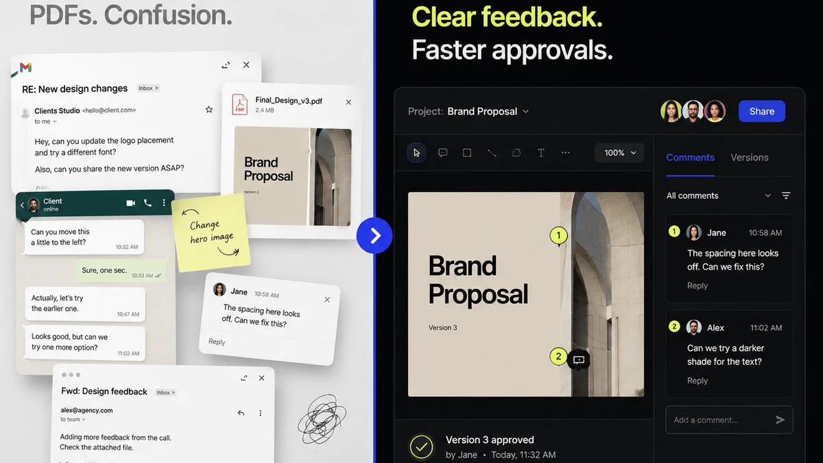
Managing feedback and revisions throughout the design process can be chaotic. This chaos is often where typographic errors begin to creep in.
When feedback is scattered across emails, Slack messages, and random annotation tools, it’s easy for crucial details to get lost. A change requested in one place might not be reflected consistently elsewhere, leading to typographic drift.
Revue helps centralize this process. All client feedback lives in one place, linked directly to the specific asset being reviewed. This means:
- Clear Revision Trails: You can see exactly what feedback led to which change, reducing the chance of misinterpretation or missed instructions.
- Version Control Visibility: Easily track different versions of the design and the feedback associated with each, ensuring you're always working from the latest approved iteration.
- Consolidated Feedback: No more hunting through multiple channels. All comments, annotations, and approvals are in one dashboard, making it easier to ensure all feedback is addressed comprehensively and consistently.
By streamlining communication and centralizing feedback, Revue helps prevent the small oversights that can lead to significant typographic errors before delivery.
Final Thought
Typography is the silent voice of your design. It speaks volumes about your attention to detail and your commitment to quality. Are you listening to what your type is saying before it goes out the door?
Frequently asked questions
What are the most common typography mistakes in final deliverables?
Common mistakes include inconsistent leading (line spacing), awkward rivers of white in justified text, incorrect tracking (letter spacing), poor hyphenation control, inconsistent font weights/styles, mismatched case usage, and improper use of small caps.
Why is a separate typography QA checklist important?
A dedicated checklist forces a systematic review, catching subtle errors that a quick visual scan might miss. It ensures consistency and adherence to brand standards, preventing oversights that can undermine the design's professionalism.
Can software automate typography QA?
Software can help flag basic issues like double spaces or inconsistent punctuation. However, it cannot replace human judgment for nuanced design elements like hierarchy, aesthetic balance, readability, and brand voice, which require a trained eye.
Who should perform typography QA?
Ideally, typography QA should be performed by someone with a fresh perspective, not directly involved in the day-to-day design of the project. This helps overcome blind spots and ensures an objective review.
How does centralized feedback help with typography QA?
Centralized feedback, like that provided by Revue, ensures all client comments and revision requests are tracked in one place. This reduces the risk of misinterpretations or missed instructions, which can lead to inconsistent typographic application.