Everyone agrees that good typography is crucial for design. It makes things readable, looks professional, and feels *right*. That’s the assumption, anyway.
None of that is wrong. But it’s incomplete.
The deeper truth? Typography is a critical component of user experience and brand integrity, and treating its quality assurance as an afterthought is a fast track to costly errors, client dissatisfaction, and accessibility failures. For creative agencies, robust typography QA isn't just about aesthetics; it's about operational excellence and risk mitigation.
1. The Cost of Sloppy Type
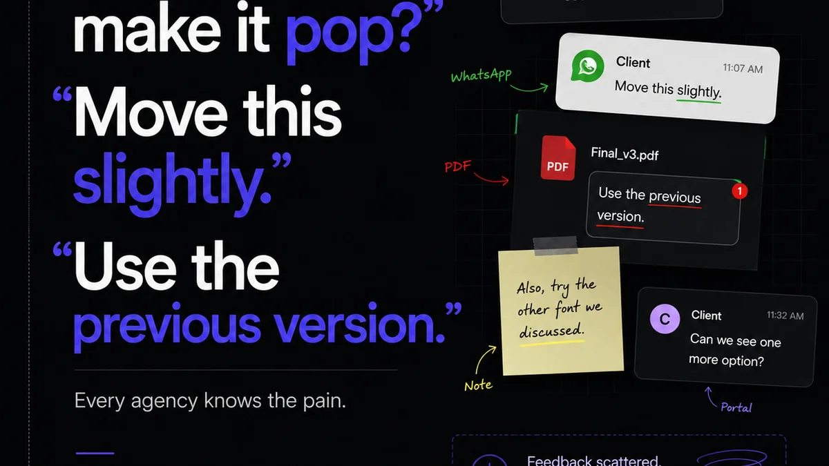
You’ve seen it. The client calls, emails, or Slack message: “The font looks weird on the mobile site,” or “This headline is too long and breaks the layout.” These aren’t minor nitpicks. They’re symptoms of a larger problem: insufficient typography quality assurance.
What does this look like in practice?
- Inconsistent font weights and sizes across different devices and browsers.
- Kerning and tracking issues that make text look unprofessional or hard to read.
- Typefaces that don’t render correctly due to missing character sets or poor hinting.
- Line heights that create awkward spacing, impacting readability and visual flow.
- Typefaces that fail to support necessary languages or special characters, alienating international audiences.
- Accessibility barriers for users with visual impairments due to poor contrast or inadequate font choices.
These aren't just visual glitches. They erode brand trust.
They create friction for your audience.
And they cost your agency time and money to fix, often under tight deadlines.
2. Beyond the Design File: Typography QA Workflow
Typography QA shouldn't be the designer’s final “look over” before handover. It needs to be a systematic process integrated into your workflow.
This means moving beyond the design software and into the real-world context where your type will live.
Content is King, But Context is Emperor
Design files are static representations. The real test comes when type meets dynamic content and multiple environments.
What’s the difference between a font in Figma and a font on a live website?
Character Sets: Does the typeface include all the characters needed? This includes punctuation, symbols, accents, and characters for specific languages. A missing character can break a headline or a crucial call to action.
Font Weights & Styles: Are all intended weights (light, regular, bold, etc.) and styles (italic) present and rendering correctly? Inconsistent application here is a common QA oversight.
Kerning & Tracking: While often handled by font designers, specific pairs or large-scale text can still require manual adjustment. Poor kerning makes text look amateurish.
Line Height & Leading: This affects vertical spacing. Too tight, and text becomes claustrophobic. Too loose, and the eye struggles to track from one line to the next. This is highly dependent on context (screen size, content length).
Hierarchy & Scale: Is the typographic hierarchy clear and consistent across all touchpoints? Headlines, subheads, body copy, captions – they all need defined, reproducible sizes and weights.
The Technical Stack Matters
Your typography’s appearance is influenced by more than just the font file and your design choices. The technology it’s served on plays a huge role.
- Browser Rendering: Different browsers (Chrome, Safari, Firefox) can render fonts slightly differently due to anti-aliasing and font smoothing algorithms.
- Operating Systems: Font rendering also varies between macOS, Windows, and mobile OSs.
- Screen Resolution & DPI: High-density displays (Retina) can present type differently than standard displays.
- Web Font Loading: How are your web fonts being loaded? Are they causing a Flash of Unstyled Text (FOUT) or a Flash of Invisible Text (FOIT)? This impacts perceived performance and user experience.
- CSS Properties: Properties like `font-feature-settings` (for OpenType features) and `text-rendering` need to be correctly implemented and QA’d.
Ignoring these technical variables means your typography QA is incomplete.
3. Accessibility: The Unskippable Requirement
Typography is foundational to accessibility. If your type isn’t accessible, your content isn’t accessible.
This isn't just good practice; it's often a legal requirement.
Key considerations for accessible typography QA include:
- Contrast Ratio: Text must have sufficient contrast against its background. Tools like the Web Content Accessibility Guidelines (WCAG) provide clear standards.
- Font Choice: Some fonts are inherently more readable than others. Sans-serif fonts are generally preferred for screen readability, but clarity is paramount. Avoid overly decorative or condensed fonts for body copy.
- Sizing: Users should be able to resize text without loss of content or functionality. Ensure your responsive design handles this gracefully.
- Line Length and Spacing: Long lines of text or cramped spacing hinder readability, especially for users with cognitive impairments or dyslexia.
Accessible typography isn't a separate checklist item; it's woven into the fabric of good typographic design and QA.
4. Developing Your Typography QA Checklist
A structured checklist is your best defense against typographic errors. Tailor this to your agency’s specific needs, but consider these core areas:
A. Design File Review
- Font Consistency: Are only approved brand fonts used? Are weights and styles applied correctly per style guide?
- Hierarchy & Scale: Is the typographic hierarchy clear and consistent across all elements (H1-H6, body, lists, captions)?
- Spacing: Check line height (leading), paragraph spacing, and letter spacing (tracking) for readability and visual appeal.
- Kerning: Spot-check critical headlines or specific kerning pairs that are known to cause issues.
- Special Characters: Ensure all necessary symbols, punctuation, and accented characters are present and render correctly.
- Ligatures & OT Features: Are desired OpenType features (like ligatures) enabled or disabled as intended?
B. Development & Implementation Review
- Font Loading: Are web fonts loading efficiently? Is FOUT/FOIT minimized?
- Cross-Browser/Device Testing: Check rendering, spacing, and hierarchy on target browsers and devices.
- Responsive Behavior: Does typography reflow correctly at different breakpoints? Can text be resized by the user?
- Contrast Ratios: Verify text-to-background contrast meets accessibility standards (WCAG AA minimum).
- Code Syntax: Ensure CSS properties for fonts (`font-family`, `font-weight`, `font-style`, `line-height`, `letter-spacing`) are correctly applied.
This isn't about catching every tiny flaw; it's about ensuring the core typographic system is robust and error-free.
5. Where Revue Fits In
Managing client feedback and revisions around design elements, including typography, can become chaotic. This is where a centralized platform like Revue becomes essential for typography QA.
Centralized Feedback: Instead of scattered email chains or Slack messages, all feedback on design iterations—including specific typographic notes—can be logged directly on the asset within Revue. This creates a single source of truth.
Revision Visibility: Track how typographic changes are implemented across versions. See who made what change, when, and whether it was approved. This clarity is vital for complex projects with multiple stakeholders.
Quality Check Integration: Use Revue’s structured review and approval workflows to build in mandatory typography QA steps. Ensure sign-off only happens once all typographic requirements and accessibility checks have been met.
By streamlining communication and providing clear version history, Revue helps ensure that typographic decisions are deliberate, approved, and implemented correctly, reducing the risk of errors slipping through.
6. Final Thought
Typography is more than just picking a pretty font. It’s a fundamental aspect of user experience, brand communication, and accessibility.
Are you treating your typography QA with the seriousness it deserves?
Or are you still treating it as a final, superficial polish?
Frequently asked questions
What is the difference between kerning and tracking?
Kerning refers to the adjustment of space between specific pairs of letters (e.g., 'AV'), while tracking (or letter-spacing) refers to the uniform adjustment of space between all letters in a block of text.
How does typography QA impact accessibility?
Typography QA ensures text is readable for all users by checking for adequate contrast ratios, appropriate font choices, sufficient sizing, and comfortable line spacing, all of which are critical for users with visual or cognitive impairments.
What are the main risks of poor typography QA in an agency?
Poor typography QA can lead to brand inconsistency, a degraded user experience, client dissatisfaction, costly revisions, and potential legal issues related to accessibility non-compliance.
How can a design agency improve its typography QA process?
Agencies can improve typography QA by developing comprehensive checklists, integrating QA into every stage of the workflow, ensuring cross-browser/device testing, and leveraging project management tools for feedback and approval.