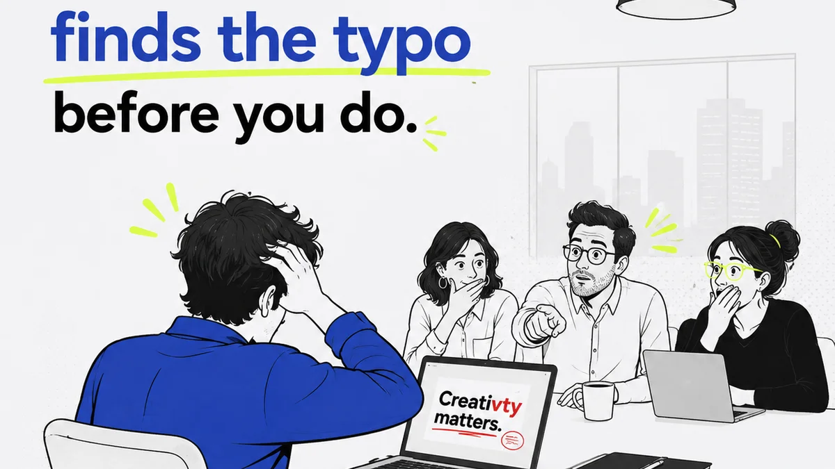
You think typography QA is about making sure the right fonts are loaded on the webpage. Maybe checking if the font files are present.
None of that is wrong. But it’s incomplete.
The hard truth? Typography QA is a critical, often overlooked, quality control gate that impacts brand perception, user experience, and overall project success. Get it wrong, and you’re not just shipping bad type; you’re shipping a broken brand experience.
1. Beyond the Font File: What Typography QA Really Means
Typography QA isn't just about the presence of a font file. It’s a comprehensive audit of how type is implemented across all touchpoints. This includes:
- Hierarchy and Readability: Are headings, subheadings, and body copy distinct and easy to scan?
- Consistency: Is the same font family, weight, and style used consistently for similar elements across the entire project?
- Spacing: Is line height (leading), letter spacing (tracking), and word spacing appropriate for readability and aesthetic appeal?
- Alignment: Are text blocks aligned correctly (left, right, center, justified) and consistently?
- Legibility: Is the chosen font readable at various sizes and on different devices?
- Accessibility: Does the typography meet contrast ratios and font size requirements for users with visual impairments?
- Brand Voice: Does the typography choice effectively communicate the desired brand personality?
This is the real work. This is where your brand’s visual identity lives or dies.
2. The Common Pitfalls of Typography Implementation
Agencies and in-house teams stumble on typography QA for predictable reasons. They often stem from a lack of standardized processes and a misunderstanding of the typographic detail required.
Inconsistent Styles
This is the most common offender. Different designers might interpret “heading 1” differently, leading to variations in font size, weight, or even the font family itself.
It looks amateurish. It erodes trust.
Poor Spacing Choices
Line height that’s too tight makes text feel cramped and hard to read. Too loose, and it loses its cohesion. Tracking that’s too wide or too narrow can also destroy legibility.
Think about dense paragraphs. They need room to breathe.
Ignoring Accessibility
Many teams overlook the importance of sufficient font size and contrast, especially for body copy. This excludes users and can lead to legal issues.
WCAG guidelines are non-negotiable. WCAG 2.2 provides clear standards.
Device and Browser Fragmentation
What looks perfect on your high-resolution Mac might render poorly on a low-spec Android device or in an older browser. Font rendering engines differ.
This requires testing, not just assuming.
Over-reliance on Defaults
Design tools offer default styles. Many teams ship with these defaults, neglecting to fine-tune them for the specific project and brand.
Defaults are a starting point, not an endpoint.
3. Building a Robust Typography QA Checklist
A good typography QA process starts with a clear, actionable checklist. This isn't just for designers; it’s for project managers, developers, and anyone involved in the final delivery.
Global Styles Audit
- Verify all defined typographic styles (H1, H2, body, captions, etc.) exist and are applied correctly.
- Check for consistency in font family, weight, size, and color across all instances of a style.
- Ensure no stray, unstyled text elements exist.
Spacing and Alignment Checks
- Review line height (leading) for body copy and headings to ensure optimal readability.
- Check letter spacing (tracking) for headlines and body text, especially for all caps.
- Inspect word spacing for consistency and avoid excessive gaps.
- Verify alignment of text blocks on all relevant breakpoints (desktop, tablet, mobile).
Legibility and Readability Tests
- Test font rendering at smallest specified sizes (e.g., captions, labels).
- Check for hyphenation issues or awkward line breaks.
- Ensure sufficient contrast between text color and background color, referencing accessibility standards.
Cross-Platform and Cross-Browser Testing
- View the design on at least three different device types (e.g., iPhone, Android, desktop).
- Test in the two most recent major versions of Chrome, Firefox, Safari, and Edge.
- Pay attention to font rendering differences and ensure consistency.
Brand Consistency Check
- Does the typography align with the established brand guidelines?
- Are the chosen weights and styles appropriate for the brand’s personality?
4. Integrating Typography QA into Your Workflow
Typography QA shouldn't be an afterthought. It needs to be woven into the fabric of your project lifecycle.
Design Handoff
Ensure design files are meticulously organized. Use features like style guides and component libraries. Tools like Figma or Adobe XD excel here.
Clear documentation is key.
Developer Collaboration
Developers need clear specifications. A style guide or a living style sheet is invaluable. This bridges the gap between design intent and implementation reality.
Regular check-ins prevent misinterpretations.
Staging and Pre-Launch Reviews
This is where your comprehensive checklist comes into play. Have a dedicated QA phase for typography. This isn't just a quick glance; it's a methodical review.
Catching issues here saves immense rework later.
Where Revue Fits In
Managing creative feedback and revisions can quickly devolve into chaos, especially when dealing with the granular details of typography. Emails get lost, comments on PDFs are missed, and version control becomes a nightmare.
Revue provides a centralized hub for all client feedback and internal reviews. Instead of scattered email threads or unclear Slack messages about text alignment or font weights, all feedback lives directly on the creative asset.
This means:
- Centralized Feedback: All comments, including those pertaining to typography, are consolidated in one place, linked to the specific version of the asset.
- Clear Revision History: Track every change, every approval, and every revision request. You can see exactly when a typographic change was requested and implemented.
- Streamlined Approvals: Get clear sign-offs on design iterations, ensuring that typographic details are reviewed and approved before moving to the next stage.
- Quality Control: Use Revue’s structured review process to ensure that typographic elements are checked against your QA checklist before final delivery.
By bringing order to feedback, Revue ensures that the crucial, often subtle, details of typography aren't lost in translation or buried under mountains of communication.
Final Thought
Typography is the silent voice of your brand. It communicates personality, guides the user, and establishes credibility. Is your typography QA process robust enough to ensure that voice is clear, consistent, and compelling across every single touchpoint?
Frequently asked questions
What are the key elements of typography QA?
Key elements include checking font hierarchy, consistency in application (family, weight, size), appropriate line and letter spacing, alignment, legibility at various sizes, accessibility standards (contrast, size), and overall brand voice alignment.
How can I ensure typography consistency across different designers and projects?
Establish a clear, documented typographic style guide that specifies font families, weights, sizes, and spacing rules for all elements (headings, body, captions). Utilize design systems and component libraries within tools like Figma or Sketch to enforce these styles.
What is the role of accessibility in typography QA?
Accessibility in typography QA means ensuring text is readable for all users, including those with visual impairments. This involves checking for sufficient color contrast between text and background, and ensuring font sizes are adequate, especially for body copy, adhering to standards like WCAG.
How does typography QA differ for web vs. print projects?
For web, typography QA must account for browser rendering differences, responsive design, pixel-perfect implementation, and dynamic content. Print QA focuses more on physical output, ink spread, and precise paper dimensions, though core principles of readability and hierarchy remain.