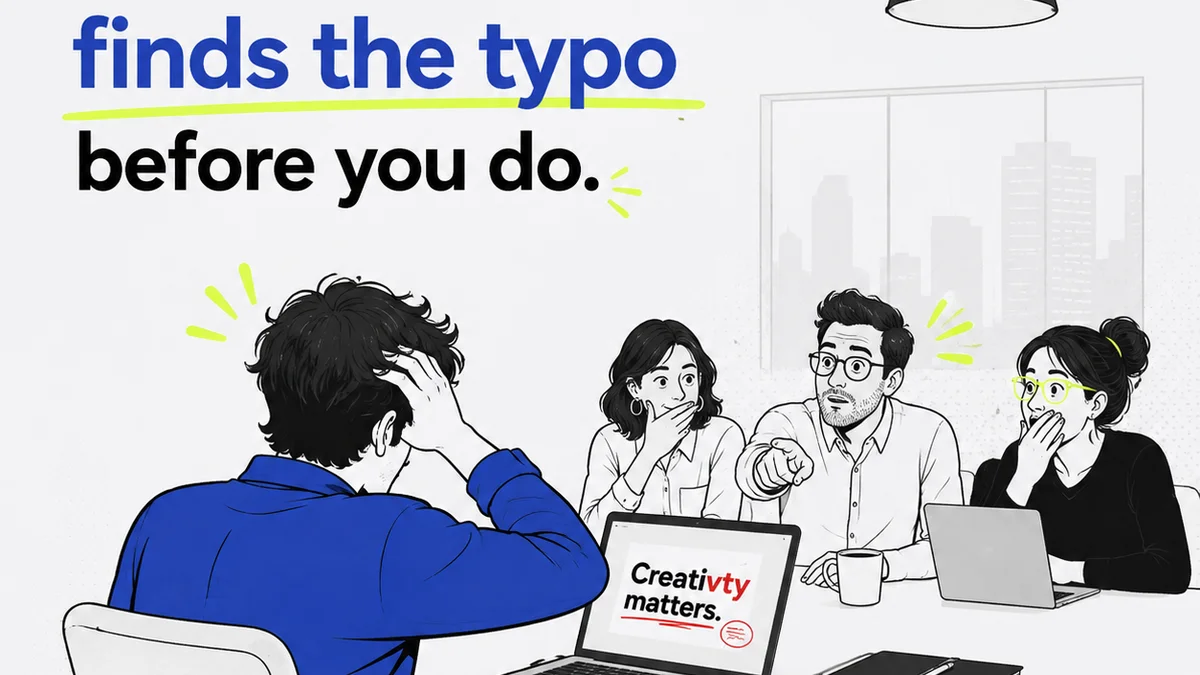
Most agencies think typography quality assurance is just a final check before launch. A quick scan for obvious errors. A tick-box exercise.
None of that is wrong. But it’s incomplete.
The hard truth is that robust typography QA isn't a stage; it’s a continuous process woven into the fabric of your design and development workflow. Treating it as an afterthought guarantees you’ll miss critical issues, leading to unprofessional-looking work, user frustration, and costly rework.
1. The Myth of the 'Final Check'
The assumption that a single, final QA pass can catch all typography problems is a dangerous one. This approach places an impossible burden on the last person in the chain and ignores the cumulative nature of design decisions.
Think about it. Typography choices are made early: brand guidelines, UI kits, content strategy, even the initial wireframes. If the foundation is shaky, no amount of last-minute polishing will fix it.
Font Selection and Licensing
Are you using fonts legally? This isn't just about avoiding fines; it’s about brand integrity. Using pirated or improperly licensed fonts can lead to unexpected costs and legal trouble down the line.
- Verify all font licenses are current and appropriate for web, print, and app use.
- Understand desktop vs. web font licensing differences.
- Confirm you have licenses for all weights and styles used, not just the base font.
Accessibility Considerations
Typography is a primary vehicle for accessibility. Ignoring this early is a critical QA failure.
Legibility isn't subjective; it's a user requirement. Low contrast, tiny sizes, or overly decorative fonts can exclude significant user groups.
Baseline Grids and Vertical Rhythm
This is where many projects fall apart. A beautiful design on screen can become a chaotic mess when text is actually applied.
Is there a consistent baseline grid? Does leading (line-spacing) create pleasing vertical rhythm, especially across different screen sizes and content types? This requires foresight, not just a final glance.
2. The Real Typography QA Process: Integrated Checks
Effective typography QA is about building checks into every phase, from strategy to deployment. It’s about prevention, not just detection.
2.1. Strategy & Brand Foundation
Before a pixel is designed, the typographic strategy must be defined. This is the first QA gate.
- Brand Guidelines: Does the project adhere to established typographic hierarchies and rules? If not, why?
- Target Audience: Are the chosen fonts appropriate for the intended audience and the brand's personality?
- Content Type: Will the selected fonts perform well with the actual content (long paragraphs, short headings, UI labels)?
2.2. Design & Prototyping
Here, typography starts to take visual form. QA needs to focus on consistency and usability.
- Type Scales: Are consistent type scales defined and applied across all elements (headings, body copy, captions, buttons)?
- Hierarchy: Is the visual hierarchy clear and logical? Can users quickly scan and understand content structure?
- Spacing: Is there consistent padding and margin around text elements? Is line-height (leading) appropriate for readability?
- Color Contrast: Does text meet minimum contrast ratios against its background? Tools like the WebAIM Contrast Checker are essential here.
- Responsive Behavior: How does typography reflow and resize across different breakpoints? Does it maintain readability and hierarchy?
2.3. Development & Implementation
This is where design meets reality. Errors often creep in during coding.
- CSS Implementation: Are font-family stacks correct? Are fallbacks in place? Are units (px, em, rem) used appropriately for scalability and accessibility?
- Web Font Loading: How are web fonts loaded? Are FOIT (Flash of Invisible Text) or FOUT (Flash of Unstyled Text) issues managed to provide a good user experience?
- Text Rendering: Are there cross-browser or cross-device rendering differences that affect legibility or spacing?
- Dynamic Content: How does the UI handle dynamically generated text that might be longer or shorter than anticipated? Does it break layouts or create overflow issues?
2.4. Post-Launch & Iteration
QA doesn't stop at launch. User feedback and analytics provide crucial data.
- User Feedback: Are users reporting readability issues?
- Analytics: Are bounce rates or time-on-page metrics for content pages unusually high or low, potentially indicating readability problems?
- Content Updates: When new content is added, does it adhere to typographic standards?
3. Common Typography QA Pitfalls and How to Avoid Them
Many agencies stumble over the same typographic hurdles. Recognizing them is the first step to avoiding them.
Pitfall 1: Over-reliance on Default Styles
Designers and developers often fall back on default browser styles or basic template settings. This leads to generic, uninspired typography that fails to communicate brand effectively.
- Fix: Mandate the use of a comprehensive type scale and spacing system from the outset. Document these rules clearly.
Pitfall 2: Ignoring Accessibility Standards
This isn't just a compliance issue; it's a business imperative. Failing to meet standards like WCAG (Web Content Accessibility Guidelines) excludes users and can lead to legal challenges.
- Fix: Integrate accessibility checks into every design and development sprint. Use automated tools and manual reviews. Refer to WCAG guidelines for detailed requirements.
Pitfall 3: Inconsistent Spacing and Alignment
This is a hallmark of amateur design. Misaligned text, inconsistent line heights, and erratic paragraph spacing scream 'unprofessional'.
- Fix: Implement and enforce a strict baseline grid. Use design tools that support grid systems and auto-layout features effectively.
Pitfall 4: Poor Web Font Performance
Large font files or inefficient loading strategies can cripple page speed, a critical factor for user experience and SEO.
- Fix: Optimize font files (e.g., WOFF2 format). Use `font-display: swap;` or `optional;` in CSS to manage rendering. Limit the number of font weights and styles used.
Pitfall 5: Lack of Clear Ownership
When no one is explicitly responsible for typography QA, it falls through the cracks. Everyone assumes someone else is handling it.
- Fix: Assign clear ownership for typography standards and QA, whether it's a dedicated role, a lead designer, or a project manager.
4. Tools for Better Typography QA
Leverage technology to streamline your typography QA. Manual checks are vital, but tools can catch issues faster and more consistently.
- Design Software Features: Figma, Sketch, and Adobe XD offer robust tools for defining type styles, grids, and auto-layout.
- Browser Developer Tools: Inspect element allows you to check computed styles, spacing, and font properties directly in the browser.
- Accessibility Checkers: Browser extensions like WAVE or Axe can identify contrast issues and other accessibility-related typography problems.
- Linters and Style Guides: Tools like Stylelint can enforce typographic rules within your codebase.
- Dedicated QA Platforms: Software designed for bug tracking and visual regression testing can flag unexpected typographic changes.
Where Revue Fits In
Managing feedback and revisions across multiple stakeholders and iterations can easily lead to typographic drift. This is where a centralized platform like Revue becomes invaluable.
Revue provides a single source of truth for creative assets and client feedback. When feedback is consolidated, you can easily track discussions around typography.
- Centralized Feedback: Instead of scattered email threads and Slack messages, all comments on design elements, including typography, live in one place. This prevents crucial details from getting lost.
- Revision Visibility: See exactly how typographic elements have been adjusted (or misadjusted) between versions. This clarity is essential for maintaining consistency.
- Approval Tracking: Ensure that changes to typography have been explicitly approved, preventing unauthorized or erroneous modifications before launch.
- Quality Check Integration: Use Revue’s structured workflows to build in specific QA steps for typography, ensuring it’s not just a cursory glance but a thorough review against established standards.
By keeping all communication and version history in one place, Revue helps ensure that typographic integrity is maintained throughout the project lifecycle, reducing the risk of last-minute errors.
Final Thought
Typography is not merely decorative; it's functional. It's the bedrock of clear communication and user experience. Are you treating it as the critical design element it is, or just another thing to check off a list?
Frequently asked questions
What is the most common typography QA mistake agencies make?
The most common mistake is treating typography QA as a final, isolated check rather than an integrated, continuous process. This often leads to overlooked errors related to accessibility, responsiveness, and brand consistency that are difficult and costly to fix late in the project.
How can I ensure typographic accessibility?
Ensure sufficient color contrast between text and its background (refer to WCAG guidelines), use legible font choices, maintain adequate line spacing and paragraph spacing, and ensure text can be resized without loss of functionality or content. Test with accessibility tools and consider users with visual impairments.
What's the difference between typography QA in design vs. development?
In design, QA focuses on visual hierarchy, type scales, spacing, alignment, and overall aesthetic. In development, QA shifts to ensuring the design is implemented correctly in code: correct font loading, responsive behavior, cross-browser consistency, and adherence to accessibility standards like text resizing and contrast ratios.
How do font licenses impact typography QA?
Font licensing is a critical part of typography QA. Agencies must verify that they have the appropriate licenses for the intended use (web, print, app) and distribution. Using improperly licensed fonts can lead to significant legal and financial penalties, impacting the project and the agency's reputation.
Can typography QA be automated?
Some aspects of typography QA can be automated, particularly for checking color contrast, basic font properties, and adherence to coding standards using linters. However, nuances like vertical rhythm, visual hierarchy, brand consistency, and overall legibility still require manual review by experienced designers and QA professionals.