Everyone thinks typography QA is just about checking if the right font is used. Or if the kerning looks okay at a glance. None of that is wrong. But it’s incomplete.
The hard truth? Typography QA is a deep dive into the brand’s visual DNA and a crucial gatekeeper for client satisfaction. It’s not just about aesthetics; it’s about consistency, accessibility, and brand integrity across every touchpoint.
1. The Real Cost of Bad Typography
Failing to nail typography isn't a minor oversight. It’s a direct hit to brand perception and user experience. Think about it: inconsistency breeds distrust. Typos, awkward spacing, or incorrect weights can make even the most brilliant creative concept look amateurish.
This isn't just about looking good. It’s about being understood. Poor typographic choices can actively hinder readability, alienating users and forcing them to work harder to consume your content.
Brand Erosion
Your brand's typography is its voice. When that voice is off-key, the entire brand message suffers. A client's carefully crafted brand guidelines become meaningless if the team can't execute them flawlessly.
User Frustration
Users expect clarity and ease. When type is difficult to read—whether due to small sizes, poor contrast, or bad line spacing—they get frustrated. This leads to higher bounce rates and lower engagement.
Accessibility Barriers
This is non-negotiable. Incorrect font choices, insufficient contrast, or unreadable character sets can exclude users with visual impairments. This isn't just bad practice; it can have legal implications.
2. Establishing a Typography QA Checklist
A solid typography QA process doesn't happen by accident. It requires a structured approach. Think of this as your essential checklist for every project, every deliverable.
Font Family & Weights
Is the correct font family applied? Are the specified weights (e.g., Regular, Bold, Light) used consistently across headings, body copy, and UI elements? Check for accidental substitutions.
Size & Hierarchy
Does the typography respect the defined hierarchy? Are headings significantly larger than body text? Is body text legible at its intended size? Are there specific minimum font sizes for web or print?
Line Height & Spacing (Leading & Kerning)
Is the line height (leading) appropriate for readability? Too tight, and lines run together. Too loose, and the text loses cohesion. Is kerning applied correctly, especially for headlines and display type? Auto-kerning isn't always perfect.
Color Contrast
Does the text color have sufficient contrast against its background? This is critical for accessibility. Tools like the Web Content Accessibility Guidelines (WCAG) provide contrast ratio standards.
Alignment & Justification
Is text aligned consistently? Are there issues with justified text creating excessive white space (rivers)? Is ragged text creating awkward hyphenation or too-short lines (widows/orphans)?
Case & Punctuation
Are all-caps used sparingly and intentionally? Are apostrophes, hyphens, and em dashes used correctly? These small details matter.
Language & Localization
Does the chosen typeface support all necessary characters for the target language(s)? Some fonts are optimized for English but break in other scripts.
3. Implementing a Typography QA Workflow
A checklist is only as good as its implementation. How do you bake typography QA into your daily grind without slowing everything to a halt?
Pre-flight Checks
Before any design leaves the studio for client review, a preliminary check is essential. This should be part of the designer's own review process.
- Self-review against the established checklist.
- Use design tool features (like spell check, style overrides) to catch common errors.
- Compare against brand guidelines or a style guide.
Cross-Functional Review
The second pair of eyes is vital. This could be a senior designer, a creative director, or even a project manager with a keen eye.
- Dedicated time for review, not an afterthought.
- Focus on the typography checklist points.
- Ensure consistency across different screens or print layouts.
Client-Facing QA
When presenting to the client, the work should already be polished. However, a final check before final delivery is still prudent.
- Verify that client feedback on typography was implemented correctly.
- A quick scan for any new issues introduced during revisions.
Automated Tools
Leverage technology where possible. Many design tools and development platforms offer checks.
- Linters for code that flag typographic inconsistencies.
- Accessibility checkers that scan for contrast issues.
- Font management tools to ensure correct versions are in use.
4. Typography QA for Different Deliverables
The specific checks might vary slightly depending on the medium. What works for a website might need adjustment for a printed brochure.
Web & Digital Interfaces
- Responsiveness: Does font size and line height adapt gracefully across different screen sizes?
- Legibility: Is body text readable at small sizes on mobile devices?
- Performance: Are web fonts loading efficiently? Are only necessary weights being loaded?
- Accessibility: Is contrast sufficient for all users? Are font choices screen-reader friendly?
Print Collateral
- Resolution: Are fonts rendered sharply at print resolution? Are vector fonts used where appropriate?
- Bleed & Margins: Does text sit correctly within trim and safe areas?
- Color Mode: Are fonts in the correct color mode (CMYK vs. RGB) for the print process?
- Hyphenation & Justification: Pay close attention to rivers of white space and awkward breaks.
Brand Guidelines
This is the ultimate source of truth. Every typographic decision must align with the brand guide.
- Verify primary and secondary typefaces.
- Check usage rules for weights, sizes, and styles.
- Ensure proper application of logos and logotypes that contain type.
5. Where Revue Fits In
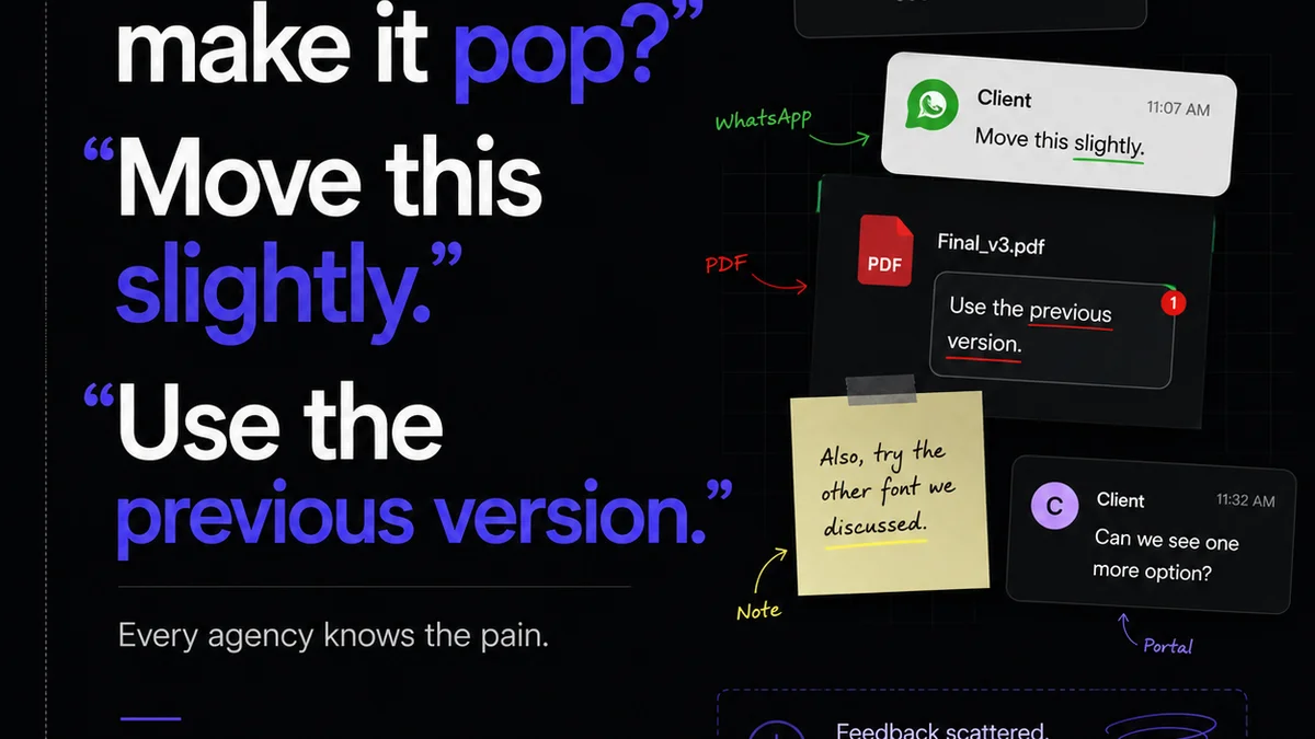
Managing feedback and revisions across multiple stakeholders can introduce typographic errors. This is where a centralized platform like Revue becomes invaluable for typography QA.
Revue acts as a single source of truth for creative assets and feedback. Instead of scattered email threads or messy annotation tools, all comments are logged against specific versions of a design.
Centralized Feedback
When clients or internal teams provide feedback directly within Revue, it’s tied to the exact asset and version. This eliminates confusion about which comment applies to which iteration, reducing the chance of missed typographic instructions.
Revision Visibility
Every change made in response to feedback is tracked. You can easily see what was modified, by whom, and when. This provides a clear audit trail, making it simple to verify that typographic adjustments were made correctly and completely.
Quality Control Gate
Before a final design is approved, Revue allows for a structured quality control process. You can ensure that all feedback has been addressed and that no new typographic issues have been introduced during the revision cycle.
This systematic approach minimizes the risk of errors slipping through the cracks, ensuring that the final deliverable is polished and on-brand.
Final Thought
Typography is more than just choosing a font. It's a fundamental aspect of communication, brand identity, and user experience. Are you treating it with the diligence it deserves?
Frequently asked questions
What is the most common typography error?
One of the most common typography errors is inconsistent application of font weights and sizes across different elements, leading to a disorganized visual hierarchy. Another frequent issue is poor line spacing (leading) which drastically affects readability, especially in long blocks of text.
How can I ensure typography is accessible?
Ensure sufficient color contrast between text and its background, adhering to WCAG guidelines (minimum 4.5:1 for normal text). Choose legible fonts, maintain adequate line spacing, and avoid using color alone to convey information. Test with screen readers where applicable.
What's the difference between kerning and leading?
Kerning refers to the adjustment of space between specific pairs of characters (like 'AV' or 'To') to improve visual appeal and readability. Leading (pronounced 'ledding') is the vertical space between lines of text.
How often should typography QA be performed?
Typography QA should be performed at multiple stages: by the designer as they work, by a second reviewer before client submission, and as a final check before project delivery. It should also be revisited after any significant design revisions.