Most teams think typography QA is about checking for stray periods or consistent font sizes. None of that is wrong. But it’s incomplete.
The hard truth is, proper typography quality assurance requires a deep dive into the details that impact readability, accessibility, and brand consistency. It’s not just about aesthetics; it’s about functionality.
1. The Fundamentals: Beyond Font Names
Before you even think about aesthetics, nail the basics. These are the non-negotiables that form the bedrock of good typography.
Font Consistency
This sounds obvious, but it’s where many projects falter. Are you using the agreed-upon fonts across all digital and print assets? Are there rogue instances of system fonts creeping in?
Size and Hierarchy
Every text element needs a purpose. Its size should reflect that. Headings must be distinct from body copy. Call-to-actions need to stand out. Ensure a clear visual hierarchy guides the user’s eye.
Line Height (Leading)
Too tight, and text becomes claustrophobic. Too loose, and the eye struggles to track from one line to the next. Optimal line height is crucial for readability, especially in long-form content.
Line Length (Measure)
Reading becomes difficult when lines are too long or too short. Aim for an optimal character count per line (often cited around 45-75 characters) for comfortable reading.
Alignment
Left-aligned text is generally the easiest to read for most languages. Center-aligned text can be used sparingly for impact but can hinder readability in long blocks. Justify text with extreme caution, as it can create uneven spacing.
2. The Nuances: Where Good Typography Becomes Great
This is where most QA processes stop. But the real magic—and the real problems—lie in the details that affect the reader’s experience on a subconscious level.
Kerning
Kerning is the adjustment of space between specific pairs of letters. Poor kerning creates awkward gaps or overlaps that distract the reader. Think ‘AV’ or ‘To’ – these pairs often need manual adjustment.
Tracking
Tracking is the uniform adjustment of space between letters across a word or block of text. Loose tracking can make text feel airy and less substantial. Tight tracking can make it feel cramped.
Ligatures
Ligatures are characters that combine two or more letters into a single glyph (e.g., ‘fi’, ‘fl’). While often beautiful, they can sometimes cause issues with screen readers or specific rendering engines. Know when to use them and when to disable them.
Hanging Punctuation
Punctuation marks (like periods, commas, quotation marks) can be optically aligned to hang outside the text block, creating a cleaner edge. This requires careful implementation.
Optical vs. Metrics Kerning
Fonts come with built-in metrics. Optical kerning uses algorithms to adjust spacing based on letter shapes. Understanding which to use and when is key.
3. Accessibility: Typography for Everyone
Great typography isn’t just for some users; it’s for all users. Accessibility considerations are paramount.
Contrast Ratios
Text must have sufficient contrast against its background to be readable, especially for users with visual impairments. Tools like the WCAG contrast guidelines provide clear standards.
Font Choice for Readability
Some fonts are simply more legible than others, particularly at smaller sizes or for users with dyslexia. Sans-serif fonts are often preferred for screen reading, but readability depends on the specific design.
Scalability
Users should be able to resize text without breaking the layout or losing information. Ensure your designs are responsive to user-defined text sizes.
Color as the Sole Indicator
Don't rely on color alone to convey meaning. If text is a different color for emphasis, ensure there's another indicator (like bolding) for those who can't perceive color differences.
4. Brand Consistency: The Unifying Element
Typography is a powerful brand asset. Inconsistent typography erodes brand recognition and trust.
Voice and Tone
Does the typography feel appropriate for the brand’s personality? A playful brand shouldn’t use rigid, corporate fonts, and vice versa.
Asset Application
Ensure typography is applied correctly across all touchpoints: websites, apps, social media, print collateral, presentations. Are brand guidelines being followed?
Templating Errors
Templates are prone to errors. Check that placeholder text is correctly formatted and that users of the template aren’t accidentally overriding styles.
5. The QA Checklist: Your Practical Tool
Here’s a checklist to integrate into your workflow. Don’t just tick boxes; understand *why* each item matters.
- Core Font Styles: Correct font family, weight, and style applied?
- Hierarchy: Clear distinction between H1, H2, H3, body, captions?
- Sizes: Consistent and appropriate font sizes for each element type?
- Leading: Optimal line height for readability?
- Measure: Appropriate line length for content type?
- Alignment: Consistent and readable alignment (usually left)?
- Kerning: Awkward letter spacing fixed (especially in headlines)?
- Tracking: Consistent letter spacing, not too tight or loose?
- Ligatures: Used intentionally? Checked for rendering issues?
- Punctuation: Hanging punctuation applied correctly?
- Contrast: Sufficient color contrast against background (WCAG AA minimum)?
- Scalability: Text resizes gracefully without layout issues?
- Brand Alignment: Typography reflects brand voice and guidelines?
- Cross-Browser/Device: Tested on major browsers and devices?
- Accessibility Tools: Checked with screen readers and contrast checkers?
Where Revue Fits In
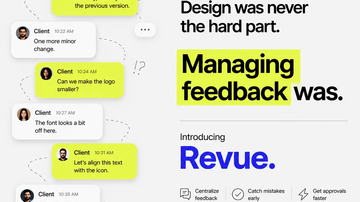
Managing typography QA across multiple stakeholders and revision cycles can become chaotic. Details get lost. Approvals get muddled.
Revue centralizes your creative assets and client feedback in one place. This means your entire team, including QA, can see the latest versions, track revisions, and ensure that typography standards are maintained from the initial concept through final approval.
No more digging through email chains or Slack messages for that one crucial detail. With Revue, your typography QA becomes a transparent, efficient part of the workflow, not an afterthought.
Final Thought
Typography is the silent voice of your design. It communicates brand, guides the user, and dictates readability. Are you giving it the attention it deserves, or are you letting subtle errors undermine your best work?
Frequently asked questions
What is the difference between kerning and tracking?
Kerning adjusts the space between specific pairs of letters (like 'AV'), while tracking adjusts the overall spacing between letters uniformly across a word or text block.
Why is line height (leading) important for typography QA?
Proper line height ensures readability by creating comfortable vertical space between lines of text, preventing it from feeling too cramped or too spread out.
How does typography QA relate to accessibility?
Typography QA ensures elements like sufficient color contrast, clear font choices, and text scalability are implemented, making content readable for all users, including those with visual impairments.
Can typography errors negatively impact brand perception?
Yes, inconsistent or poorly implemented typography can undermine a brand's professionalism, message, and overall trustworthiness in the eyes of the audience.
What's the most common typography mistake agencies make?
Often, it's overlooking the subtle details like improper kerning in headlines, inconsistent leading across different sections, or using fonts that don't meet accessibility contrast standards.