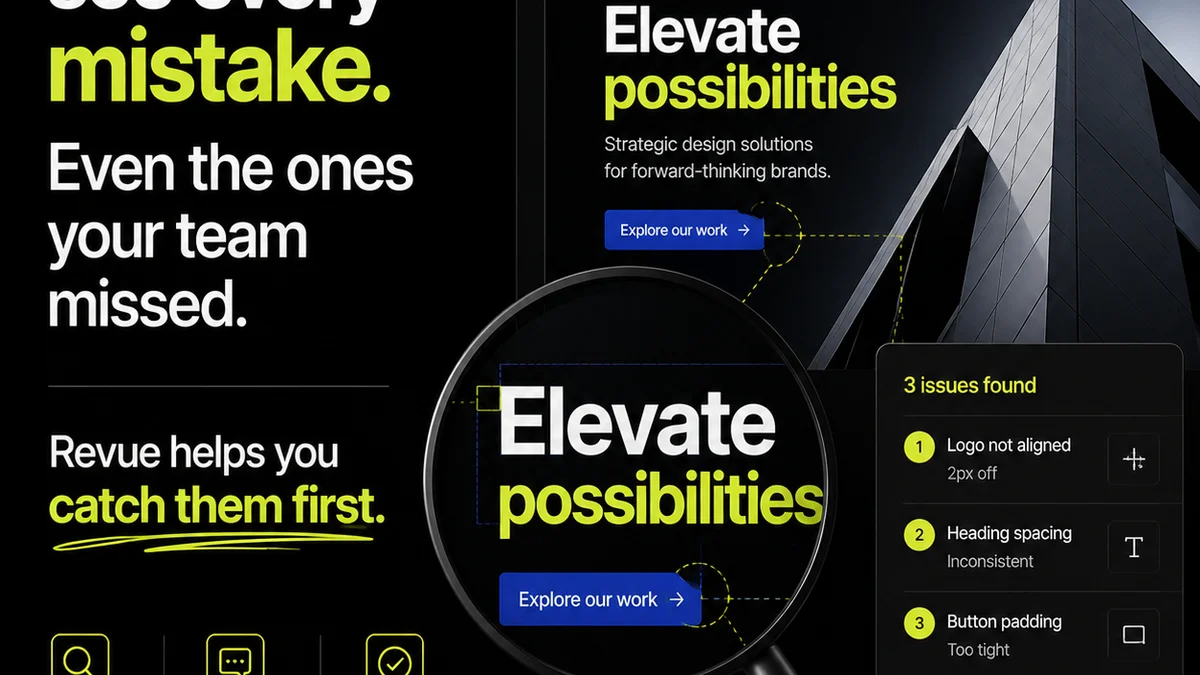
Everyone thinks typography QA is about making things look pretty. That the job is simply to spot rogue widows, uneven kerning, or fonts that don't quite match the brand guide. None of that is wrong. But it’s incomplete.
The hard truth for enterprise teams? Typography QA is an operational bottleneck disguised as a design detail. It’s a critical touchpoint for brand consistency and accessibility, impacting millions of customer interactions. Getting it wrong costs more than just a botched campaign; it erodes trust and dilutes brand equity at scale.
1. The Real Cost of Bad Typography
Most teams treat typography as a purely aesthetic concern. A final polish. This mindset misses the forest for the trees. Poor typography isn't just an eyesore; it’s a functional failure.
Consider these impacts:
- Reduced readability, leading to frustrated users and missed calls-to-action.
- Inconsistent brand experience across global markets and diverse platforms.
- Accessibility failures, alienating a significant portion of your audience.
- Increased revision cycles, draining valuable time and resources.
- Legal and compliance risks due to non-adherence to accessibility standards.
For enterprise organizations, where brand touchpoints are manifold and global, these failures multiply exponentially.
The Accessibility Imperative
This isn't a niche concern anymore. Accessibility, including clear and legible typography, is a legal and ethical requirement. Standards like the Web Content Accessibility Guidelines (WCAG) mandate specific considerations for font size, line height, and contrast. Failing here isn't just bad design; it's a compliance risk.
Brand Dilution at Scale
Your brand guide might specify a font. But how is it implemented? Is it embedded correctly? Is the correct weight used consistently? Are ligatures disabled where they cause rendering issues? Small deviations, repeated across thousands of assets, create a thousand tiny cuts to your brand's perceived quality and professionalism.
2. Beyond the Brand Guide: Practical Typography QA Checks
A brand guide is a starting point, not an end. Enterprise typography QA needs a rigorous, systematic approach that goes beyond visual inspection.
Technical Font Implementation
This is where many teams stumble. It’s not just about *which* font, but *how* it’s deployed.
- Font File Formats: Are you using appropriate formats for web (e.g., WOFF2) and print? Are fallback fonts defined correctly?
- Licensing Compliance: Are your font licenses valid for all intended uses (web, print, app, embedding)? This is a major enterprise risk.
- Subseting and Performance: For web, are font files subsetted to include only necessary characters? Large font files kill page load speed.
- Cross-Browser/Platform Testing: Do fonts render consistently across Chrome, Firefox, Safari, Edge, iOS, and Android? Minor rendering differences can be jarring.
Layout and Spacing Integrity
Typography lives in context. Its surrounding space is as critical as the letterforms themselves.
- Line Height (Leading): Is it consistent and appropriate for the font size and context? Too tight or too loose harms readability.
- Paragraph Spacing: Is there clear visual separation between paragraphs? Often, a simple `margin-top` or `margin-bottom` is overlooked.
- Character Spacing (Tracking): While often handled by designers, check for egregious over- or under-spacing in headings or long blocks of text.
- Word Spacing: Uneven word spacing can create rivers of white space, disrupting the reading flow.
Typographical Hierarchy and Readability
Users scan. Your typography must guide their eyes efficiently.
- Hierarchy Clarity: Is it immediately obvious which is the heading, subheading, body text, and caption? Visual weight, size, and spacing all contribute.
- Contrast Ratios: Does the text have sufficient contrast against its background? Use tools to verify against WCAG AA or AAA standards.
- Font Size Minimums: Are body text sizes large enough for comfortable reading on various devices? For web, consider Material Design's guidance or similar established scales.
- Hyphenation and Justification: Is hyphenation used appropriately, or does it create awkward
Frequently asked questions
What are the key components of typography QA for enterprise teams?
Key components include technical font implementation (file formats, licensing, performance), layout and spacing integrity (line height, paragraph spacing), and typographic hierarchy/readability (contrast, font size, consistency across platforms).
How does typography QA impact brand consistency in large organizations?
Inconsistent typography across thousands of assets, channels, and regions dilutes brand perception. Rigorous QA ensures adherence to brand standards, maintaining a unified and professional brand image globally.
What role does accessibility play in typography QA?
Accessibility is a critical component. Typography QA must ensure sufficient contrast ratios, legible font sizes, and appropriate line spacing to meet standards like WCAG, making content accessible to all users and avoiding compliance issues.
How can teams streamline typography QA processes?
Streamlining involves establishing clear checklists, utilizing automated tools for contrast checks, defining font usage patterns in design systems, and centralizing feedback and approval workflows to manage revisions efficiently.