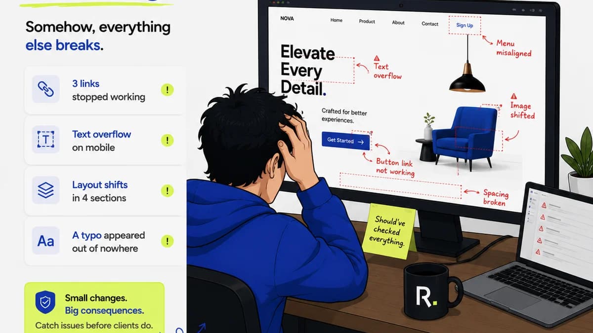
Everyone agrees that a UI QA checklist is essential. You can’t ship code without one. It’s the safety net that catches the obvious bugs: broken links, misaligned buttons, typos.
None of that is wrong. But it’s incomplete.
The hard truth is that a checklist focused only on surface-level defects is a liability. It breeds a false sense of security, masking deeper issues that impact user experience, brand perception, and ultimately, your bottom line.
1. The Illusion of Completeness
Most UI QA checklists are built on a foundation of “what if it’s broken?” This approach is reactive. It’s about finding individual errors.
Think about it: Does your current checklist account for:
- Inconsistent spacing across different components?
- Confusing microcopy that leaves users guessing?
- Accessibility violations that exclude a segment of your audience?
- Performance bottlenecks that make the interface sluggish?
- A user flow that feels clunky or unintuitive, even if every element is technically correct?
If these aren't explicitly called out, you're likely missing critical quality issues.
The Real Problem: Process, Not Just Pixels
The real problem isn't usually a single developer or QA tester dropping the ball. It's a process that doesn't account for the holistic nature of a good user experience. A pixel-perfect component in isolation can still be part of a terrible user journey.
This is where the conversation needs to shift from *finding bugs* to *ensuring quality*.
2. Shifting from Bug Hunting to Quality Assurance
Quality Assurance (QA) is more than just bug hunting. It's about validating that the product meets user needs and business objectives. It’s proactive, not just reactive.
A robust UI QA process looks beyond individual defects to evaluate:
User Experience (UX) Integrity
Does the UI feel intuitive? Is the navigation clear? Are calls to action obvious? Does the overall experience align with user expectations and the intended user journey?
Brand Consistency
Does the UI reflect the brand's visual identity? Are colors, typography, and tone of voice consistent across all touchpoints? Does it feel like the same product, regardless of the screen?
Accessibility Standards
Is the interface usable by people with disabilities? This includes keyboard navigation, screen reader compatibility, sufficient color contrast, and clear focus indicators.
Performance and Responsiveness
Does the UI load quickly? Does it adapt gracefully to different screen sizes and devices? Are there any performance bottlenecks that frustrate users?
Functional Correctness (The Obvious Stuff, Done Right)
Of course, the basics still matter. All interactive elements should function as expected. Forms should submit correctly. Data should be displayed accurately. But this is just one piece of the puzzle.
3. Building a Deeper UI QA Checklist
To move beyond superficial checks, your checklist needs to evolve. It should guide testers to evaluate the product on multiple levels.
Foundational Checks (The Basics)
- Element Functionality: All buttons, links, forms, and interactive elements work as intended.
- Content Accuracy: Text is free of typos and grammatical errors. Data displayed is correct.
- Layout and Alignment: Elements are properly aligned and spaced according to design specifications. No overlapping or cut-off content.
- Cross-Browser/Device Compatibility: UI renders correctly on target browsers and devices.
Advanced Checks (The Experience)
- Visual Consistency: Color palette, typography, iconography, and spacing are uniform across the application.
- Interaction States: Hover, focus, active, and disabled states for all interactive elements are clearly defined and functional.
- Error Handling: Clear, user-friendly error messages are displayed when things go wrong. Validation works correctly.
- Usability & Intuition: Navigation is logical. Key actions are discoverable. The flow feels natural.
- Performance: Page load times are acceptable. Animations are smooth. No noticeable lag.
- Accessibility (WCAG Compliance): Keyboard navigability, screen reader compatibility, color contrast, focus management.
- Responsiveness: Layout adapts fluidly to different screen sizes (mobile, tablet, desktop).
Contextual Checks (The Business Goal)
- Goal Completion: Can users easily achieve key tasks (e.g., complete a purchase, submit a form, find information)?
- Brand Alignment: Does the UI accurately represent the brand's identity and tone?
- User Feedback Integration: Have previous user feedback and insights been addressed?
This isn't just a list of things to tick off. It's a framework for thinking critically about the user's entire interaction with the product.
4. The Human Element: Beyond Automated Testing
Automation is fantastic for catching regressions and repetitive tasks. It’s your first line of defense.
But automation can’t replicate human intuition. It can’t judge the *feeling* of an interface. It can’t assess brand alignment or the subtle nuances of user delight.
This is why manual QA, performed by humans who understand the product, the users, and the business goals, remains indispensable.
Empowering Your QA Team
Your QA team needs more than just a technical checklist. They need:
- Clear design specifications: A single source of truth for visual and interaction design.
- User personas and journey maps: To understand who they are testing for and why.
- Context on business goals: To prioritize testing efforts and understand the impact of defects.
- Tools that facilitate thorough review: Beyond basic bug trackers.
When QA is treated as a strategic function, not just a gatekeeping step, the quality of your output skyrockets.
5. Where Revue Fits In
Managing a comprehensive UI QA process, especially across multiple stakeholders and revisions, can be chaotic. This is where a centralized platform like Revue becomes critical.
Centralized Feedback: Instead of scattered emails and chat messages, all client and stakeholder feedback lives in one place, linked directly to the creative asset. This ensures no feedback gets lost and everyone is working from the same input.
Revision Visibility: Track every version of a design, alongside the feedback and decisions made at each stage. This context is invaluable for QA, helping them understand the intended changes and potential ripple effects.
Streamlined Approvals: Formalize the approval process. QA can be a distinct step, ensuring that functional and experiential checks are completed before a final sign-off.
Quality Checks as a Workflow Step: Integrate QA directly into your workflow. Assign tasks, set deadlines, and ensure that quality checks are not an afterthought but a deliberate part of the production cycle.
Revue helps connect the dots between design, feedback, revisions, and final quality assurance, ensuring that the process itself supports, rather than hinders, the delivery of high-quality work.
6. Final Thought
Is your UI QA checklist a tool for finding bugs, or a strategy for building exceptional user experiences?
The answer reveals more about your product quality than any bug report ever could.
Frequently asked questions
What's the difference between UI QA and bug hunting?
Bug hunting focuses on identifying individual defects or errors in the UI. UI QA (Quality Assurance) is a broader process that includes bug hunting but also evaluates the overall user experience, brand consistency, accessibility, and performance to ensure the product meets user needs and business goals.
Why is a UI QA checklist important for agencies?
For agencies, a UI QA checklist ensures that the final product delivered to clients is polished, functional, and meets high standards. It prevents costly revisions, protects the agency's reputation, and leads to more satisfied clients and better user adoption of the final product.
Can automated testing replace manual UI QA?
Automated testing is excellent for catching regressions and repetitive checks, significantly speeding up the process. However, it cannot replicate human intuition, assess the subjective 'feel' of an interface, judge brand alignment, or evaluate nuanced usability issues. Manual QA remains crucial for comprehensive quality assurance.
What are the key areas a UI QA checklist should cover?
A comprehensive UI QA checklist should cover foundational checks (element functionality, content accuracy, layout), advanced checks (visual consistency, interaction states, error handling, usability, performance, accessibility, responsiveness), and contextual checks (goal completion, brand alignment).