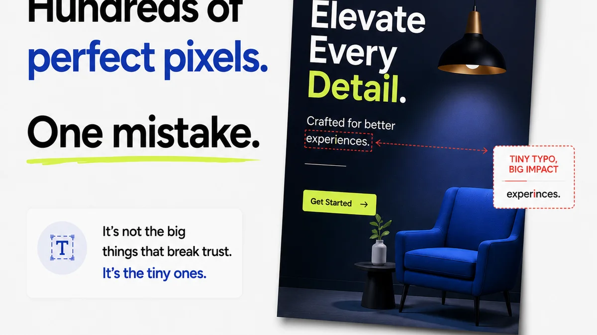
Everyone knows UI QA means checking for bugs. It means ensuring the design looks right across devices and browsers. It means catching typos before launch.
None of that is wrong. But it’s incomplete.
The hard truth is that UI QA is not just a final gate. It’s an ongoing, integrated process that protects your agency’s reputation, your client’s investment, and your team’s sanity. It’s about more than just finding errors; it’s about preventing them and ensuring the final product is not just functional, but strategically sound.
1. The Assumption Trap: QA as a Post-Mortem
Too many teams treat UI QA as the last step before launch. A final sweep. A ceremonial sign-off. This approach is fundamentally flawed. It positions QA as a cost center, a necessary evil, and a blame game waiting to happen.
This reactive stance leads to:
- Last-minute fire drills and rushed fixes.
- Missed critical issues due to time pressure.
- Frustrated clients who see bugs that should have been caught earlier.
- Increased project costs and potential scope creep.
- Burnout for your QA and development teams.
The real goal of UI quality assurance isn’t just to find bugs; it’s to build quality into the process from the start.
2. Shifting Left: Integrating QA Early and Often
Quality Assurance (QA) needs to be woven into the fabric of your design and development workflow, not tacked on at the end. This is often called “shifting left” – moving QA activities earlier in the project lifecycle.
2.1. Design QA: Catching Issues Before Code
Before a single line of code is written, the design itself needs rigorous vetting. This is where many issues can be preemptively resolved.
- Consistency Checks: Are spacing, typography, color palettes, and iconography used consistently according to brand guidelines and design systems?
- Accessibility Review: Does the design meet WCAG (Web Content Accessibility Guidelines) standards for color contrast, focus states, and interactive element sizing? Even at the design stage, these considerations are crucial.
- Usability Flow: Does the user flow make sense? Are there any dead ends or confusing navigation paths?
- Content Accuracy: Is placeholder text removed? Is the actual content (headlines, body copy, CTAs) present, accurate, and appropriately formatted?
- Responsiveness Planning: Have breakpoints and how elements will adapt been considered for various screen sizes?
This design QA phase saves immense time and resources down the line. Fixing a design flaw in Figma is exponentially cheaper than fixing it in a coded product.
2.2. Development QA: Building with Precision
As development progresses, QA becomes more granular, focusing on the implementation of the design and its functionality.
- Code-Level Checks: Are developers adhering to established coding standards and best practices? This includes semantic HTML, efficient CSS, and well-structured JavaScript.
- Cross-Browser/Device Testing: Verifying that the UI functions and appears correctly across different browsers (Chrome, Firefox, Safari, Edge) and devices (desktops, tablets, mobile phones) is non-negotiable.
- Performance Testing: Are images optimized? Is the code efficient? Slow load times kill user experience and conversions.
- Interactive Element Testing: Do buttons, forms, accordions, modals, and other interactive elements behave as expected? Are hover states, focus states, and click feedback present and correct?
- Data Integrity: If forms or data displays are involved, is the data being handled, displayed, and submitted correctly?
This continuous testing prevents the accumulation of technical debt and ensures a stable foundation.
3. The Comprehensive UI QA Checklist
While a generic checklist is a starting point, a truly effective UI QA process is tailored to the specific project. However, here are the core components every checklist should consider:
3.1. Visual & Design Consistency
- Brand Alignment: Colors, logos, typography match brand guidelines.
- UI Element Uniformity: Buttons, form fields, icons, etc., are consistent in style, size, and spacing.
- Layout & Spacing: Margins, padding, and element alignment are consistent and visually pleasing.
- Image Quality: Images are high-resolution, correctly sized, and optimized for web.
- Typography Hierarchy: Headings, subheadings, and body text follow a clear, readable hierarchy.
- Error State Consistency: Form errors, validation messages, and system alerts are styled and presented uniformly.
- Empty States: Pages or sections with no data are handled gracefully with informative and well-designed empty states.
3.2. Functionality & Interactivity
- Interactive Element States: Hover, active, focus, and disabled states are implemented correctly.
- Form Validation: All required fields, data types, and validation rules work as expected.
- Link Functionality: All internal and external links point to the correct destinations and open in the appropriate tabs.
- Interactive Components: Carousels, accordions, modals, dropdowns, and other dynamic elements function without glitches.
- Navigation: Menus, breadcrumbs, and pagination are intuitive and work correctly.
- Search Functionality: Search bars return accurate results and handle edge cases (no results, special characters).
3.3. Performance & Optimization
- Page Load Speed: Pages load within acceptable timeframes across different network conditions.
- Image Optimization: Images are appropriately sized and compressed.
- Code Minification: CSS and JavaScript files are minified.
- Responsiveness: Layout adapts gracefully to different screen sizes and orientations.
3.4. Accessibility (WCAG Compliance)
- Color Contrast: Text and background colors meet contrast ratio requirements.
- Keyboard Navigation: All interactive elements are focusable and operable via keyboard.
- Screen Reader Compatibility: Semantic HTML, ARIA labels, and alt text provide a good experience for screen reader users.
- Focus Indicators: Clear visual indicators show which element currently has keyboard focus.
- Touch Target Size: Interactive elements on touch devices are large enough to be easily tapped.
3.5. Content & Copy
- Typos & Grammatical Errors: All text is free of errors.
- Content Accuracy: Information presented is correct and up-to-date.
- Tone of Voice: Copy aligns with the brand's established tone.
- Placeholder Text: No instances of
Frequently asked questions
What is the primary goal of a UI QA checklist?
The primary goal is to systematically verify that the user interface meets design specifications, functions correctly, is accessible, and provides a positive user experience across various devices and browsers, ultimately ensuring client satisfaction and project success.
When should UI QA begin in a project?
UI QA should begin as early as possible, ideally during the design phase (design QA) and continue iteratively throughout the development process, rather than being solely a final pre-launch activity.
How does UI QA impact project profitability?
By catching errors early, a robust UI QA process prevents costly late-stage rework, reduces the need for extensive bug-fixing post-launch, minimizes scope creep, and ensures client satisfaction, all of which contribute directly to project profitability.
What's the difference between design QA and development QA?
Design QA focuses on verifying the visual design, consistency, and usability of mockups and prototypes before coding begins. Development QA focuses on testing the actual implemented code, ensuring it matches the design, functions correctly, and performs well across different environments.