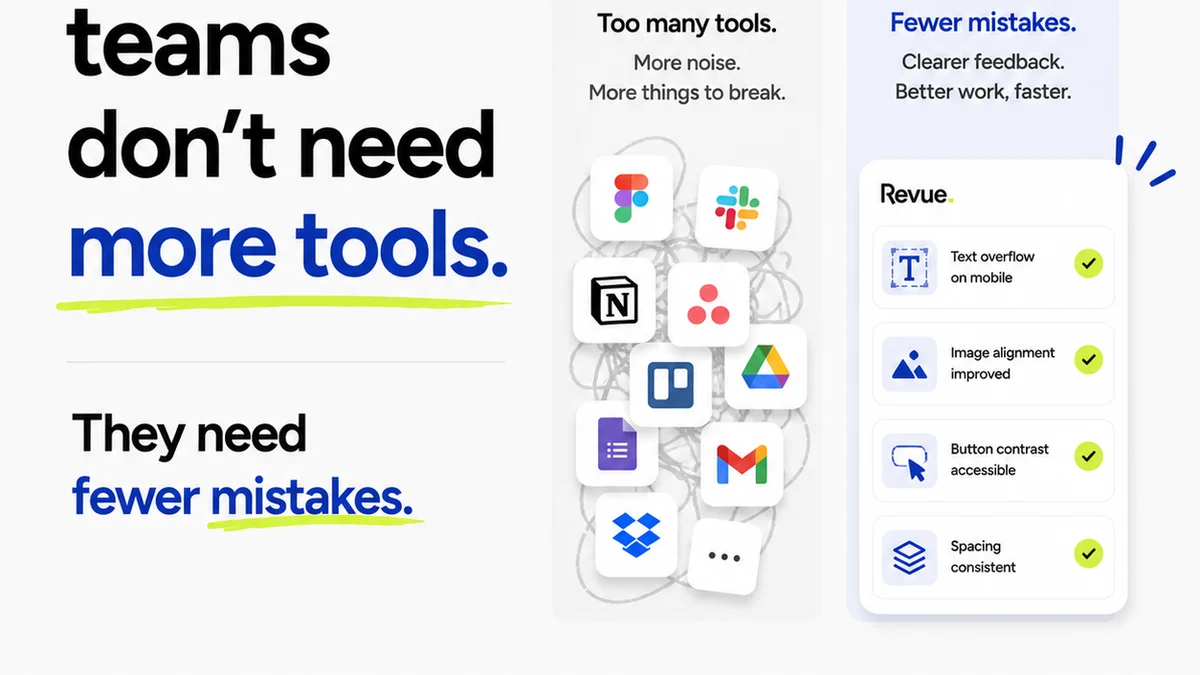
Everyone agrees that QA is important. That it catches bugs. That it saves time and money. None of that is wrong. But it’s incomplete.
The real truth? A robust UI QA checklist isn't just about bug hunting. It's about de-risking your entire creative process. It’s about ensuring the final product doesn't just look good, but *works* flawlessly for the end-user and meets the client's strategic objectives.
1. The Foundation: Understanding Project Goals
Before a single pixel is placed or a line of code is written, the UI QA process must begin with a deep understanding of the project's core objectives.
Understanding User Needs
Who is this for? What problem are we solving for them? A UI that doesn't serve user needs is fundamentally broken, regardless of its aesthetic appeal.
Aligning with Business Goals
What does success look like for the client? Increased conversions? Better engagement? Reduced support tickets? Every design decision, and therefore every QA check, should tie back to these measurable outcomes.
Defining Scope and Requirements
What are the must-haves? What are the nice-to-haves? A clear requirements document is the blueprint for your QA. Without it, you're testing in the dark.
- Review the project brief thoroughly.
- Confirm all acceptance criteria are documented.
- Ensure stakeholder sign-off on initial requirements.
2. Visual Consistency and Brand Alignment
This is where many QA checklists start and end. But true visual QA goes deeper than just matching colors.
Color Palette Adherence
Are primary, secondary, and accent colors used correctly according to the brand guidelines? Are there any stray hex codes floating around?
Typography Hierarchy
Is the font family consistent? Are font sizes, weights, and line heights correctly applied for different text elements (headings, body copy, captions, buttons)? Does it read well on all screen sizes?
Spacing and Layout
Are margins and padding consistent? Does the grid system hold up across different components and pages? Is there enough white space?
Iconography and Imagery
Are icons clear, consistent in style, and appropriately sized? Are images optimized for web and displayed without distortion or pixelation? Do they have alt text?
Brand Voice and Tone
Does the UI copy reflect the brand's personality? Is it clear, concise, and error-free? This is often overlooked in visual QA but is critical for brand perception.
3. Functionality and Interactivity Testing
This is the core of bug hunting, but it needs structure.
Interactive Elements
- Buttons: Do they look clickable? Do they have hover and active states? Do they link to the correct destinations?
- Forms: Are fields clearly labeled? Is validation working correctly (required fields, email formats, etc.)? Are error messages helpful and clear? Is the submit button functional?
- Navigation: Are menus, links, and breadcrumbs working as expected? Is the user able to navigate intuitively?
- Accordions, Modals, Carousels: Do they open, close, and function correctly? Are they accessible?
User Flows
Map out critical user journeys. For example, the sign-up flow, the checkout process, or a key task completion. Test each step meticulously.
- Can a user complete the primary task without friction?
- Are there any dead ends or unexpected loops?
- Are success messages clear upon completion?
Error Handling
What happens when things go wrong? Test scenarios like network errors, invalid input, or unauthorized access. The UI should provide clear, non-technical feedback.
4. Usability and Accessibility (WCAG Compliance)
A beautiful, functional UI is useless if people can't use it. This is non-negotiable.
Keyboard Navigation
Can users navigate and interact with all elements using only a keyboard? Is the focus indicator visible and logical?
Screen Reader Compatibility
Are all interactive elements properly labeled? Is the content structured semantically? Use a screen reader (like NVDA, VoiceOver, or JAWS) to test key flows.
Color Contrast
Does text have sufficient contrast against its background? Tools like the WCAG contrast checker are essential. Aim for AA or AAA compliance.
Resizable Text and Responsive Design
Does the layout adapt gracefully to different screen sizes (mobile, tablet, desktop)? Can users zoom or increase text size without breaking the layout or losing information?
Clear and Understandable Language
Is the UI copy easy to understand for the target audience? Avoid jargon. Use simple sentence structures.
5. Performance and Technical Checks
A slick UI can be ruined by slow load times or technical glitches.
Page Load Speed
Are images optimized? Are there excessive HTTP requests? Use tools like Google PageSpeed Insights. Slow UIs lead to abandonment.
Cross-Browser and Cross-Device Compatibility
Does the UI render correctly and function as expected on major browsers (Chrome, Firefox, Safari, Edge) and devices (iOS, Android, different screen resolutions)?
Code Validation
While often the developer's domain, designers should be aware of common issues like invalid HTML or CSS that can cause rendering problems. Ensure design specifications are technically feasible.
6. Content Accuracy and Completeness
Don't forget the actual words and data displayed.
Text Accuracy
Proofread all UI text for typos, grammatical errors, and factual inaccuracies. This includes button labels, menu items, and any informational copy.
Data Integrity
If the UI displays dynamic data (e.g., user profiles, product information, pricing), is that data accurate and up-to-date? Are there placeholders left in the design?
Links and CTAs
Are all internal and external links working correctly? Do Call-to-Action (CTA) buttons lead to the intended destinations?
7. Where Revue Fits In
Managing a comprehensive UI QA process across multiple stakeholders and iterations can quickly become chaotic. This is where a centralized platform like Revue becomes invaluable.
Imagine tracking every design version, every client comment, and every approval in one place. No more digging through endless email threads or Slack channels.
Revue allows you to:
- Centralize Feedback: All client and stakeholder feedback lives on the specific design asset. No more lost comments.
- Manage Revisions: Easily see which version is the latest, track changes, and ensure all feedback has been addressed before moving to QA.
- Streamline Approvals: Get clear, documented sign-offs at key milestones, reducing ambiguity and preventing costly rework later.
- Facilitate QA: Provide your QA team with a single source of truth, making it easier for them to test against the latest approved designs and log issues with context.
By integrating Revue into your workflow, you move from reactive bug fixing to proactive quality assurance, ensuring your team is always working from the most up-to-date, client-approved designs.
8. Building Your UI QA Checklist
No two projects are identical. Your checklist should reflect that.
Start with a Template
Use a comprehensive template like the one outlined here as a starting point.
Customize for Each Project
Add, remove, or modify checklist items based on the project's specific requirements, technology stack, and client needs.
Involve the Whole Team
Designers, developers, and QA testers should all contribute to building and refining the checklist. This ensures buy-in and covers all angles.
Make it Actionable
Each item should be a clear, verifiable check. Instead of "Check visuals," use "Verify button states (default, hover, active)."
Iterate and Improve
Your checklist is a living document. Review it after each project to identify what worked, what didn't, and how it can be improved for the next cycle.
Final Thought
Is a UI QA checklist just a list of tasks, or is it a strategic tool for safeguarding your agency's reputation and your client's investment? The difference lies in treating QA not as an afterthought, but as an integral part of the design and development lifecycle, from the very first concept to the final launch.
Frequently asked questions
What is the primary goal of a UI QA checklist?
The primary goal is to ensure the user interface is visually consistent, fully functional, usable, accessible, and performs well across different devices and browsers, ultimately meeting project objectives and user needs.
When should UI QA begin?
UI QA should ideally begin early in the design process, focusing on requirements and goals, and continue through development. Key checks can be performed on wireframes, mockups, and prototypes before final development.
How does a UI QA checklist help with accessibility?
A UI QA checklist ensures critical accessibility standards are met, such as keyboard navigation, sufficient color contrast, screen reader compatibility, and responsive design, making the UI usable for people with disabilities.
What's the difference between UI QA and functional testing?
UI QA focuses on the visual aspects, brand consistency, and user interface elements, while functional testing verifies that specific features and user flows work as intended according to requirements. Both are crucial but distinct.
How can agencies benefit from using a UI QA checklist?
Agencies benefit by reducing costly rework, improving client satisfaction through high-quality deliverables, minimizing bugs in production, and streamlining their internal review processes. It acts as a risk mitigation tool.