Everyone talks about pixel perfection. About sleek animations and intuitive user flows. They say great UI/UX is about empathy, about putting the user first.
None of that is wrong. But it’s incomplete.
The hard truth is, the biggest UI/UX failures in agencies aren't about design theory. They're about workflow. They're about the messy reality of client collaboration, internal reviews, and the sheer volume of feedback that swamps creative teams.
Your beautiful design system can crumble under the weight of a disorganized feedback loop. A perfectly crafted user journey can get derailed by unclear approval processes.
Let’s cut through the noise and talk about the operational mistakes that kill good UI/UX design before it even sees the light of day.
1. The "Feedback Free-for-All"
This is the classic. A client gets a link to a prototype or a set of mockups. They’re told to “leave comments.”
What follows is a tsunami of unstructured feedback. Emails, Slack messages, Word docs, scribbled notes on PDFs. It’s a chaotic mix of subjective opinions, vague requests, and outright contradictions.
The Symptom: Vague and Conflicting Input
You get gems like:
- “I don’t like the color.” (Which color? Why?)
- “Make it pop more.” (What does “pop” even mean in this context?)
- “This feels… off.” (Off how? Where?)
- “Can we try X? My other agency did that.” (Irrelevant to your strategy.)
- One stakeholder loves blue, another hates it.
Your designers drown in this noise, trying to decipher intent and prioritize conflicting demands. It’s not design; it’s a guessing game.
The Fix: Centralize and Structure
Feedback needs a home. A single source of truth where all comments are logged, organized, and actionable.
This means:
- Using a dedicated platform for feedback.
- Implementing clear annotation tools that link comments directly to design elements.
- Establishing a process for consolidating and clarifying feedback before it hits the design team.
- Defining who the final decision-maker is for each project.
When feedback is structured, you can track changes, understand the rationale, and avoid endless back-and-forth on subjective whims.
2. The "Mystery Revision"
Revisions are part of the process. But when they happen in a vacuum, they become a black hole.
A designer makes a change. Maybe it’s a small tweak, maybe it’s a major overhaul. The client is updated, or maybe they aren't. The rationale behind the change? Lost.
The Symptom: Scope Creep and Redundant Work
This leads to:
- Redoing work that was already approved.
- Designers making changes based on assumptions, not clear direction.
- Clients feeling like their feedback isn't being heard or implemented correctly.
- Difficulty tracking the evolution of a design and its associated costs.
- The dreaded “Can we just tweak this one thing?” that spirals into a week of work.
You end up spending more time managing revisions than actually designing.
The Fix: Version Control and Clear Approval Gates
Every revision needs a clear trail.
This involves:
- Maintaining distinct versions of designs.
- Documenting why a change was made.
- Getting explicit sign-off on each significant revision milestone.
- Ensuring the client understands what they are approving at each stage.
Visibility is key. If everyone can see the history of changes and the status of approvals, you prevent misunderstandings and protect your project scope.
3. The "Gut Feeling" Handoff
You’ve designed a beautiful, functional interface. Now it needs to be built. The handoff is often treated as a formality. A quick export of assets and a brief chat.
But the nuances of the design – the spacing, the interactions, the states – are often left to interpretation.
The Symptom: Implementation Gaps
Developers are left guessing:
- What’s the exact padding around this button?
- How does this dropdown behave on hover?
- What happens if the user enters a very long name?
- Are these colors accessible?
- Is this animation smooth or jarring?
The result? The live product doesn’t quite match the design. It feels “off.” This isn't just an aesthetic problem; it impacts usability and the overall user experience.
The Fix: Detailed Specifications and Interactive Prototypes
A successful handoff requires more than just assets.
It needs:
- Detailed design specifications (often called a style guide or design system documentation).
- Interactive prototypes that demonstrate user flows and micro-interactions.
- Clear documentation for states (e.g., hover, active, disabled, error).
- A collaborative space where developers can ask questions and get immediate answers.
- Tools that can export design specs automatically.
Treat the handoff as a critical design phase, not an afterthought.
4. The "Usability Guesswork"
Too often, usability testing is seen as a final QA step, or worse, skipped entirely.
The assumption? “We’re experts; we know what works.”
The Symptom: Unforeseen User Friction
This leads to:
- Users struggling with basic tasks.
- High bounce rates on critical pages.
- Confusing navigation.
- Features that look good but aren't actually used.
- A product that fails to meet business goals because users can't effectively engage with it.
Your internal team, no matter how skilled, has biases and a deep understanding of the product that real users lack. You’re too close to it.
The Fix: Integrate Real User Feedback Early and Often
Usability testing isn't a one-time event.
It should be:
- Integrated throughout the design process, not just at the end.
- Conducted with representative users from your target audience.
- Focused on observing user behavior, not just collecting opinions.
- Used to validate assumptions and identify pain points.
Even informal hallway testing with colleagues outside the project team can uncover obvious flaws. Formal moderated or unmoderated tests provide deeper insights.
Where Revue Fits In
Managing client feedback, tracking revisions, and ensuring design integrity across multiple stakeholders is an operational nightmare. This is where tools designed for creative workflows become essential.
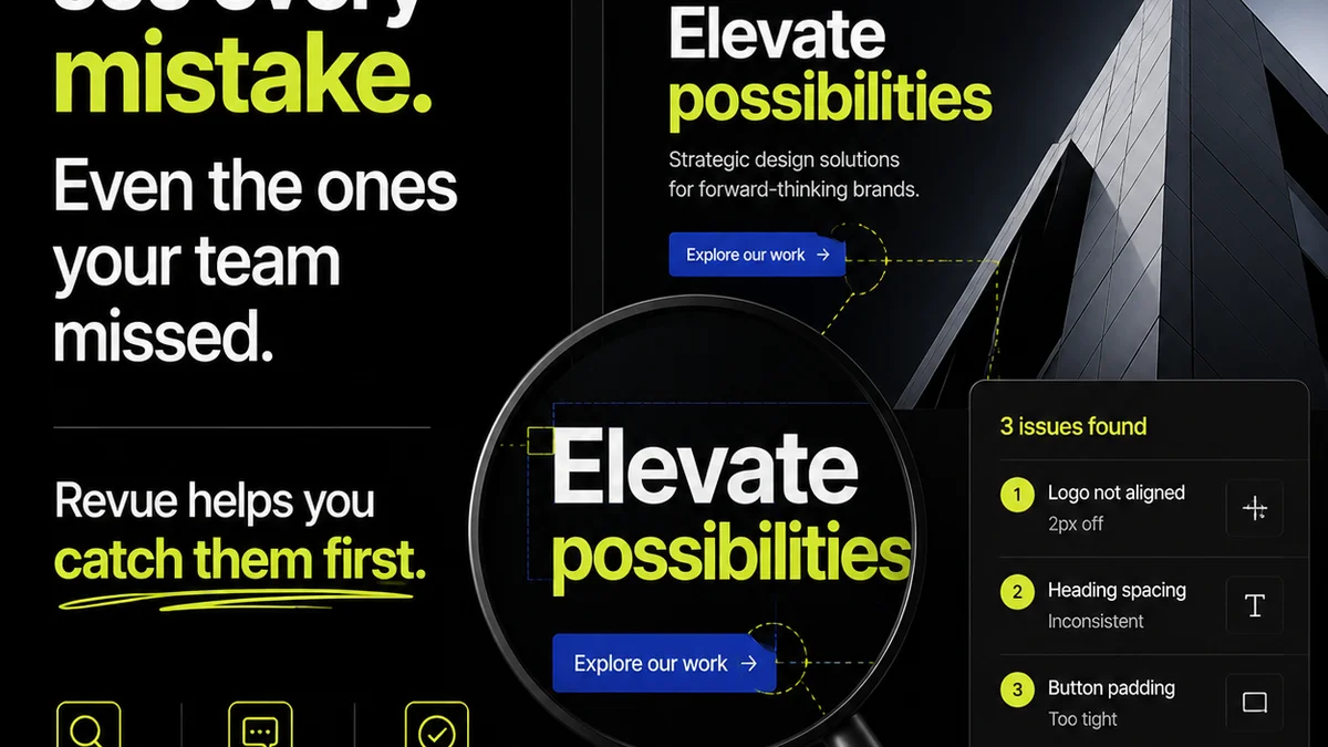
Revue helps centralize all client feedback, linking comments directly to design elements. No more hunting through emails or Slack threads. Every piece of feedback has context.
Our version control features allow you to track the evolution of your designs, see exactly what was changed, and get clear approvals at each stage. This eliminates ambiguity and prevents scope creep.
For handoffs, Revue provides a clear, organized repository of finalized designs and specifications, ensuring developers have the clarity they need to build accurately.
Ultimately, by streamlining these critical operational aspects of the design process, Revue empowers your team to focus on what they do best: creating exceptional UI/UX, free from the chaos of miscommunication and disorganization.
Final Thought
Great UI/UX isn't just about aesthetic appeal or clever interaction design. It's about the robustness of your internal processes.
Are your workflows set up to support great design, or are they inadvertently sabotaging it?
Frequently asked questions
What's the biggest operational mistake agencies make with UI/UX?
The biggest mistake is treating UI/UX as purely a design challenge, ignoring the operational chaos of managing client feedback, revisions, and handoffs. Unstructured feedback loops and unclear approval processes are major culprits.
How can I centralize client feedback effectively?
Use a dedicated platform designed for creative feedback. Tools that allow for annotated comments directly on design elements, linked to specific versions, are crucial. This creates a single source of truth and avoids fragmented communication across emails, Slack, and documents.
Why is version control important for UI/UX revisions?
Version control ensures every change is tracked, documented, and explicitly approved. It prevents redundant work, clarifies scope, and provides a clear history of how a design evolved, avoiding confusion for both the creative team and the client.
How can I improve the design handoff process to developers?
Go beyond asset exports. Provide detailed specifications, interactive prototypes demonstrating interactions and states, and maintain open communication channels. Treat the handoff as a critical design phase, not an afterthought.
When is the best time to conduct usability testing?
Usability testing shouldn't be a last step. Integrate it early and often throughout the design process. Testing with representative users at various stages helps validate assumptions, identify friction points, and ensures the final product truly meets user needs.