Everyone agrees that good UX is crucial. A slick interface, intuitive navigation – these are the hallmarks of a product users love. And when it comes to ensuring that quality, you’ve probably got some form of UX QA checklist in place. You’re checking for broken links, missing alt text, and consistent button styles.
None of that is wrong. But it’s incomplete.
The real hard truth? A superficial UX QA process is a ticking time bomb. It catches the obvious errors, but it misses the fundamental flaws that lead to user frustration, churn, and ultimately, product failure. True UX QA isn't about ticking boxes; it's about deeply understanding user behavior and validating the product's core value proposition at every stage.
1. The Illusion of 'Done'
Many teams view UX QA as the final gate before launch. A last-minute sweep to catch stray typos and visual glitches. This mindset is fundamentally flawed.
It assumes the design and development phases have perfectly translated user needs into a functional product. That’s a big assumption.
The reality of agency and in-house workflows is far messier. Requirements shift. Technical constraints emerge. Design decisions, made with the best intentions, can have unforeseen consequences on the user experience.
Treating UX QA as an afterthought means you’re likely to find major issues when it’s too late – and too expensive – to fix them.
The Hidden Costs of Late-Stage QA
- Increased development rework.
- Missed market opportunities due to launch delays.
- Reputational damage from a buggy or confusing product.
- Lost user trust and loyalty.
- Higher customer support load.
2. Shifting Left: Integrating UX QA Early and Often
The most effective UX QA isn't a distinct phase; it's woven into the fabric of the entire product development lifecycle. This is often called 'shifting left' – moving quality assurance activities earlier in the process.
This means QA isn't just about finding bugs; it's about preventing them by validating assumptions and designs from the outset.
Key Integration Points
- Discovery & Research: Does the initial problem statement and user research hold up? Are the user personas and journey maps realistic?
- Wireframing & Prototyping: Are the core user flows logical? Is the information architecture sound? Can users complete key tasks in a low-fidelity prototype?
- UI Design: Is the visual hierarchy clear? Are interactive elements discoverable? Does the design adhere to accessibility standards?
- Development Sprints: Are new features implemented as intended from a UX perspective? Does the interaction design match the spec?
- Pre-Launch Testing: Final checks, of course, but grounded in the confidence built from earlier validation.
This continuous validation is critical. It ensures that user needs remain the central focus, rather than becoming a casualty of scope creep or technical debt.
3. Beyond the Checklist: Deeper QA Practices
Your basic UX QA checklist is a starting point. But a truly robust process requires digging deeper. It’s about understanding the *why* behind user actions, not just the *what*.
Heuristic Evaluation
This involves having experienced UX professionals evaluate an interface against established usability principles. Think of Jakob Nielsen's 10 Usability Heuristics. It’s a structured way to identify potential usability problems without direct user involvement.
Cognitive Walkthroughs
This technique simulates a user's thought process step-by-step through a task. The evaluator asks specific questions at each stage: Will the user be trying to achieve the right effect? Will the user notice that the correct action is available? Will the user associate the correct action with the effect they are trying to achieve? This is invaluable for complex workflows.
User Testing (Even Small Scale)
You don’t always need a massive, formal user study. Moderated or unmoderated usability testing with even 5-8 representative users can uncover significant issues. Watching real people interact with your product is the ultimate reality check.
Accessibility Audits
Ensuring your product is usable by everyone, including people with disabilities, isn't just good practice – it's often a legal requirement. This goes beyond basic checks and involves understanding standards like the Web Content Accessibility Guidelines (WCAG).
Performance Testing
Slow load times kill UX. Ensure your product feels responsive. This includes checking page load speeds, interaction responsiveness, and behavior under different network conditions.
4. The Human Element: Empathy in QA
The most critical, yet often overlooked, aspect of UX QA is empathy. It’s easy to get lost in the technical details and forget that real people are using your product.
Are you testing with the actual target audience in mind? Are you considering different user contexts – a busy commuter, someone with a visual impairment, a novice user?
This human-centered approach transforms QA from a technical hurdle into a strategic advantage. It ensures the product isn't just functional, but genuinely delightful and effective for its intended users.
Questions to Foster Empathy
- What is the user *really* trying to accomplish?
- What are their emotional states and potential frustrations?
- Are there edge cases based on user background or environment?
- Does the product feel trustworthy and reliable?
5. Where Revue Fits In
Managing the complexities of UX QA, especially across multiple stakeholders and revisions, demands clear communication and centralized information. This is where tools designed for creative workflows become essential.
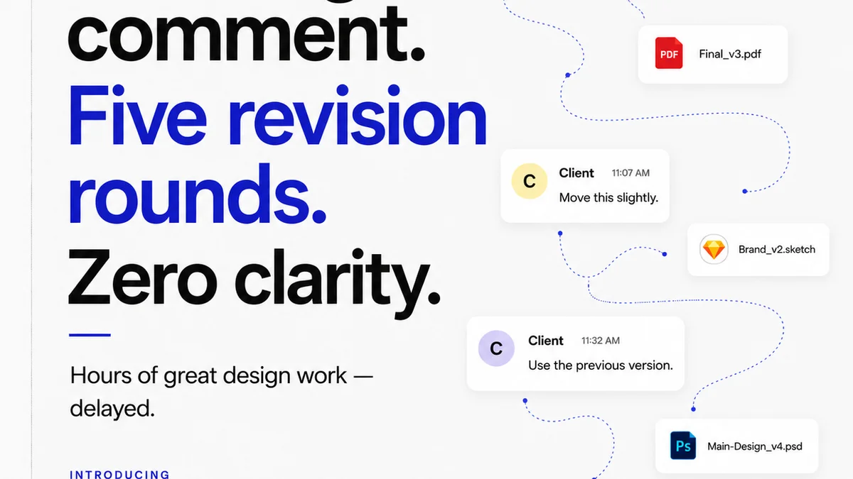
Revue provides a single source of truth for client feedback and design revisions. Instead of chasing scattered email threads or Slack messages, all feedback is logged against specific versions of the creative work.
This centralized system ensures that:
- Feedback is never lost: Every comment, annotation, and approval is tracked.
- Revision history is clear: Stakeholders can see exactly what changed and why, reducing confusion.
- Quality checks are systematic: You can build review stages directly into your workflow, ensuring that UX considerations are addressed before final sign-off.
- Accountability is maintained: It’s clear who approved what, and when.
By streamlining the feedback and approval process, Revue helps teams focus on the substance of UX QA, rather than getting bogged down in administrative overhead.
6. Final Thought
The goal of UX QA isn't just to find bugs. It's to build confidence. Confidence that the product meets user needs. Confidence that it delivers on its promise. Confidence that it’s ready for the world.
Are you treating UX QA as a final check, or as a continuous validation of user value? The answer profoundly impacts your product's success.
Frequently asked questions
What is the difference between UX QA and functional QA?
Functional QA focuses on whether the software works as specified. UX QA focuses on whether the software is usable, efficient, and satisfying for the end-user. It evaluates the user's experience, not just the code's correctness.
When should UX QA start in the product lifecycle?
Ideally, UX QA should start as early as possible, during the discovery and design phases. Continuous validation through wireframe reviews, prototyping, and early development testing is far more effective than waiting until the end.
How can a UX QA checklist be improved?
Expand beyond basic functional checks. Incorporate heuristic evaluations, cognitive walkthroughs, accessibility audits, performance checks, and empathy-focused questions about the user's context and goals.
What are Nielsen's 10 Usability Heuristics?
Nielsen's 10 Usability Heuristics are a set of general principles for user interface design, including visibility of system status, user control and freedom, consistency and standards, error prevention, and recognition rather than recall.