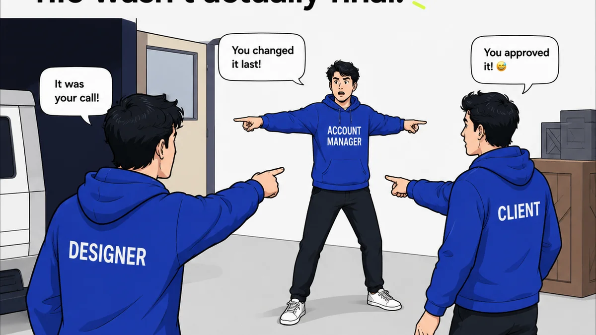
Everyone thinks they know what UX QA is. It’s about finding broken buttons, typos, and glaring usability flaws. That’s not wrong. But it’s incomplete.
For enterprise teams building complex digital products, a robust UX QA checklist goes far beyond the surface.
The hard truth? Your UX QA process is likely leaving critical issues on the table. Issues that impact brand perception, operational efficiency, and user trust at scale.
1. Beyond Functionality: The Enterprise UX Mindset
Enterprise software isn't a single app; it’s an ecosystem. It’s a suite of interconnected tools, often with distinct user bases but shared underlying principles. This complexity demands a QA approach that mirrors it.
Think beyond the single user journey. Consider the system as a whole.
Consistency is King
In a large organization, consistency is the bedrock of trust and efficiency. Inconsistent UX erodes both. Your UX QA checklist must actively hunt for deviations.
- Are UI patterns applied uniformly across all modules and applications?
- Do navigation elements behave predictably everywhere?
- Is terminology consistent, from labels to error messages?
- Do visual styles (color, typography, spacing) adhere to brand guidelines without exception?
A single, jarring inconsistency can make a user question the entire platform’s reliability.
Accessibility Isn't Optional
For enterprise clients, accessibility is often a legal and ethical mandate, not a nice-to-have. It’s also a massive market differentiator.
Your QA must rigorously test against standards like WCAG 2.1 AA.
- Can users navigate using only a keyboard?
- Is sufficient color contrast maintained for all interactive elements and text?
- Are all images and non-text content properly described with alt text?
- Do form fields have clear, associated labels?
- Is focus order logical and predictable?
Neglecting accessibility excludes a significant portion of users and opens the organization to risk.
Performance Under Pressure
Enterprise users expect speed, especially when dealing with large datasets or complex workflows. Slow interfaces aren't just annoying; they're productivity killers.
Your UX QA should include performance benchmarks.
- How quickly do critical pages load?
- How responsive are complex forms or data tables to user input?
- Does performance degrade significantly with larger data sets?
Performance is a core component of user experience at the enterprise level.
2. The Deep Dive: Enterprise UX QA Checklist Items
Let's get specific. What does a truly comprehensive enterprise UX QA checklist look like? It’s more than a list of bugs; it’s a framework for evaluating the entire user experience system.
Information Architecture & Navigation
- Clarity of Labels: Are labels concise, unambiguous, and aligned with user mental models?
- Navigational Predictability: Does the navigation structure remain consistent and easily discoverable across the application?
- Hierarchy & Flow: Is content organized logically? Can users easily find what they need and understand where they are within the system?
- Search Functionality: Is search effective, providing relevant results quickly? Are there options for advanced filtering?
Interaction Design & Functionality
- Form Validation: Are error messages clear, specific, and helpful? Is validation performed intuitively (e.g., on blur, not just submit)?
- Feedback Mechanisms: Does the system provide clear feedback for user actions (e.g., loading states, success messages, error notifications)?
- State Management: Are different states of UI elements (e.g., hover, focus, disabled, active) clearly distinguishable and functional?
- Data Handling: For complex data, is it presented clearly? Are sorting, filtering, and pagination intuitive and efficient?
- Error Prevention & Recovery: Does the system guide users away from errors? Are there confirmation steps for destructive actions?
Visual Design & Brand Integrity
- Brand Alignment: Does the UI strictly adhere to established brand guidelines (colors, typography, logos, tone of voice)?
- Visual Hierarchy: Is it clear what’s most important on the screen through size, color, and placement?
- Layout & Spacing: Is there consistent use of grids and spacing to create a clean, organized, and professional look?
- Iconography & Imagery: Are icons clear, universally understood, and consistently styled? Is imagery high-quality and on-brand?
Accessibility (WCAG 2.1 AA Focus)
- Keyboard Navigation: Can all interactive elements be accessed and operated via keyboard? Is the focus indicator visible and logical?
- Screen Reader Compatibility: Is content properly structured with semantic HTML? Are ARIA attributes used correctly where needed?
- Color Contrast: Meets minimum contrast ratios for text and interactive elements (4.5:1 for normal text, 3:1 for large text and UI components).
- Form Accessibility: All form controls have associated labels. Error messages are programmatically associated with fields.
- Resizable Text: Users can resize text up to 200% without loss of content or functionality.
Content & Copywriting
- Clarity & Conciseness: Is all microcopy (labels, buttons, tooltips, error messages) easy to understand and to the point?
- Tone of Voice: Does the copy align with the brand’s established tone and voice?
- Grammar & Spelling: Are there any errors? (Yes, this still matters at enterprise scale).
- Instructional Text: Are instructions clear, unambiguous, and easy to follow?
3. The Process Problem: How Enterprise Teams Break UX QA
Even with a perfect checklist, enterprise UX QA often falters. The sheer scale and distributed nature of work create systemic issues.
Common pitfalls include:
- Siloed Teams: Different departments or product teams operating with their own QA processes, leading to fragmentation.
- Lack of Centralized Feedback: Feedback scattered across emails, spreadsheets, and chat apps, making it impossible to track and act upon systematically.
- Manual, Repetitive Checks: QA teams bogged down in tedious, manual verification that could be automated or streamlined.
- Poor Version Control: Difficulty in tracking which version of a design or feature is currently being tested, leading to confusion and wasted effort.
- No Clear Audit Trail: Inability to easily demonstrate compliance, track historical feedback, or understand the rationale behind specific design decisions.
These aren't minor inconveniences. They are operational failures that directly impact the quality and consistency of the end product.
Where Revue Fits In
This is where a centralized platform for creative feedback and approvals becomes indispensable for enterprise teams.
Revue helps by:
- Centralizing Feedback: Consolidating all client and stakeholder feedback on creative assets in one place, eliminating scattered communication.
- Streamlining Revisions: Providing clear visibility into revision history and approval status, ensuring QA teams are always working with the latest, approved versions.
- Enabling Quality Checks: Offering a structured environment to conduct and document QA, linking feedback directly to specific design elements.
- Improving Collaboration: Facilitating clear communication between design, development, QA, and clients, reducing ambiguity.
By bringing order to the chaos of feedback and revisions, Revue empowers enterprise teams to execute a more rigorous and consistent UX QA process.
4. Building Your Enterprise UX QA Framework
A checklist is a tool, not a strategy. To truly elevate your UX QA, you need a framework.
This framework should include:
- Defined Standards: Clearly documented UX/UI guidelines, accessibility targets (e.g., WCAG level), and brand standards.
- Dedicated Roles: Assigning clear responsibility for UX QA within teams or having a dedicated QA function.
- Integrated Tools: Utilizing software that supports centralized feedback, version control, and clear communication.
- Regular Audits: Performing periodic, holistic reviews of the UX across the entire product suite, not just on new releases.
- Continuous Improvement: Regularly reviewing the QA process itself and updating the checklist based on findings and evolving best practices.
This isn't about adding more steps. It's about making the steps you take more effective and impactful.
Final Thought
Is your current UX QA process merely checking boxes, or is it actively safeguarding the integrity and usability of your complex digital products?
The difference is operational excellence.
Frequently asked questions
What's the difference between standard UX QA and enterprise UX QA?
Standard UX QA often focuses on individual feature usability and bug fixing. Enterprise UX QA addresses the complexity of interconnected systems, demanding a higher bar for consistency, accessibility, performance, and brand integrity across a broader ecosystem of products.
Why is accessibility so critical in enterprise UX QA?
For enterprise products, accessibility is often a legal requirement (e.g., ADA, Section 508 compliance), a business imperative to serve a wider user base, and a reflection of the organization's commitment to inclusivity. Neglecting it poses significant risks.
How can a platform like Revue help with enterprise UX QA?
Revue centralizes feedback, streamlines revision tracking, and provides a clear audit trail for approvals. This eliminates scattered communication, ensures QA teams are testing the correct versions, and facilitates more efficient and thorough quality checks across complex projects.
What are the biggest process challenges for enterprise UX QA?
Common challenges include siloed teams leading to fragmentation, lack of centralized feedback management, manual and repetitive testing processes, poor version control, and the absence of a clear audit trail for decisions and changes.