Everyone thinks WCAG compliance is about ticking boxes. That it’s a legal hurdle, a technical task for developers, and frankly, a bit of a drag on creativity.
None of that is wrong. But it’s incomplete.
The hard truth? WCAG is a masterclass in inclusive design. It’s not just about avoiding lawsuits; it’s about building better products for everyone. It forces you to think about usability in ways you probably haven't.
1. Rethinking Accessibility: It’s Not Just for “Disabled” Users
The biggest misconception about WCAG is that it’s only for people with disabilities. That’s the narrow view.
Think about the real world. We all experience temporary or situational limitations. Someone with a broken arm can’t easily use a mouse. A new parent juggling a baby might only have one hand free. Someone in bright sunlight might struggle to see a low-contrast screen. A user with a slow internet connection needs efficient content.
WCAG guidelines, when applied thoughtfully, improve the experience for ALL users. It’s about robust, flexible design.
The Ripple Effect of Inclusive Design
- Improved Usability: Clear navigation, logical structure, and readable text benefit everyone.
- Enhanced SEO: Alt text for images, transcripts for videos, and semantic HTML all help search engines understand your content.
- Wider Audience Reach: You’re not excluding potential customers or users based on their abilities or circumstances.
- Better Brand Perception: Demonstrating care and inclusivity builds trust and loyalty.
Treating WCAG as a mere compliance task is a missed opportunity. It’s a chance to elevate your entire design process.
2. The Real WCAG Design Checklist: What You’re Actually Checking
Forget the developer-centric checklist for a moment. Let’s talk about what *designers* need to actively consider and implement. This isn't about code; it's about visual hierarchy, interaction patterns, and content structure.
Visual Design & Layout
- Color Contrast: Is there sufficient contrast between text and its background? Not just for the default state, but for hover, focus, and disabled states too. Aim for WCAG AA (4.5:1 for normal text, 3:1 for large text).
- Information Hierarchy: Is the most important information presented first? Are headings used correctly (H1, H2, H3, etc.) to structure content logically?
- Layout Consistency: Do navigation elements, buttons, and forms appear in predictable locations across the site or application?
- Focus Indicators: Is it clear which element has keyboard focus? The default browser outline is often insufficient. Design a clear, visible focus state.
- Spacing and Readability: Is there enough white space? Is line height adequate? Is text justified, or does it create rivers of white space?
Interaction & Navigation
- Keyboard Navigation: Can users navigate and interact with *everything* using only a keyboard? This means tabbing through elements in a logical order and activating controls with Enter or Space.
- Link Purpose: Are link texts descriptive enough on their own? “Click here” is useless out of context. “Read our WCAG design checklist” is much better.
- Form Labels & Instructions: Are all form fields clearly labeled? Are instructions provided where needed? Are error messages helpful and specific?
- Error Prevention & Handling: Can users easily correct mistakes? Are critical actions (like deleting data) reversible or confirmed?
Content & Media
- Alternative Text for Images: Do images convey meaning? If so, provide descriptive alt text. If purely decorative, use an empty alt attribute (`alt=""`).
- Video & Audio Transcripts/Captions: If there’s spoken content, is there a synchronized caption track and a separate transcript?
- Understandable Language: Is the content written in clear, concise language? Avoid jargon where possible or explain it.
- Resizable Text: Can users zoom or increase text size without losing content or functionality?
This list isn't exhaustive, but it covers the core design responsibilities that directly impact accessibility.
3. The Developer Hand-off: Bridging the Gap
This is where many agencies stumble. You’ve designed with accessibility in mind, but how do you ensure it translates into code?
The hand-off needs to be explicit. Don't assume developers know your intentions or the underlying WCAG requirements.
Key Elements for Developer Briefing
- Visual Specs for States: Clearly document hover, focus, active, and disabled states for all interactive elements. Provide contrast ratios.
- Semantic Structure: Specify heading order (H1, H2, etc.) and the purpose of each. Indicate which elements are landmarks (header, nav, main, footer).
- Keyboard Interaction Notes: Detail the expected tab order and how custom controls should be operable via keyboard.
- Image Descriptions: Provide the alt text directly within your design files or accompanying documentation. Mark decorative images.
- Form Field Requirements: Specify required fields, error states, and validation messages. Ensure labels are correctly associated with inputs.
- Content Considerations: Note any complex data visualizations, tables, or media requiring captions/transcripts.
A shared understanding is crucial. If your developers aren't trained in accessibility, consider bringing in an expert or providing training.
4. Testing: The Reality Check
Design and development are only half the battle. You *must* test.
And not just with automated tools. While tools like WAVE or Axe are great for catching low-hanging fruit, they miss nuanced usability issues.
Types of Testing to Implement
- Automated Testing: Run these regularly during development and before launch.
- Manual Keyboard Testing: Navigate through the entire interface using only the Tab, Shift+Tab, Enter, Spacebar, and arrow keys. Can you reach and operate everything? Is the focus visible?
- Screen Reader Testing: Use actual screen readers (like NVDA, JAWS, VoiceOver) to experience the site as a visually impaired user would. This is eye-opening.
- User Testing (with diverse users): If possible, involve users with disabilities in your testing process. Their feedback is invaluable.
Don't treat testing as an afterthought. Build it into your sprints and project timelines.
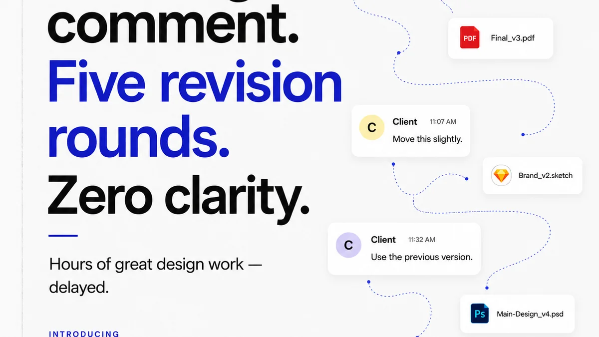
Where Revue Fits In
Managing the feedback loop on creative projects is complex. Ensuring accessibility requirements are met adds another layer.
Revue helps centralize this. Instead of scattered email threads or confusing annotation tools, all feedback lives in one place.
Centralized Feedback: Stakeholders can leave comments directly on specific design elements, including notes about visual hierarchy, contrast, or usability issues.
Revision Visibility: Track changes and revisions clearly. If an accessibility fix is made, you can see it alongside the original design and other feedback.
Quality Checks: Use Revue’s structured review process to build in accessibility checks. Add specific comments or tasks related to WCAG compliance, ensuring they aren't overlooked during the final quality assurance stage.
When feedback and revisions are transparent and organized, it’s easier to ensure that accessibility considerations aren't lost in translation.
Final Thought
WCAG compliance isn't a destination; it's a continuous journey. It’s about embedding inclusive thinking into your agency’s DNA.
Are you designing for the widest possible audience, or just the easiest path?
Frequently asked questions
What are the essential WCAG compliance levels?
WCAG offers three levels of conformance: A (lowest), AA (mid-level, the most common target), and AAA (highest). Most organizations aim for AA conformance as it provides a good balance of accessibility and feasibility.
How does WCAG affect creative freedom?
It shouldn't stifle creativity; it should enhance it by forcing more thoughtful problem-solving. Inclusive design principles often lead to more elegant and user-friendly solutions that benefit everyone, not just users with disabilities.
Can automated tools fully check WCAG compliance?
No. Automated tools are excellent for catching technical issues like color contrast or missing alt text, but they cannot assess usability, understandability, or the context of content. Manual testing with keyboard and screen readers is essential.
What's the difference between WCAG and ADA?
The Americans with Disabilities Act (ADA) is a US civil rights law that prohibits discrimination based on disability. WCAG (Web Content Accessibility Guidelines) are a set of technical standards developed by the W3C to make web content accessible. While ADA doesn't explicitly mandate WCAG, it's widely accepted as the standard for meeting ADA's accessibility requirements for digital content.