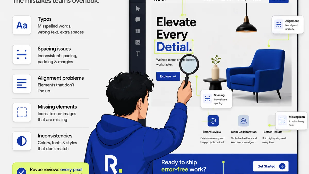
The Print Design QA Checklist That Actually Works
Stop treating print QA like a formality. It's the last line of defense against costly errors. Here's how to do it right.
Revue Editorial·6 min
The Revue Journal
Operations, client relationships, and what we're learning building Revue with studios around the world.
Stop treating print QA like a formality. It's the last line of defense against costly errors. Here's how to do it right.

Think AI is the magic bullet for typos and bad kerning? Think again. The real fix requires a deeper look at your workflow.
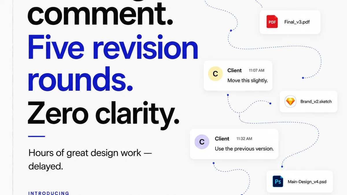
Stop guessing about type quality. Master typography QA with the right tools and processes.
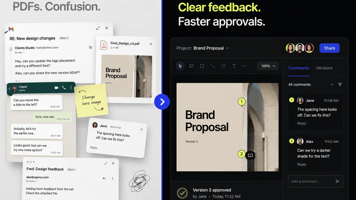
Don't let sloppy typography tank your design. A rigorous QA process is non-negotiable.
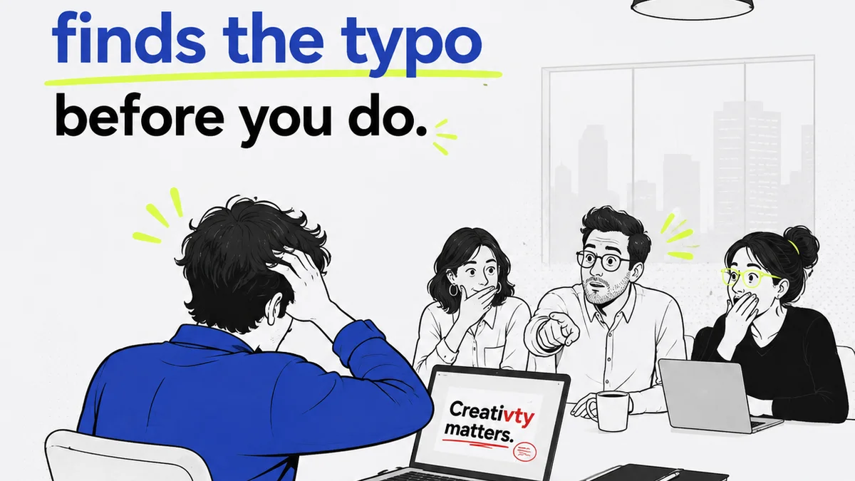
Beyond aesthetics: Mastering typography proofreading is critical for print design success. Learn the essential checks that separate good from great.

You think a misplaced kerning pair won't matter? Think again. Poor typography isn't just an aesthetic misstep; it's a direct hit to your client's brand trust and perceived professionalism.
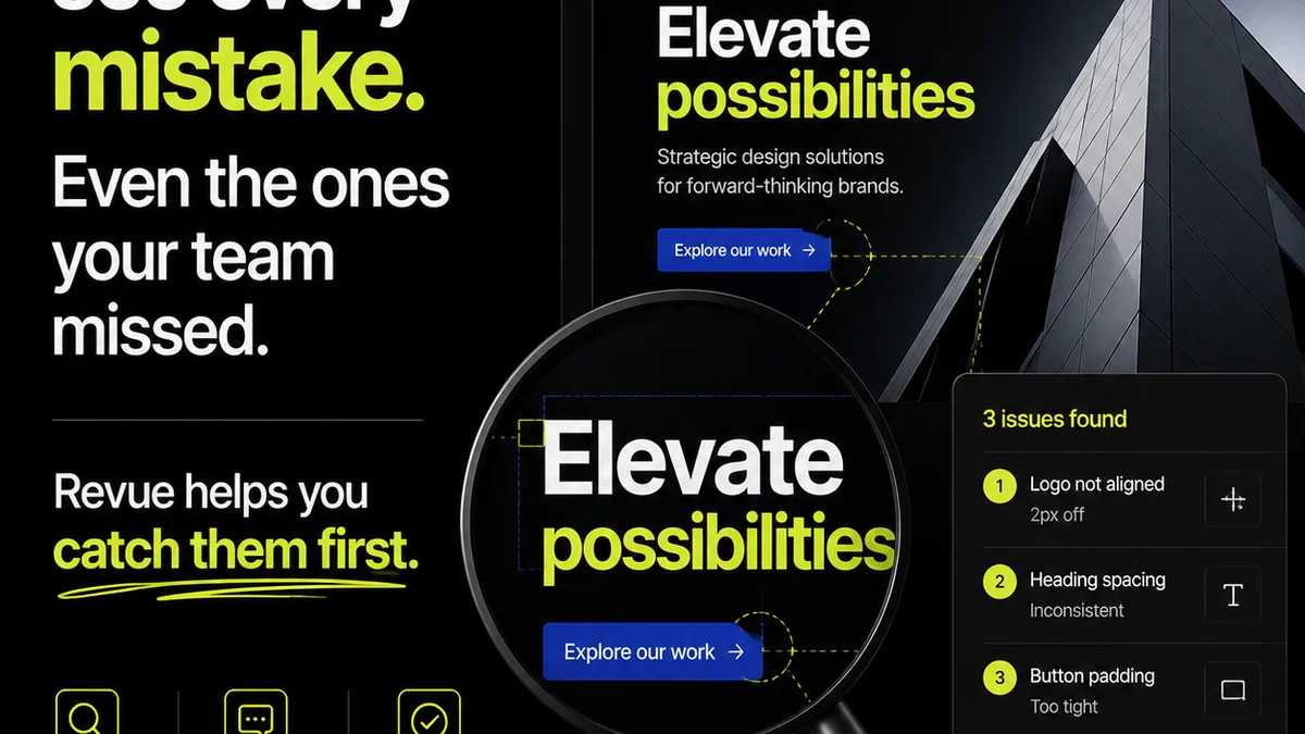
You think you're covered on font licenses. You're probably not. Here's why and what to do about it.
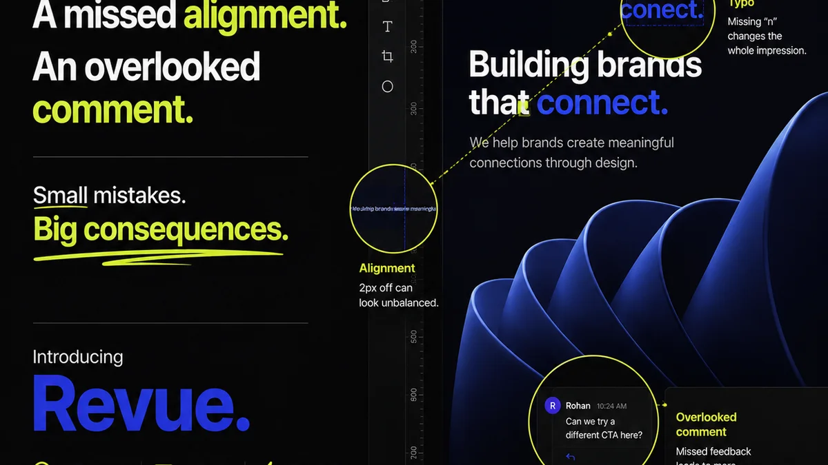
Stop guessing. Get your typography right every time with this practical guide to kerning, tracking, and leading.
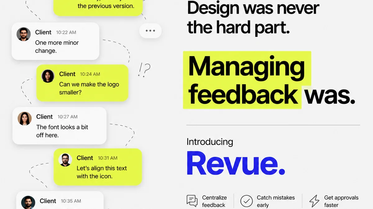
Stop guessing. Discover the operational truth behind maintaining perfect font consistency across your most complex design projects.
Join the beta
One essay every Thursday. No fluff, no roundups.