A Complete Guide to Proofreading Typography in Print Design
Beyond aesthetics: Mastering typography proofreading is critical for print design success. Learn the essential checks that separate good from great.
Revue Editorial·6 min
The Revue Journal
Operations, client relationships, and what we're learning building Revue with studios around the world.
Beyond aesthetics: Mastering typography proofreading is critical for print design success. Learn the essential checks that separate good from great.

You think a misplaced kerning pair won't matter? Think again. Poor typography isn't just an aesthetic misstep; it's a direct hit to your client's brand trust and perceived professionalism.
You think you're covered on font licenses. You're probably not. Here's why and what to do about it.
Stop guessing. Get your typography right every time with this practical guide to kerning, tracking, and leading.
Stop guessing. Discover the operational truth behind maintaining perfect font consistency across your most complex design projects.
Stop guessing. These common typography mistakes are costing you client trust and project clarity. Here’s the hard truth and how to fix them.
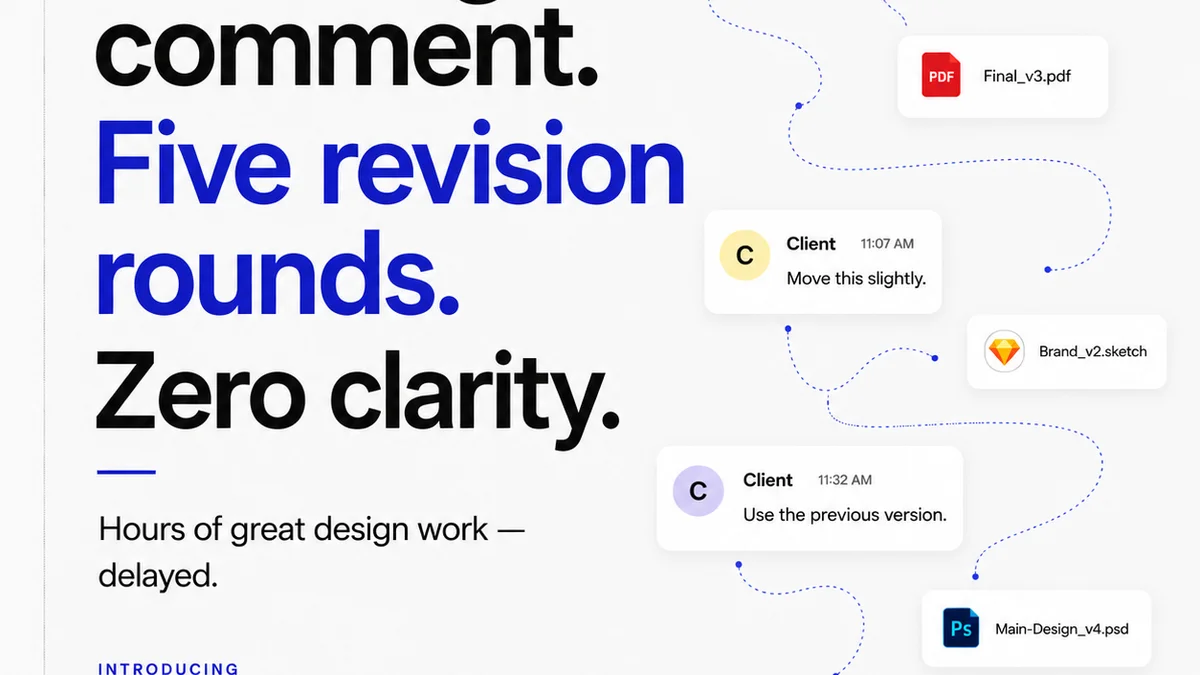
Beyond the basics: A practical typography QA checklist for designers who want to eliminate errors and elevate their work.
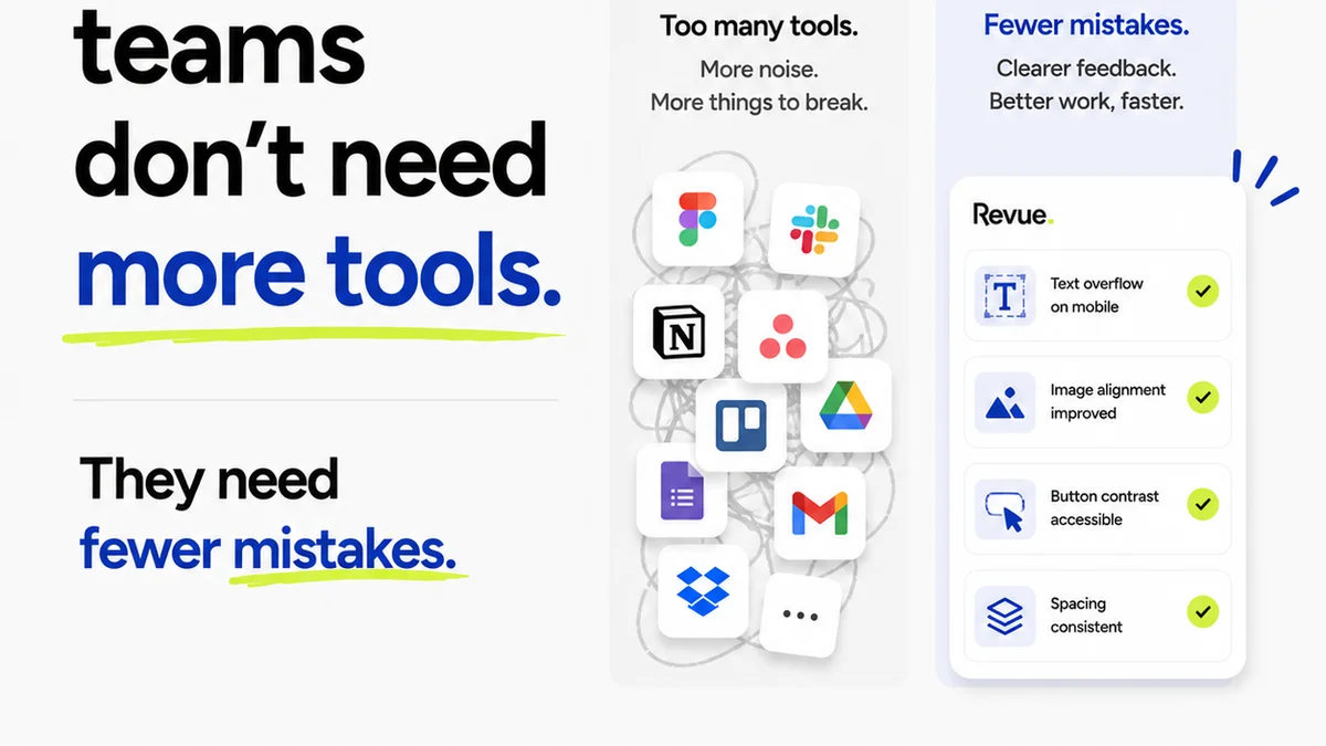
Forget the hype. The real evolution of client-agency partnerships is about operational grit, not just shiny tech. Here's what's actually changing.
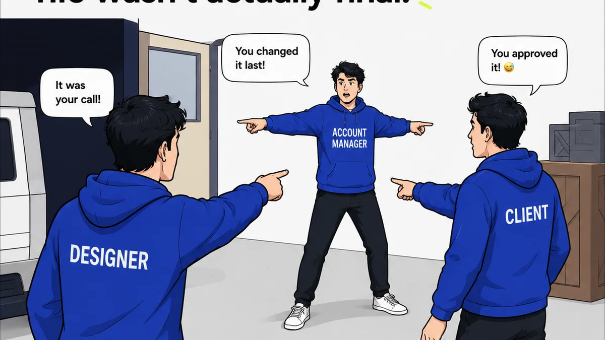
Stop guessing. Start delivering. See how seeing the whole picture transforms project outcomes.
Join the beta
One essay every Thursday. No fluff, no roundups.