
Color Consistency Across Digital and Print: The Hard Truth Agencies Ignore
Stop blaming the printer. The real problem with color consistency between digital screens and print lies much earlier in your workflow.
Revue Editorial·6 min
The Revue Journal
Operations, client relationships, and what we're learning building Revue with studios around the world.
Stop blaming the printer. The real problem with color consistency between digital screens and print lies much earlier in your workflow.

You think you know how to use a logo. You're probably wrong. Here’s the hard truth about protecting your brand identity, one misused mark at a time.
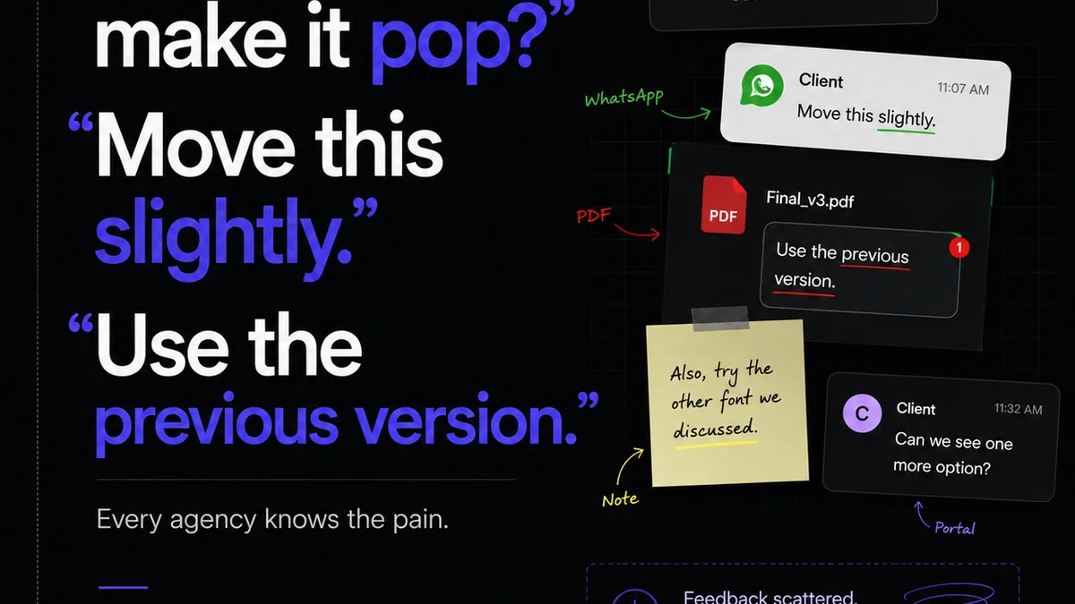
Brand guidelines are crucial, but they’re only half the battle for creative consistency. Learn why operational processes are the missing piece.
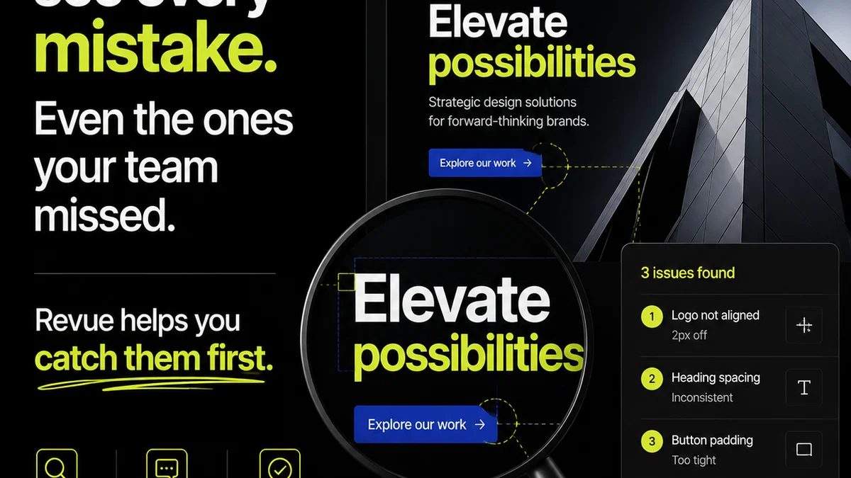
You think branding is all about pretty logos and color palettes? Think again. The real errors are deeper, and they're costing you.
Stop chasing brand consistency. It’s not about more guidelines; it’s about better systems.

Stop chasing ghosts. A truly consistent brand isn't built on templates alone. It's built on process.

Don't let these common packaging design mistakes derail your next print run. Learn how to spot and fix them before they cost you time and money.

Stop thinking about color modes as just technical specs. Understand how they impact your agency's workflow, client approvals, and bottom line.

Stop treating print QA as an afterthought. Build a workflow that catches errors before they hit the press.
Join the beta
One essay every Thursday. No fluff, no roundups.